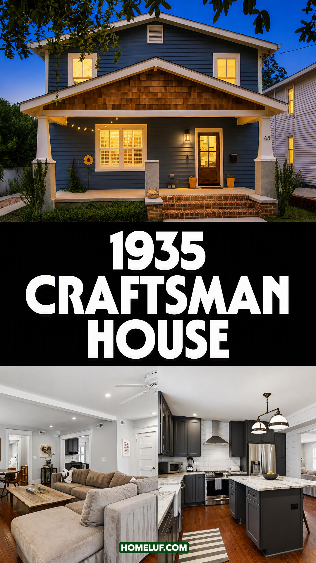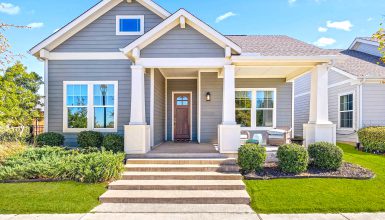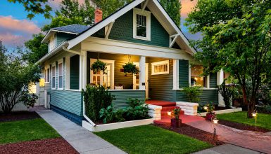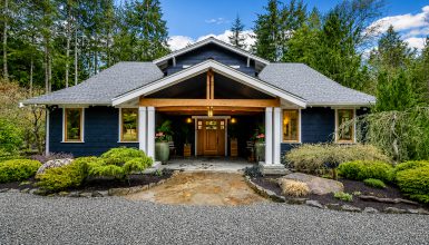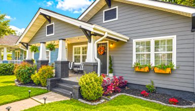
What happens when a 1935 Craftsman house keeps its old soul but gains a fresh new look? This charming home does just that. From its deep front porch and cedar-shingle accents to its warm wood floors and bright modern kitchen, every space blends history with comfort. The result feels classic, relaxed, and ready for modern life.
Here is a closer look at the details that make this 1935 Craftsman house work so well.
1. A Craftsman Exterior With a Strong, Simple Shape
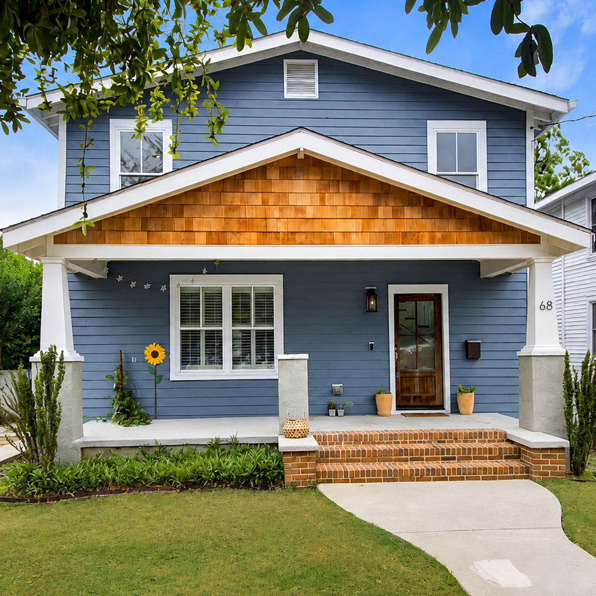
The first thing you notice is the shape of the house.
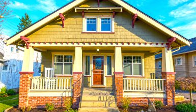
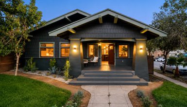
It has a wide front-facing gable and a deep porch. Those features give the front a strong horizontal feel. Craftsman homes often look grounded instead of tall and delicate, even when they have two floors.
The porch helps a lot.
It stretches across much of the front and creates a clear transition between the yard and the house. Rather than placing the front door right on the facade, the porch gives visitors a sheltered place to arrive.
The roof has broad overhangs as well. That adds shade and gives the exterior more depth.
Meanwhile, the blue-gray siding keeps the home calm and casual. White trim outlines the windows, roof edges, porch, and columns. The contrast feels crisp, but it does not look harsh.
Then there is the cedar-shingle gable.
Its warm wood tone breaks up the painted siding. It also gives the home the handcrafted feel that belongs on a Craftsman exterior.
Design cues to notice
- Broad front-facing gable
- Deep covered front porch
- Wide roof overhangs
- Horizontal lap siding
- Natural cedar shingles in the porch gable
- Blue-gray exterior color
- Bright white trim
- Simple, sturdy porch supports
- Warm wood front door
- Brick front steps
2. The Porch Creates the Home’s First Cozy Moment
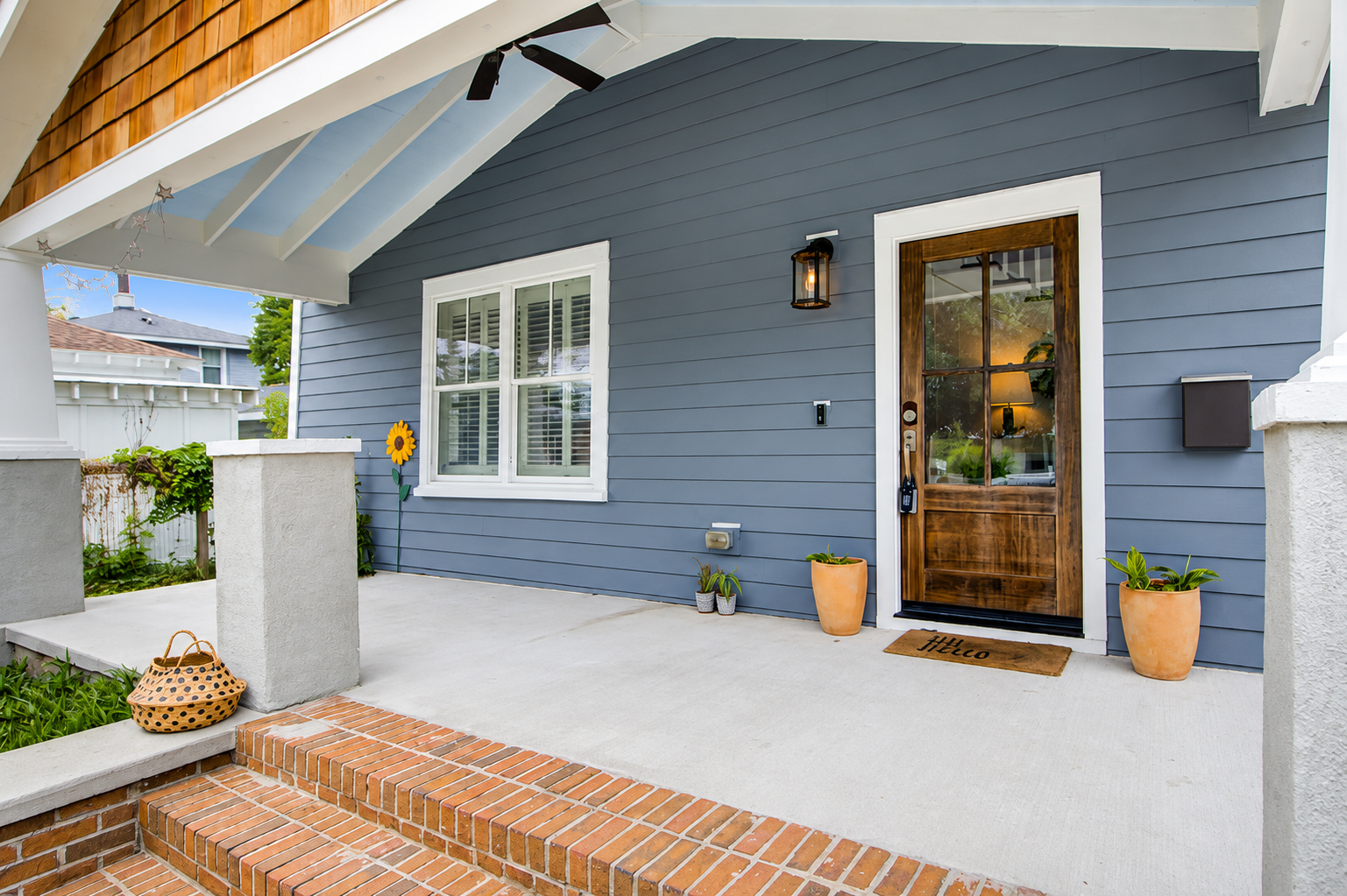
A good Craftsman porch should feel like part of the house, not an add-on.
This one does.
The porch roof comes forward from the main structure and creates a low, welcoming ceiling. Exposed structural details are easy to see beneath it. They add texture without making the porch feel busy.
The supports are also simple and solid.
Square posts sit on larger masonry bases. This is a classic Craftsman idea. The heavier base makes each support look strong enough to hold the broad roof above.
The porch itself stays quite minimal.
There is no heavy railing or ornate trim. Instead, the architecture does most of the work.
Warm brick steps lead up from the curved walkway. Their earthy red tone adds another layer of natural color. Then the wood front door repeats the same warm idea.
A pair of simple planters keeps the entry fresh.
Even the ceiling fan makes sense here. It turns the porch into a usable outdoor room during warm weather.
Porch design cues
- Low porch roof
- Exposed framing details
- Chunky square supports
- Masonry porch bases
- Brick steps
- Smooth concrete porch floor
- Wood entry door
- Simple wall lantern
- Small potted plants
- Outdoor ceiling fan
3. A Natural Color Palette Connects Old and New
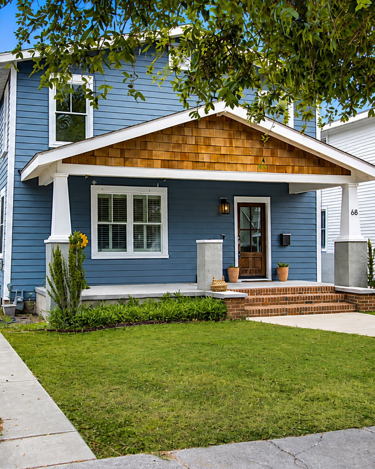
The exterior color scheme sets the mood for the whole house.
Blue-gray siding makes the home feel calm. White trim gives the facade a clean edge. Cedar shingles add honey-brown warmth. Brick introduces red and rust tones.
None of the colors fight for attention.
That matters.
Craftsman design often works best with colors pulled from nature. Think wood, stone, earth, leaves, clay, and sky.
This house takes that traditional idea and makes it lighter.
Instead of deep olive, brown, or dark red, the exterior uses a softer blue-gray. The shade feels more current, yet the natural wood and brick keep it connected to Craftsman style.
The same approach appears indoors.
White walls create a fresh base. Dark wood floors add history and warmth. Gray cabinets bring in a cooler neutral. Natural wood furniture stops the rooms from feeling too polished.
The whole palette feels linked from front door to back yard.
Color cues
- Blue-gray exterior siding
- Bright white trim
- Natural cedar
- Rustic red brick
- Warm brown hardwood
- Soft gray walls
- Charcoal kitchen cabinets
- Cream and beige upholstery
- Small accents of black metal
4. The Entry Keeps the Historic Character Alive
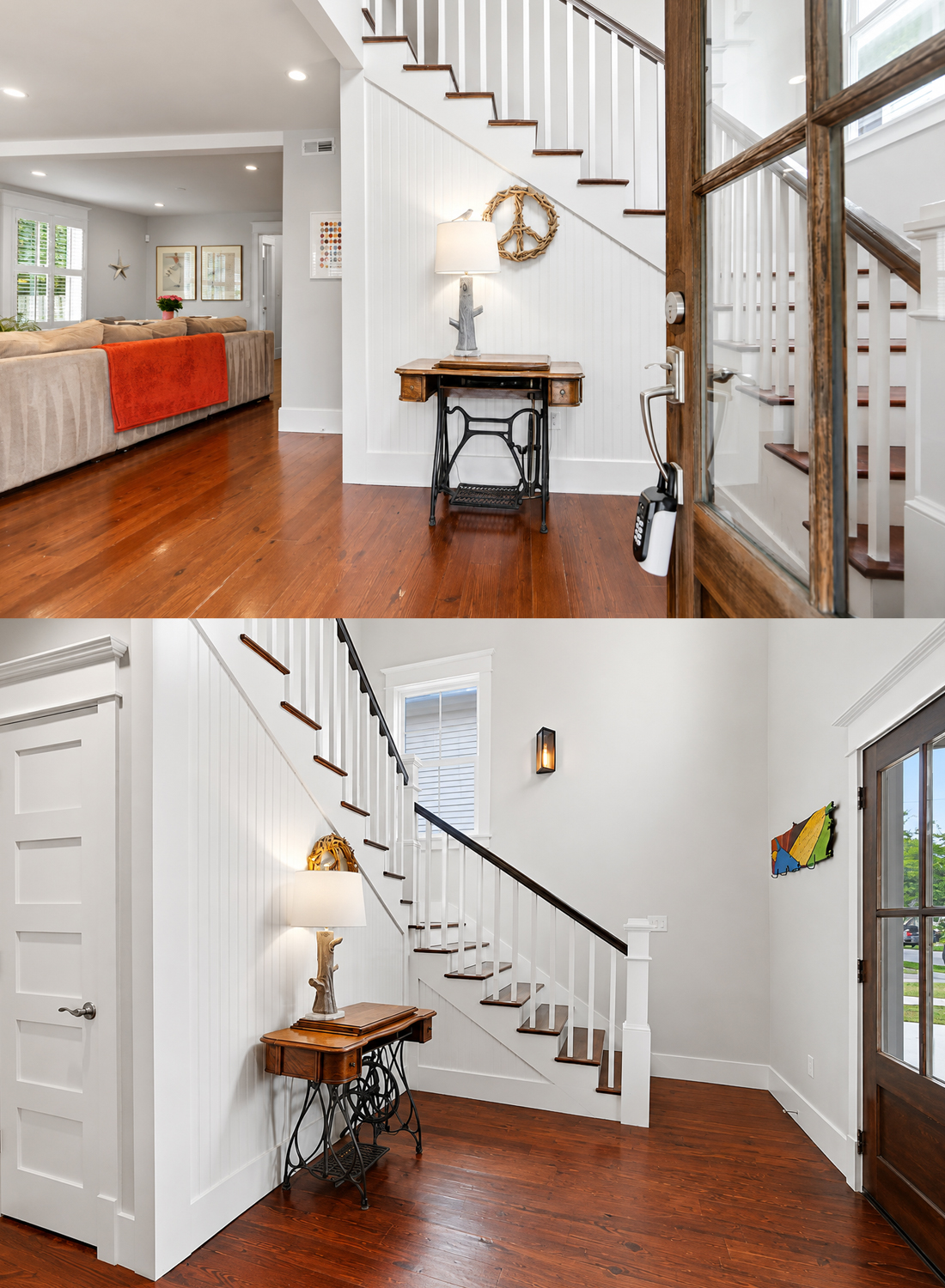
The front door opens into one of the strongest parts of the remodel.
The entry is bright and simple, yet it still feels like an older house.
The wood floor immediately brings warmth inside. Its deep brown-red tone has natural grain and small marks that give it character.
Then the staircase becomes the star.
White square balusters keep it clean. Dark wood stair treads and a matching handrail tie back to the floor. The contrast makes the stair easy to see without turning it into a showpiece.
There is also vertical wall paneling beside the stairs.
That detail adds a bit of traditional texture. It feels right in a Craftsman home because Craftsman interiors often use plenty of wood trim and paneling.
Here, however, the trim is painted white.
That small change keeps the room bright.
The vintage sewing-machine table adds another nice touch. Its dark metal base and worn wood top give the entry a sense of age. It feels collected rather than staged.
Entry design cues
- Original-looking wood floor
- White stair balusters
- Dark wood stair treads
- Dark stained handrail
- Simple square newel posts
- White vertical wall paneling
- Wide baseboards
- Craftsman-style interior trim
- Vintage accent furniture
- Warm wood front door
5. An Open Living Area Makes the Old House Feel Larger
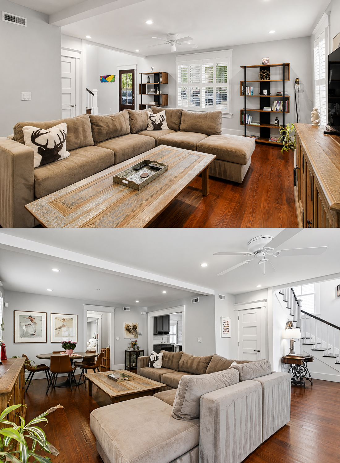
Older homes often have many small rooms.
This home takes a different approach.
The main level feels open and connected. The living room and dining area share one large space. Wide openings lead toward the kitchen.
This creates long sight lines.
You can stand near the front door and see deep into the house. That alone makes the floor plan feel larger.
Still, the home does not feel like one huge box.
Furniture creates clear zones.
A large sectional defines the living area. A round dining table creates a second zone beside it. The kitchen sits beyond a wide framed opening.
The ceiling also helps.
Subtle beams and changes in ceiling height give each area a little structure.
This is a smart way to update an old Craftsman home. You gain the open feel people want today, yet you still keep enough visual breaks to make each space feel cozy.
Open-plan cues
- Wide room openings
- Long views across the main level
- Living and dining zones in one space
- Furniture used as room dividers
- Simple ceiling beams
- Matching wood flooring throughout
- Repeated white trim
- Clear paths between rooms
6. The Living Room Mixes Comfort With Rustic Texture

The living room does not rely on fancy furniture.
Instead, it feels soft and easy.
A large beige sectional fills the center of the room. Its deep seats make the space look ready for real life. The pale fabric also keeps such a large piece from feeling too heavy.
Then a rustic wood coffee table adds texture.
Its worn surface feels relaxed. A wood media cabinet continues that natural look on the other side of the room.
Open shelves mix black metal frames with wood shelves. This introduces an industrial note, but the warm wood keeps it from feeling cold.
Windows surround the room.
White plantation shutters give them a clean finish. They also work well with the wide Craftsman-style trim.
Most of the walls remain light gray. That quiet backdrop lets the old wood floor stand out.
A few plants bring life into the room. Small pieces of art add color without making the space feel crowded.
Living room cues
- Oversized neutral sectional
- Rustic wood coffee table
- Natural wood media console
- Black metal and wood shelving
- Pale gray walls
- White window trim
- Plantation shutters
- Warm hardwood floors
- Simple framed art
- Small houseplants
7. The Dining Area Feels Casual, Not Formal
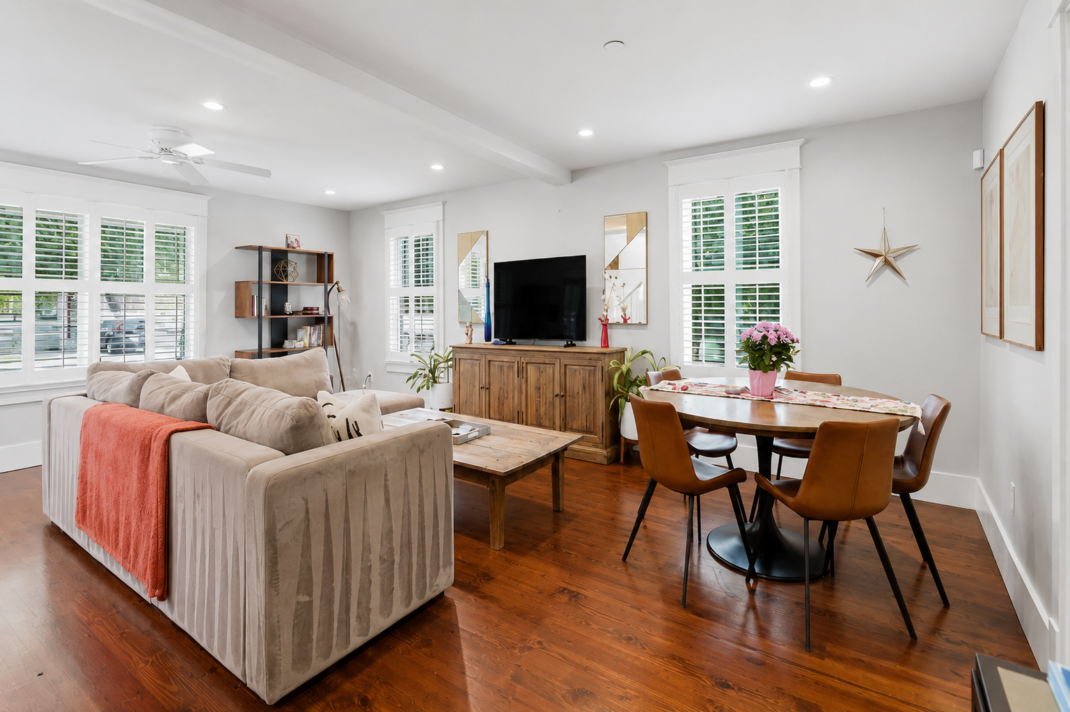
A Craftsman house can handle a formal dining room. Yet this home takes a more relaxed route.
The dining table sits right beside the living space.
It has a round wood top and a dark pedestal base. The shape is a smart choice. Round tables soften rooms that already have many straight lines.
The chairs add a rich camel-brown color.
Their simple shape feels modern, but the warm tone fits the wood floor and rustic furniture nearby.
Artwork stays light and simple.
There is no large chandelier over the table. That keeps the shared living and dining room visually calm.
The dining space works because it does not try too hard to look like a separate room. It remains part of the main living zone.
Dining cues
- Round dining table
- Dark pedestal base
- Warm brown dining chairs
- Simple wall art
- Open connection to living room
- Natural wood tones
- Minimal decoration
8. A Modern Craftsman Kitchen With Strong Contrast
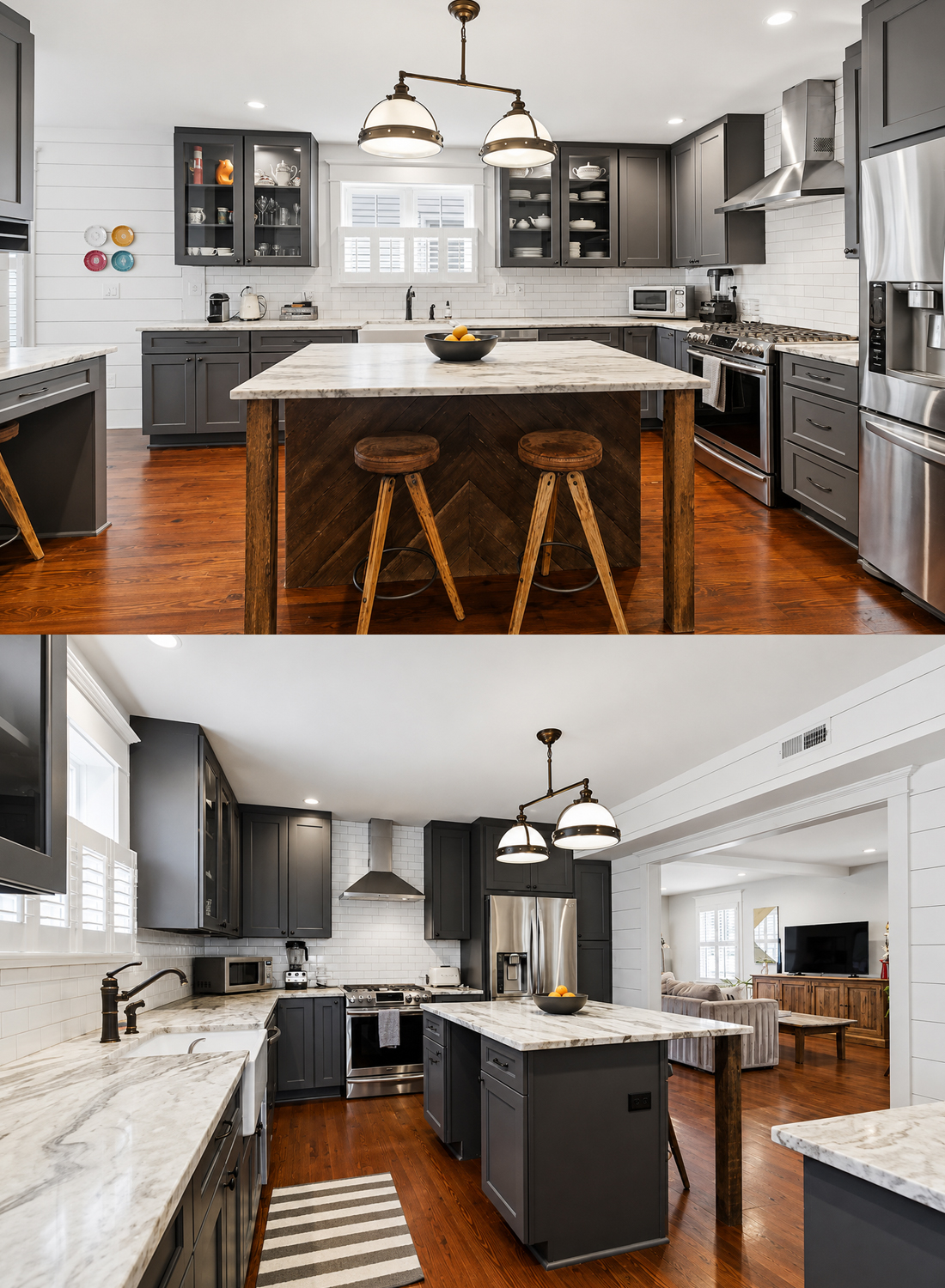
The kitchen may be the most updated room in the house.
Still, it connects well with the rest of the design.
Gray Shaker-style cabinets cover most of the walls. Their recessed panels add classic detail without looking ornate.
White subway tile forms the backsplash.
This is a simple choice, but it works. The light tile brightens the kitchen and balances the dark cabinets.
Stone counters bring soft gray and cream movement to the surfaces.
Then the stainless steel range, hood, dishwasher, and refrigerator add a more modern layer.
The large island stands at the center.
Its stone top offers plenty of work space. One side features a dark wood chevron pattern. This detail adds warmth and creates a handcrafted look.
Industrial-style pendant lights hang above the island. Their white glass shades and dark metal frames feel bold without taking over the room.
A farmhouse sink near the window brings the kitchen back toward traditional style.
This mix is the secret.
Nothing feels too old. Nothing feels too new.
Kitchen design cues
- Gray Shaker cabinets
- White subway tile
- Light stone countertops
- Stainless steel appliances
- Farmhouse sink
- Large center island
- Chevron wood island detail
- Industrial pendant lights
- Glass-front cabinets
- Dark hardware
- White plantation shutters
- Original-style wood floors
9. Shiplap Adds Texture Without Making the House Feel Themed
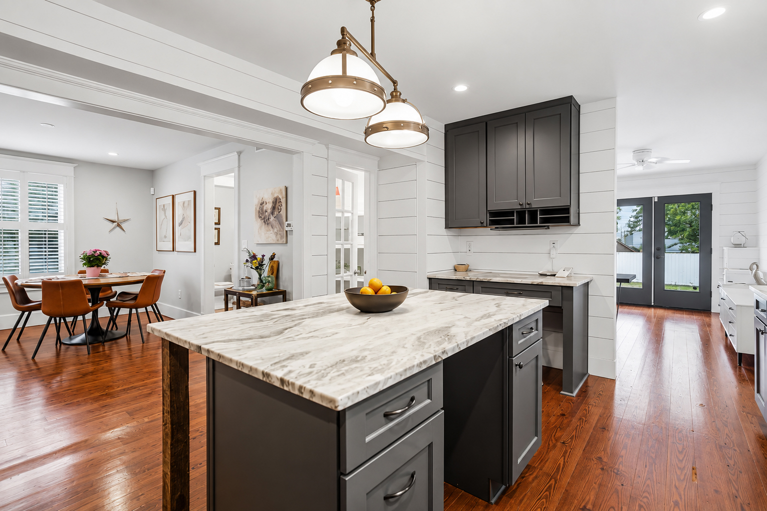
White horizontal boards appear in several rooms.
You can see them in the kitchen, office area, bathroom, and halls.
This treatment adds texture to simple white walls.
It also gives the remodeled rooms a casual cottage feel.
However, the house does not cover every surface with boards. That restraint is important.
Too much shiplap could make the home feel like a modern farmhouse instead of a Craftsman.
Here, it works as a supporting detail.
The narrow horizontal lines also make small spaces feel wider. Meanwhile, the bright white finish reflects light.
In the kitchen, the wall boards create a clean frame around the opening into the living room. In the bathroom, they soften the hard surfaces of tile and stone.
Wall-detail cues
- White horizontal wall boards
- Limited use rather than full-house coverage
- Wide painted trim
- Simple neutral wall colors
- Mix of smooth and textured surfaces
10. The Home Office Turns a Narrow Space Into Something Useful
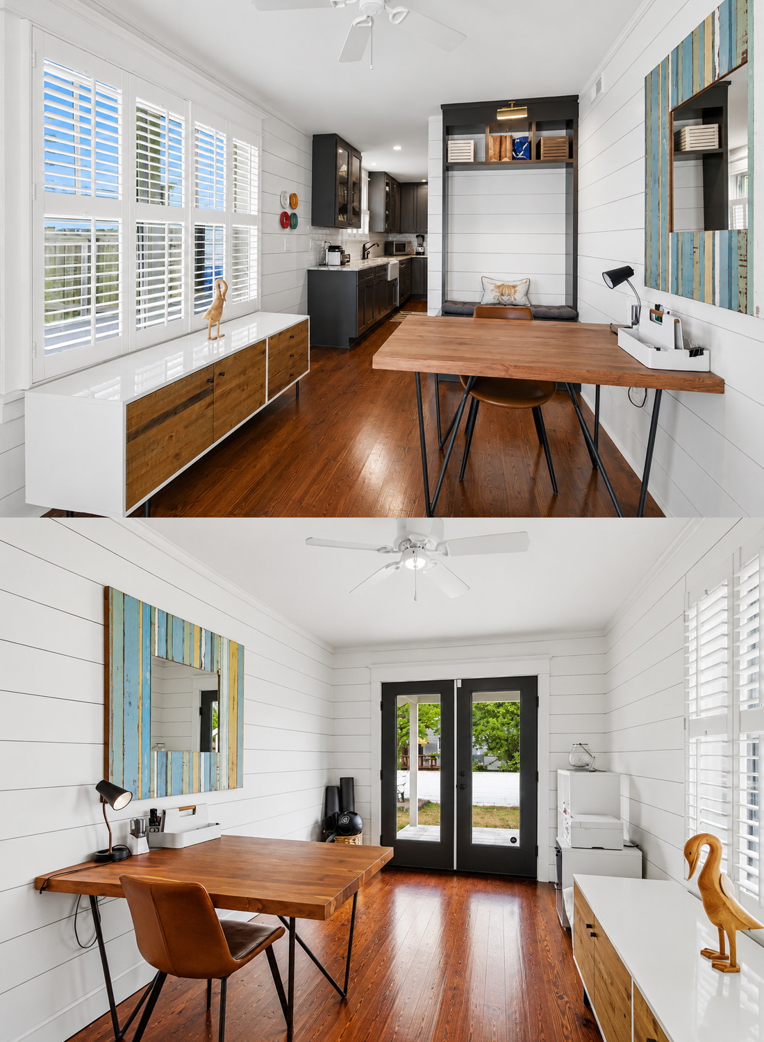
One of the smartest spaces sits just beyond the main kitchen.
A long room becomes a bright home office.
Large windows run along one wall. Plantation shutters control the light while keeping the room neat.
A simple wood desk takes center stage.
The desk is large enough for daily work, but its thin metal legs keep it from feeling bulky.
A low cabinet sits below the windows. The mix of white framing and natural wood doors continues the home’s warm modern style.
There is even a built-in bench at the far end.
That little nook makes good use of space that might otherwise sit empty.
This room proves that every area in an older home can serve a purpose. You do not always need to move walls. Good furniture and built-ins can change how a room works.
Office cues
- Long wood desk
- Slim black metal legs
- Large bank of windows
- White plantation shutters
- Low storage cabinet
- Natural wood cabinet fronts
- Built-in bench nook
- White plank walls
- Simple task lighting
11. The Stair Hall Shows Off the Height of the House
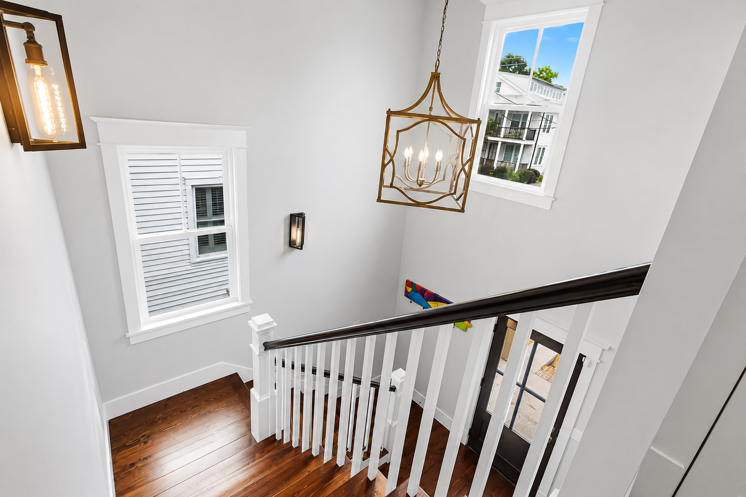
The stair hall gives the house a sense of scale.
Tall walls stretch between floors. Large windows bring daylight into the center of the home.
A large open-frame pendant hangs in the space.
Its shape looks modern, yet its aged metal finish adds warmth.
The dark handrail traces the staircase and creates a strong line against the white walls.
This is another example of contrast doing the work.
You do not need lots of color when you have white trim, dark wood, and strong shapes.
The stair design also feels true to Craftsman ideals. The pieces look sturdy. The shapes stay simple. There is very little decoration for decoration’s sake.
Stair hall cues
- Double-height wall space
- Tall windows
- Simple square balusters
- Dark wood handrail
- Dark stair treads
- White risers
- Large geometric pendant
- Wide Craftsman trim
- Natural daylight
12. The Main Bedroom Feels Calm and Quiet
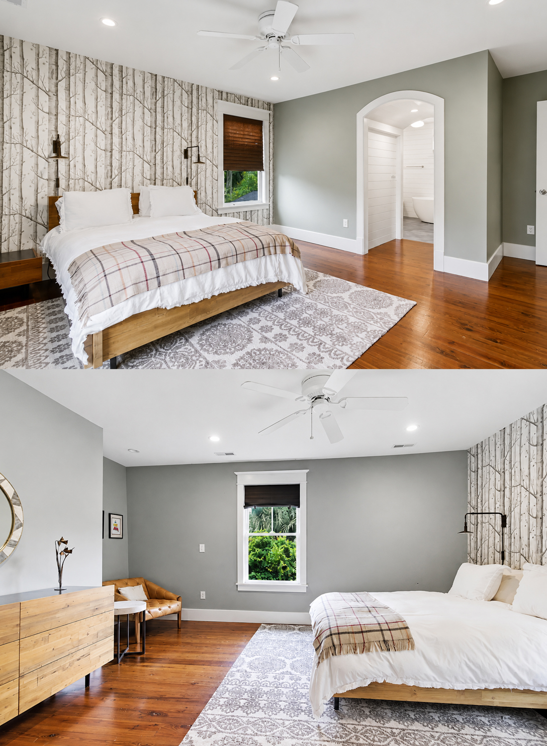
Upstairs, the main bedroom shifts into a softer mood.
Gray-green walls create a calm backdrop. A wood platform bed keeps the room grounded.
Then one wall adds a playful surprise.
Tree-pattern wallpaper fills the wall behind the bed.
The print brings nature indoors, which fits the wider Craftsman idea of using organic forms and natural materials.
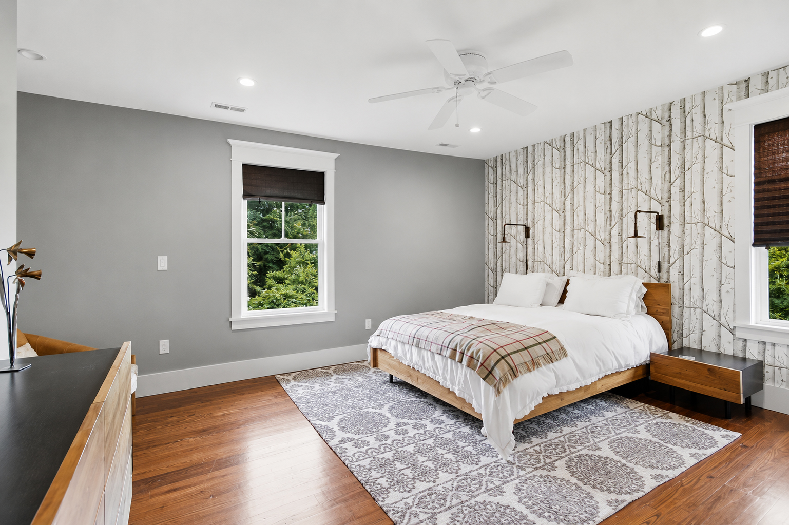
White bedding keeps the pattern from becoming too busy.
A simple plaid throw adds another soft layer.
The hardwood floor remains visible around the rug. That helps the bedroom feel connected to the rest of the home.
An arched doorway leads into the bathroom. Its curved top breaks up all the straight lines and gives the suite a special detail.
Bedroom cues
- Soft gray-green walls
- Nature-inspired wallpaper
- Simple wood bed
- White layered bedding
- Plaid throw
- Neutral patterned rug
- Hardwood floors
- Arched bathroom opening
- Minimal furniture
13. A Bright Bathroom Mixes Spa Style With Craftsman Texture
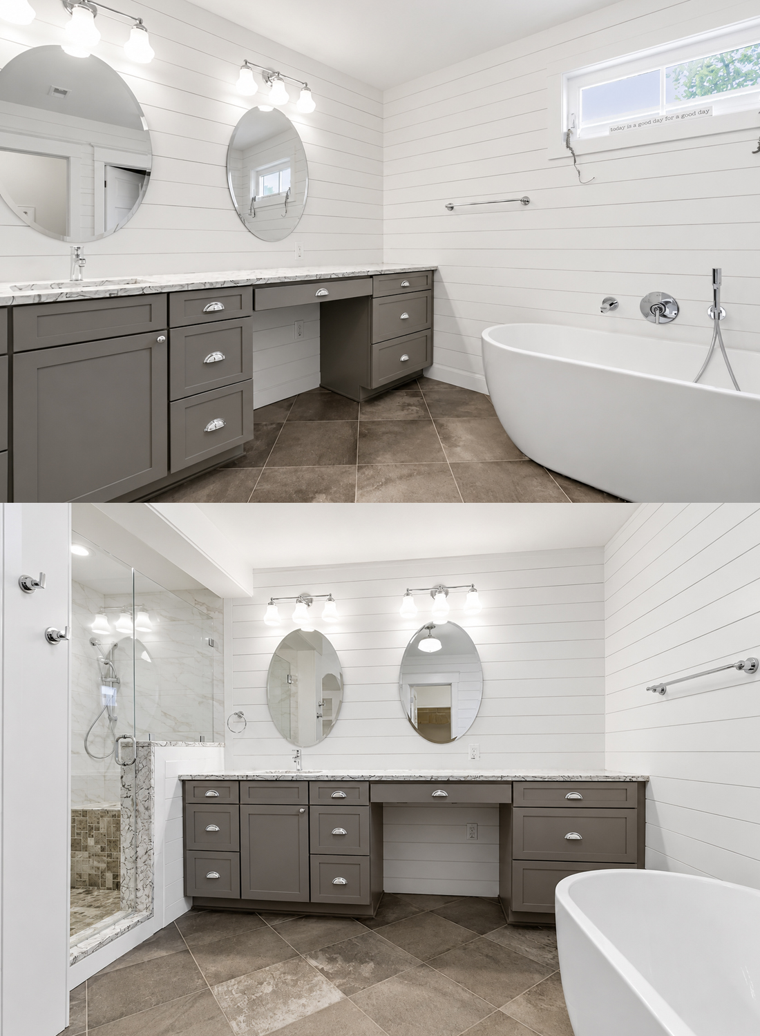
The main bathroom feels much more modern than 1935.
Yet a few choices help it belong inside the house.
White plank walls give the room texture. Gray Shaker cabinets connect the bath with the kitchen.
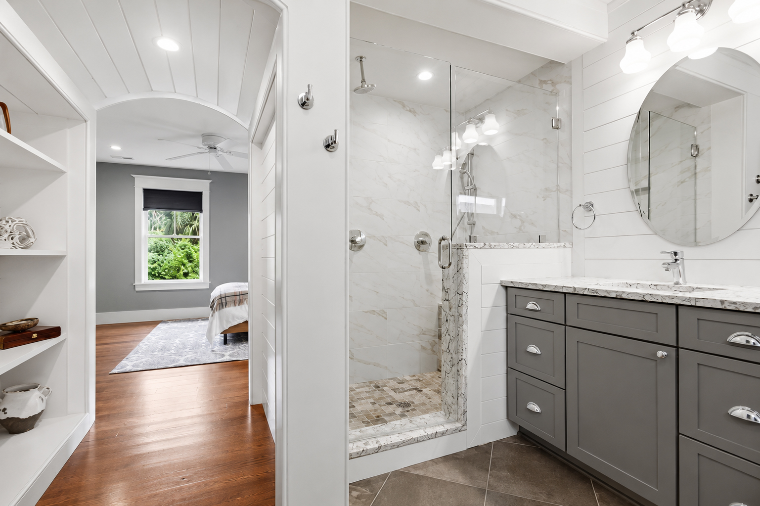
Two large round mirrors sit above the long vanity.
Their curved shape softens the straight cabinet doors and wall boards.
The freestanding tub becomes the main focal point.
It sits against a quiet white wall beneath a high window. Wall-mounted fixtures keep the area clean and simple.
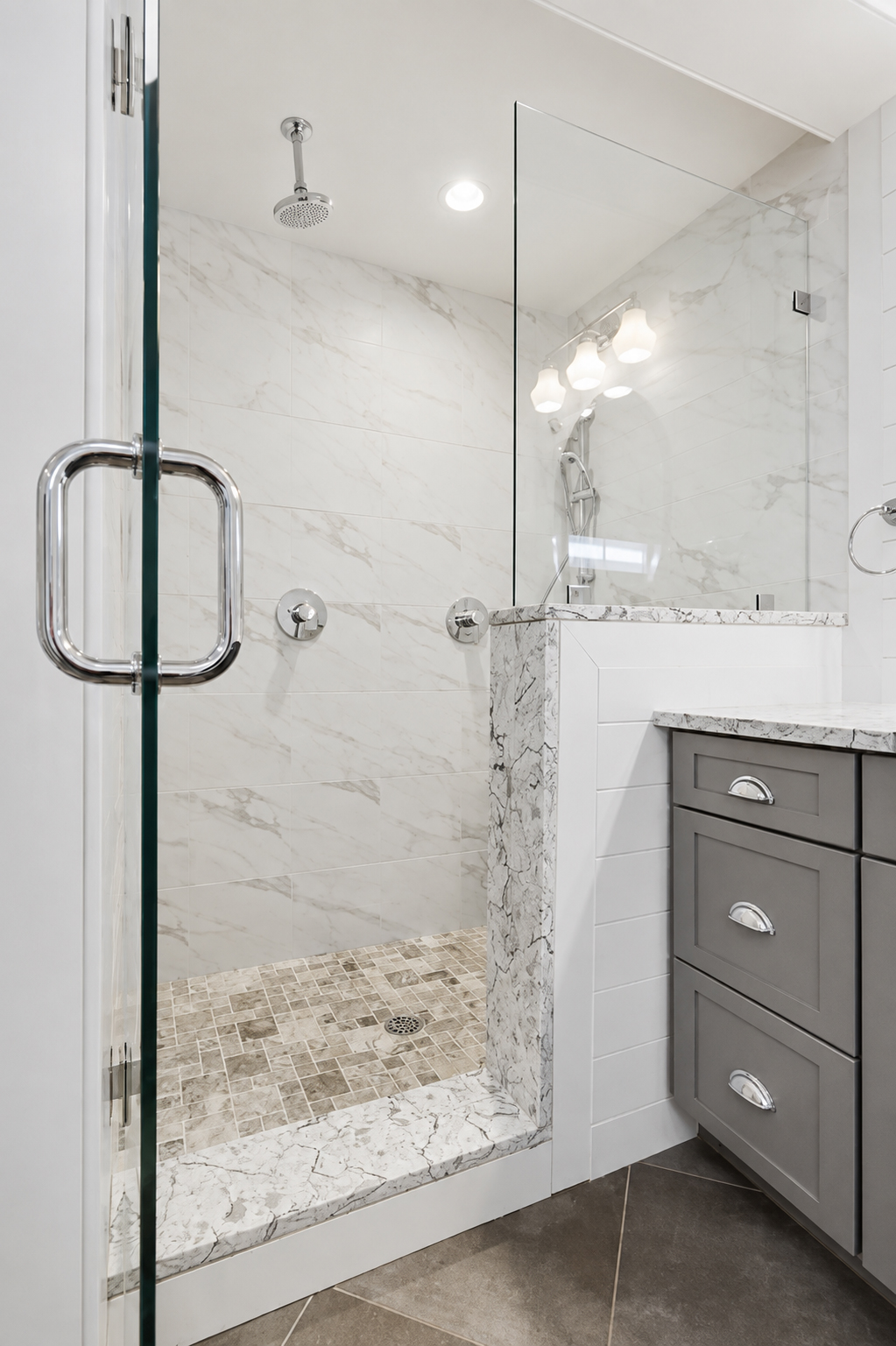
Large gray floor tiles create a grounded base.
Nearby, the walk-in shower uses glass panels and large marble-look wall tiles. Small stone-look floor tiles add more texture underfoot.
The mix feels fresh but not flashy.
Bathroom design cues
- Freestanding white tub
- Wall-mounted tub filler
- Long gray vanity
- Shaker drawer fronts
- Stone countertop
- Round mirrors
- White horizontal wall boards
- Large gray floor tile
- Glass walk-in shower
- Marble-look shower walls
- Small textured shower-floor tile
- Chrome fixtures
14. Built-In Storage Makes the Remodel Feel Thoughtful
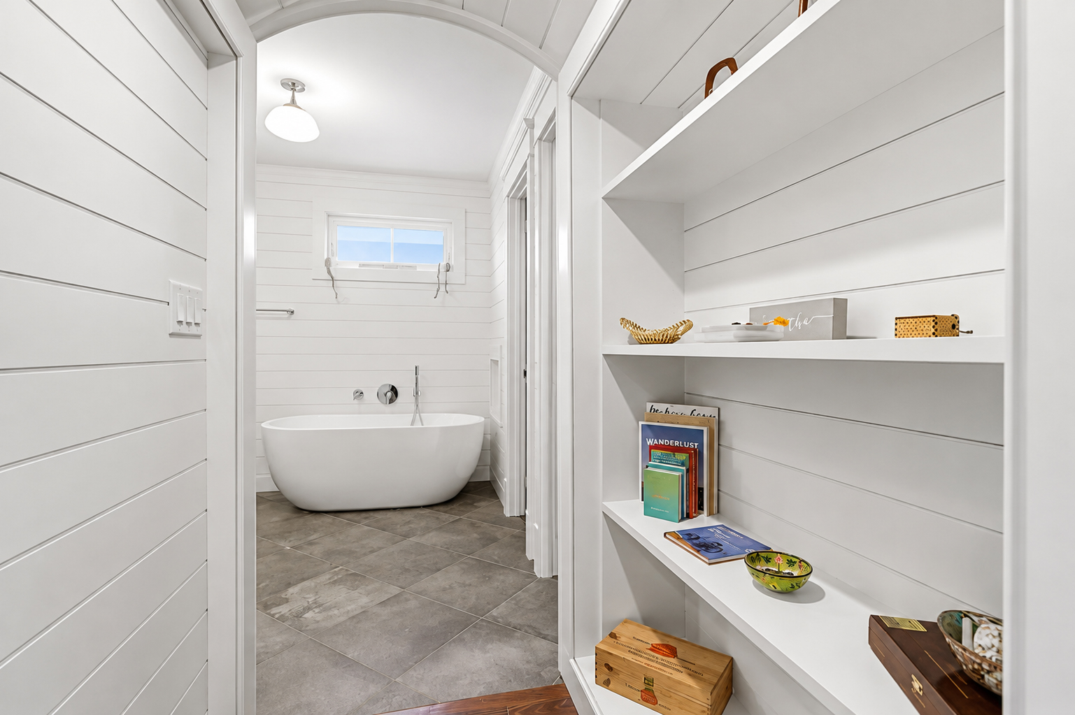
Old houses often have awkward corners.
Instead of ignoring them, this remodel turns several of those spots into useful storage.
Built-in shelves appear near the main bathroom.
They sit inside a narrow passage and provide open space for books, small boxes, and decor.
Because the shelves match the white wall treatment, they almost disappear.
That is a smart move.
Storage works best in small or historic homes when it becomes part of the architecture.
The office also uses built-ins.
Kitchen cabinets reach high on the walls.
Even the living room relies on open shelving rather than large, heavy furniture.
These choices keep the floor clear and make the home feel larger.
Storage cues
- Recessed wall shelves
- Built-in window storage
- Tall kitchen cabinets
- Open living-room shelving
- Small display niches
- Storage fitted into unused wall space
15. Original-Looking Wood Floors Tie the Whole House Together
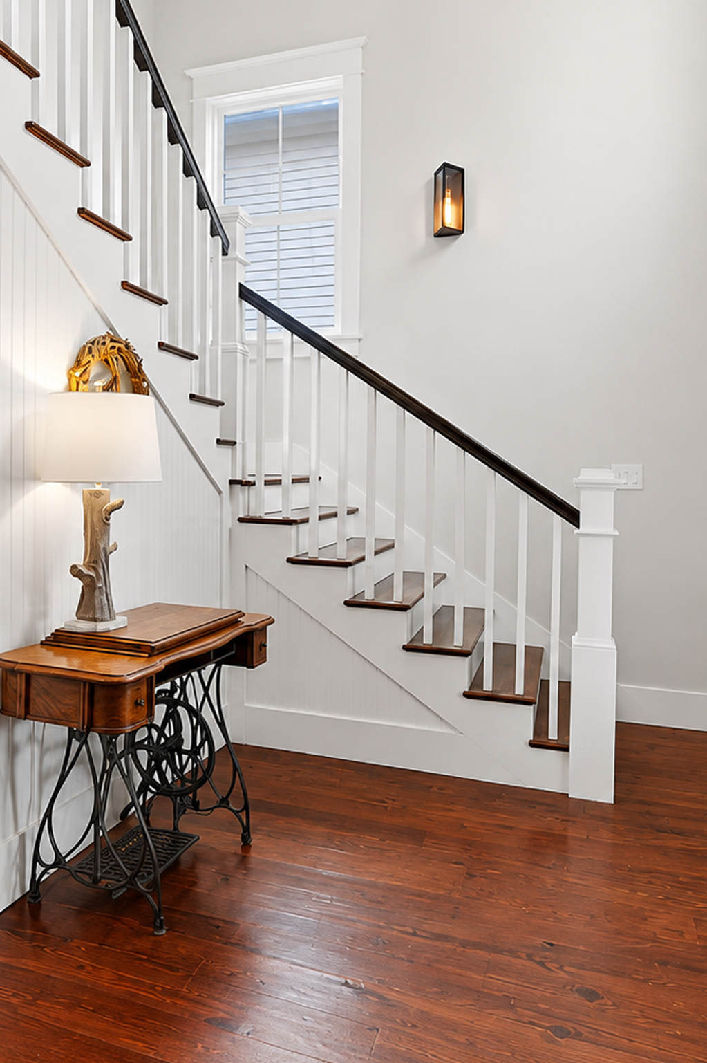
One feature appears again and again.
The wood floor.
Its warm tone runs through the entry, living room, dining area, kitchen, office, staircase, hall, and bedroom.
That consistency matters.
Many finishes in the house are new. The cabinets feel new. The tile feels new. The lighting feels new.
The floor gives all those updates something older to connect with.
Its warm red-brown color also prevents the white and gray palette from feeling cold.
You can see natural grain, knots, and small changes in tone. Those details bring life to the rooms.
This is one of the best lessons from the whole remodel.
When updating an older home, you do not need every finish to look new. Keeping one strong historic material can anchor the entire design.
Flooring cues
- Warm red-brown wood
- Visible grain
- Natural tone variation
- Continuous flooring between rooms
- Dark wood stair treads
- Gray tile reserved for wet rooms
16. The Backyard Keeps Things Simple
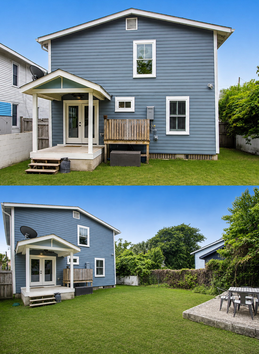
The rear of the house is much quieter than the front.
Blue-gray lap siding continues around the exterior. White trim keeps the look consistent.
A small covered back porch offers shade.
French doors create a wide link between the house and yard.
The lawn takes up most of the space. A simple paved patio sits in one corner with a small table and chairs.
There is no complex outdoor kitchen or huge deck.
That simplicity suits the house.
The yard feels flexible. It could work for dining, gardening, pets, or play.
Most important, the rear exterior does not compete with the historic front facade.
Backyard cues
- Matching blue-gray siding
- White trim
- Small covered porch
- Simple gable roof
- French doors
- Open lawn
- Basic patio
- Mature greenery
- Casual outdoor furniture
Conclusion
This 1935 Craftsman house proves that an old home can change without losing what makes it special. Warm wood, wide trim, Craftsman details, and a welcoming porch preserve its character. At the same time, open rooms, soft colors, modern finishes, and smart storage make the house feel fresh. It is a thoughtful mix of past and present that still feels warm, easy, and timeless.