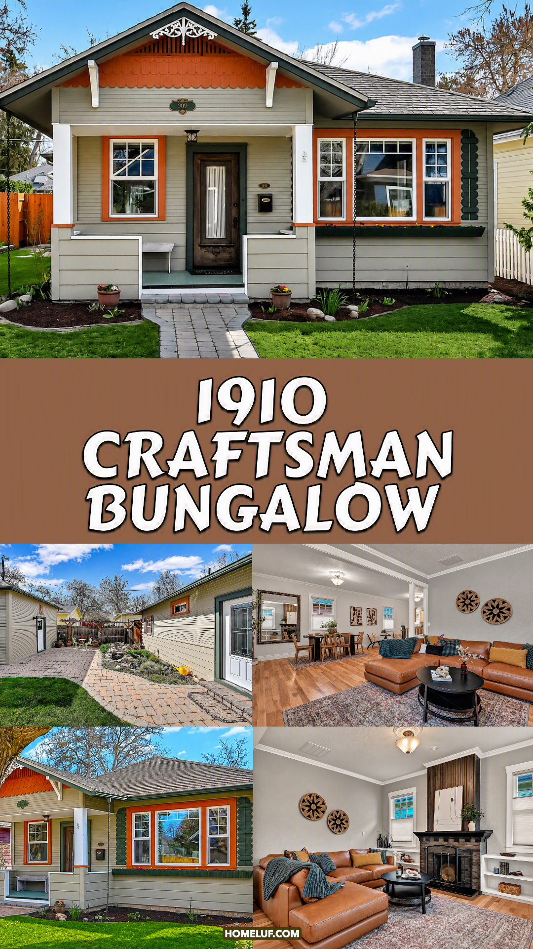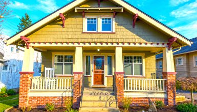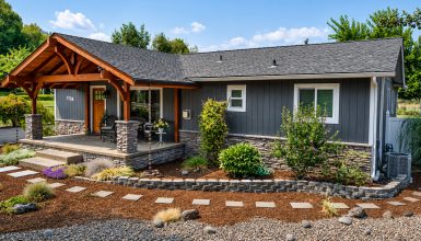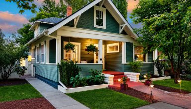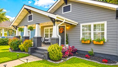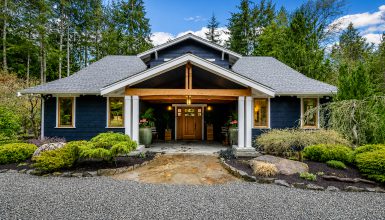
What gives a small historic home so much warmth and charm? This 1910 Craftsman-style bungalow offers the answer through its deep porch, low roofline, rich wood details, and smart modern updates. Inside, open rooms, warm floors, and a bold two-tone kitchen create a home that feels both timeless and easy to live in.
A Floor Plan That Uses Every Inch
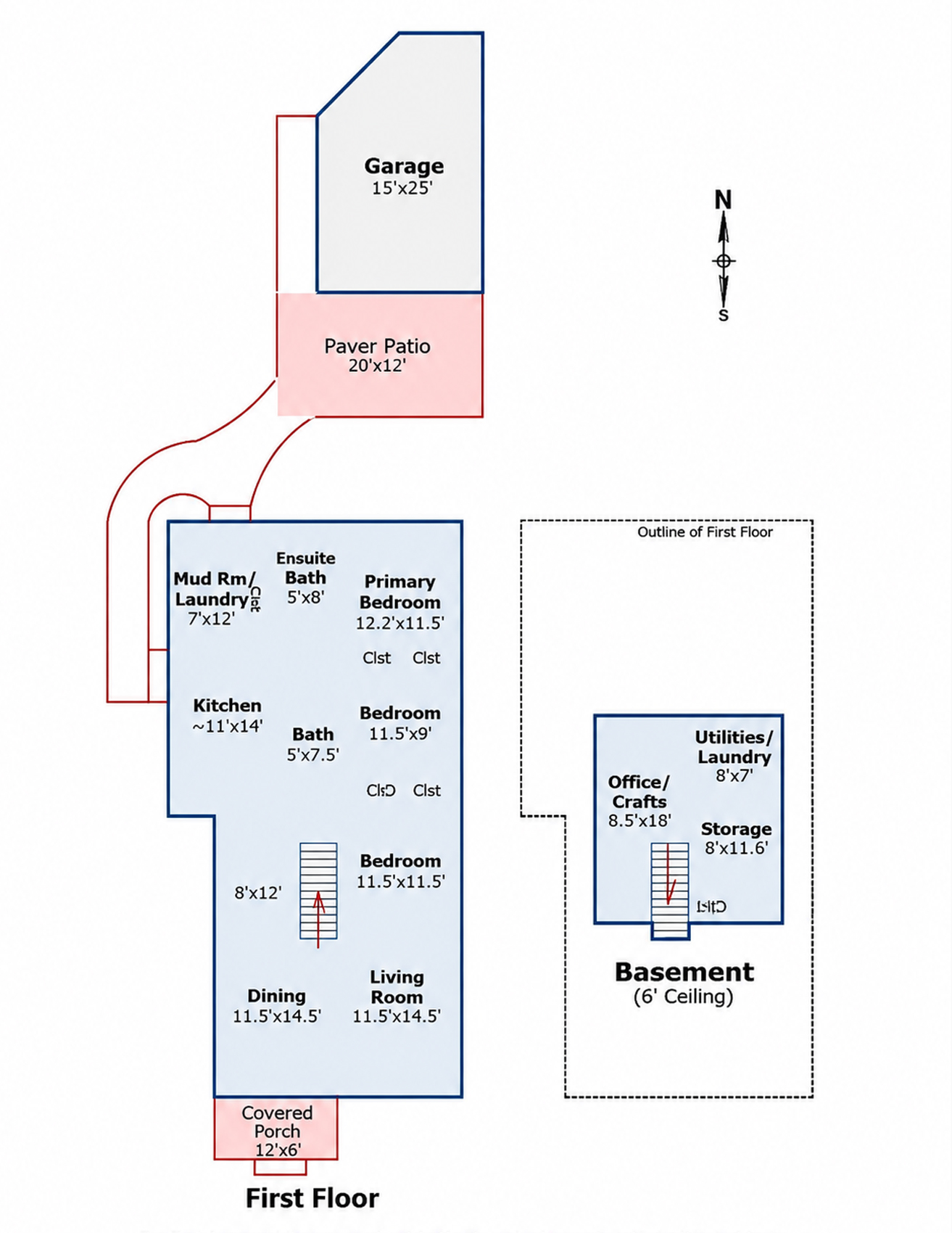
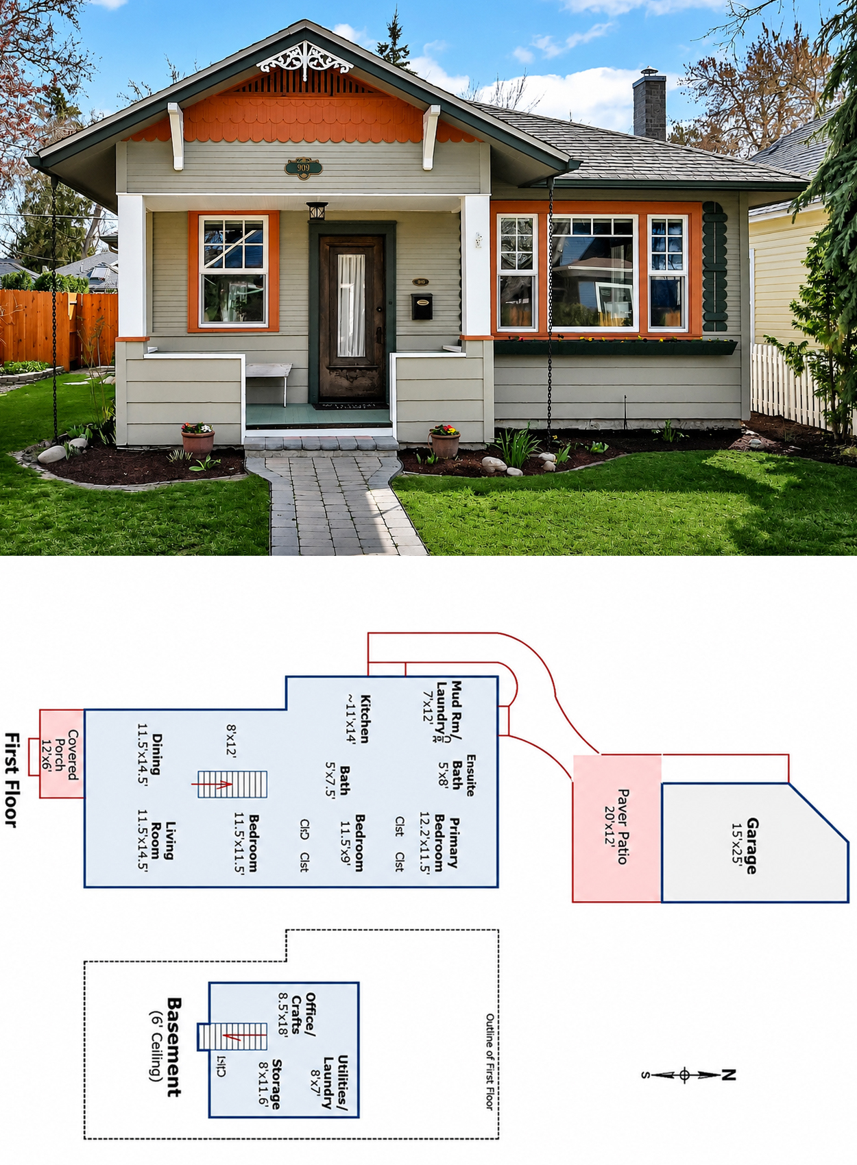
The home has a long, narrow shape. This form is common in older bungalows built on slim city lots.
The covered porch opens into the front living and dining area. These two rooms share one large space. The living room sits on one side, while the dining table sits on the other.
The kitchen runs through the center of the home. Bedrooms and baths line the rear half. A mudroom and laundry space connect the kitchen to the back garden.
The plan shows three bedrooms and two baths on the main level. The primary bedroom measures about 12 feet by 11½ feet. The other bedrooms also have useful proportions.
The lower level adds an office or craft room, laundry or utility space, and storage. The ceiling is lower than a full main floor, yet the basement adds valuable function.
The detached garage measures about 15 by 25 feet. A 20-by-12-foot patio sits in front of it.
Layout cues
- Long rectangular footprint
- Front living and dining rooms
- Central kitchen
- Three main-floor bedrooms
- Two main-floor baths
- Rear mudroom and laundry
- Small working basement
- Detached rear garage
A Compact Bungalow With Strong Curb Appeal
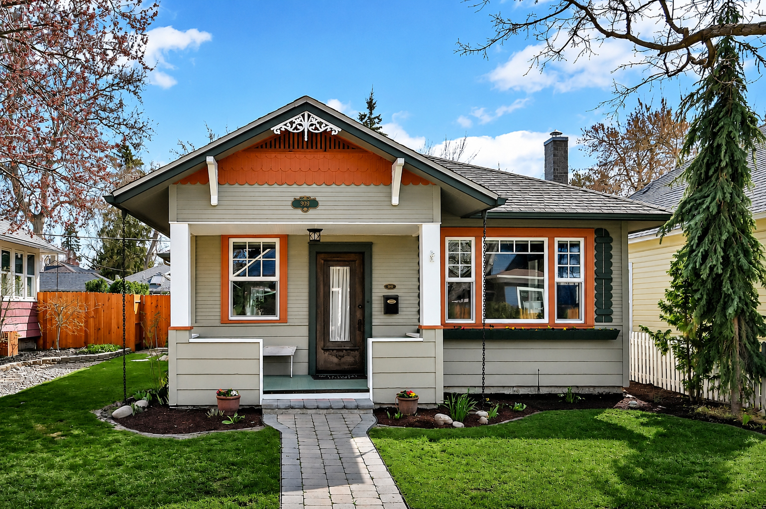
The front of the home feels balanced at first glance. A broad gable sits above the covered porch. A lower roof extends across the right side. Together, these roof forms make the bungalow look wider than it is.
The house also sits close to the ground. That low shape is a key part of the bungalow look. It helps the home feel tied to the yard rather than placed on top of it.
A straight paver walk leads from the lawn to the porch. This clear path draws the eye toward the front door. Small garden beds soften both sides of the walk. Meanwhile, the clipped lawn keeps the setting neat.
The front porch does not feel grand. Instead, it feels personal. That sense of scale suits the home.
Exterior design cues
- Low, wide bungalow form
- Front-facing gable
- Deep roof overhangs
- Covered front porch
- Square porch posts
- Low porch walls
- Straight path to the entry
- Simple lawn and garden beds
Craftsman Form With a Hint of Victorian Detail
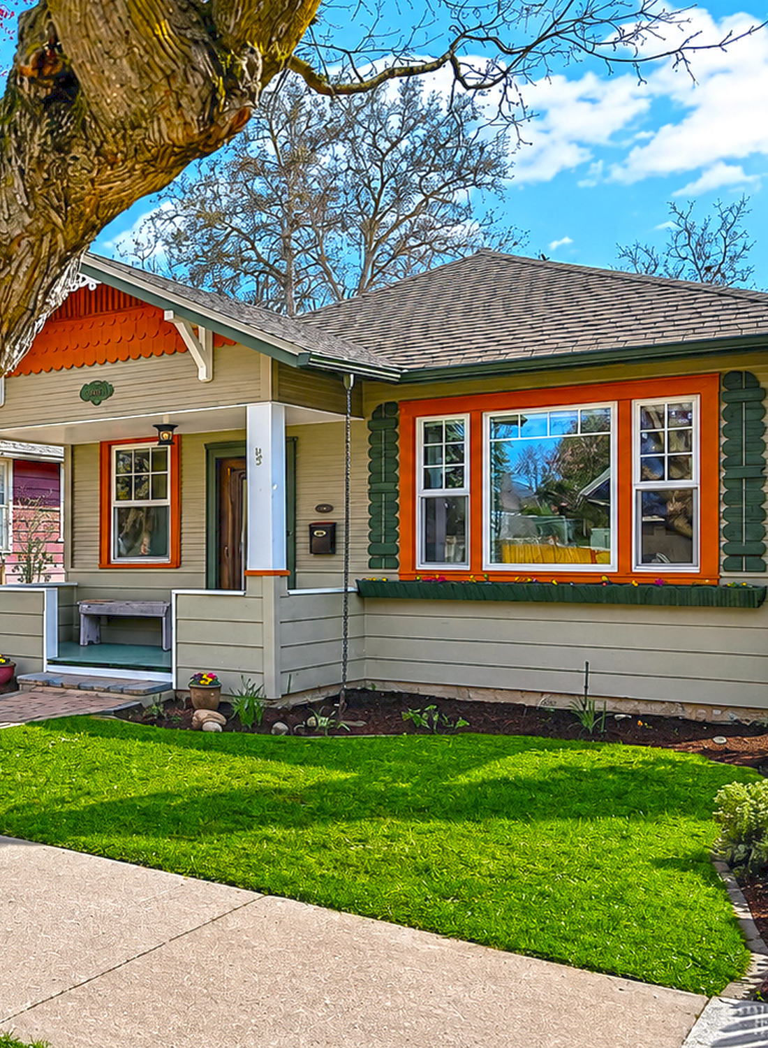
This home blends more than one historic idea.
The broad porch, deep eaves, horizontal siding, and solid porch walls all point toward Craftsman design. However, the white scrollwork under the roof peak has a more decorative look. It leans toward late Victorian or folk-style trim.
The scalloped shingles inside the gable add another playful note. Below them, narrow vertical boards create texture and shadow. These small changes keep the front from looking flat.
That mix gives the house charm. Pure Craftsman homes often use exposed beams, heavy brackets, stone piers, and strong timber details. This bungalow uses a lighter version of that language.
The design feels more cheerful than rugged. It has the grounded shape of a Craftsman home, yet it also has the sweet trim of an older cottage.
That blend feels natural on a home from the early 1900s. Builders often mixed local ideas, available materials, and popular styles.
Architectural cues
- Decorative gable scrollwork
- Scalloped shingle siding
- Vertical gable boards
- Wide fascia trim
- Horizontal lap siding
- Simple square columns
- Strong front roof line
- Cottage-like window trim
A Warm and Unusual Exterior Color Scheme
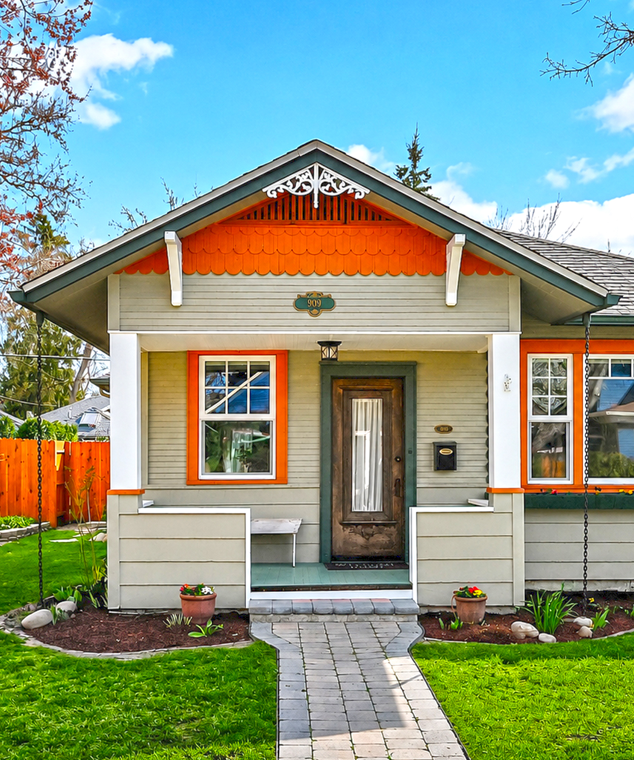
The exterior colors help this bungalow stand out.
Soft gray-green siding covers most of the house. This muted tone feels calm and earthy. It also works well with the lawn, trees, and garden beds.
Dark green outlines the roof, door, and a few trim details. This deeper shade adds weight. It helps frame the pale siding and ties the exterior to the landscape.
Warm orange-red trim surrounds the windows. The same color appears beneath the gable and along a few porch edges. This accent brings energy to the soft green base.
White trim keeps the whole palette crisp. It highlights the porch posts, window sashes, soffits, and decorative gable piece.
Four colors may sound like too many. Yet they work because each one has a clear job. The light green forms the base. Dark green adds depth. Warm orange draws attention. White creates contrast.
Color cues
- Muted gray-green siding
- Deep green roof trim
- Warm rust window frames
- Crisp white porch details
- Natural wood at the door
- Small accents used in repeat areas
The Front Porch Feels Like an Outdoor Room
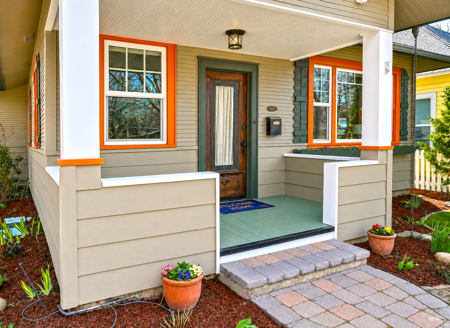
The porch gives this bungalow much of its charm.
It sits under a broad roof, so it feels sheltered and quiet. Square white posts frame the opening. Low walls wrap both sides and create a sense of privacy.
These walls also make the porch feel more like a room. They set a clear edge without blocking the view. Their wide horizontal boards echo the siding on the house.
The painted porch floor adds a soft green tone underfoot. It connects the entry to the exterior palette. A simple ceiling light provides a warm glow at night.
The front door brings in more texture. Its dark wood finish looks rich next to the pale siding. A tall glass panel softens the heavy wood and lets light reach the interior.
Small flowerpots near the step finish the entry. They add color without making the porch feel crowded.
Porch design cues
- Deep overhead cover
- Low solid porch walls
- Square columns
- Painted wood floor
- Simple flush-mount light
- Natural wood front door
- Glass panel for daylight
- Small pots near the steps
Windows Give the Home a Friendly Face
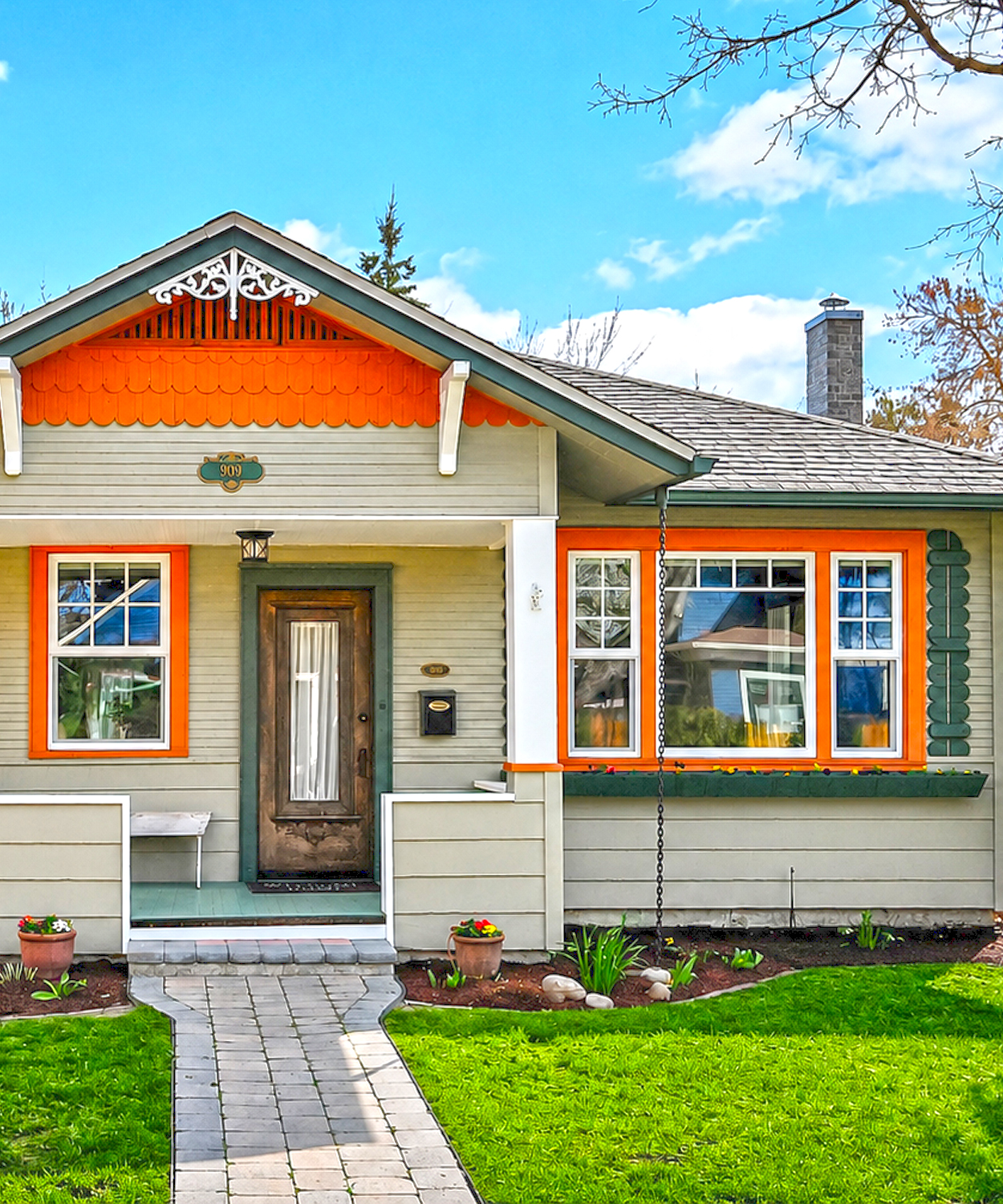
The front windows have a strong role in the design.
On the left, a double-hung window sits beside the door. On the right, a wider group of windows brings light into the living room. The larger center pane creates a broad view, while narrow side windows add rhythm.
White sashes keep the glass bright. Rust-colored trim makes each window stand out against the green siding.
Dark vertical trim pieces beside the right window group add another layer. Their cut edges look almost like stacked blocks. This detail gives the front more depth.
Inside, the windows keep their wide white trim. That trim brings a clean border to each opening. It also makes the walls look more finished.
Cellular shades cover only the lower part of several windows. This choice gives privacy while leaving the upper panes open to the sky.
Window cues
- Double-hung window style
- Wide painted casings
- Grouped living-room windows
- Contrasting outer trim
- Clear upper panes
- Lower privacy shades
- Strong indoor-outdoor connection
A Backyard Made for Simple Outdoor Living
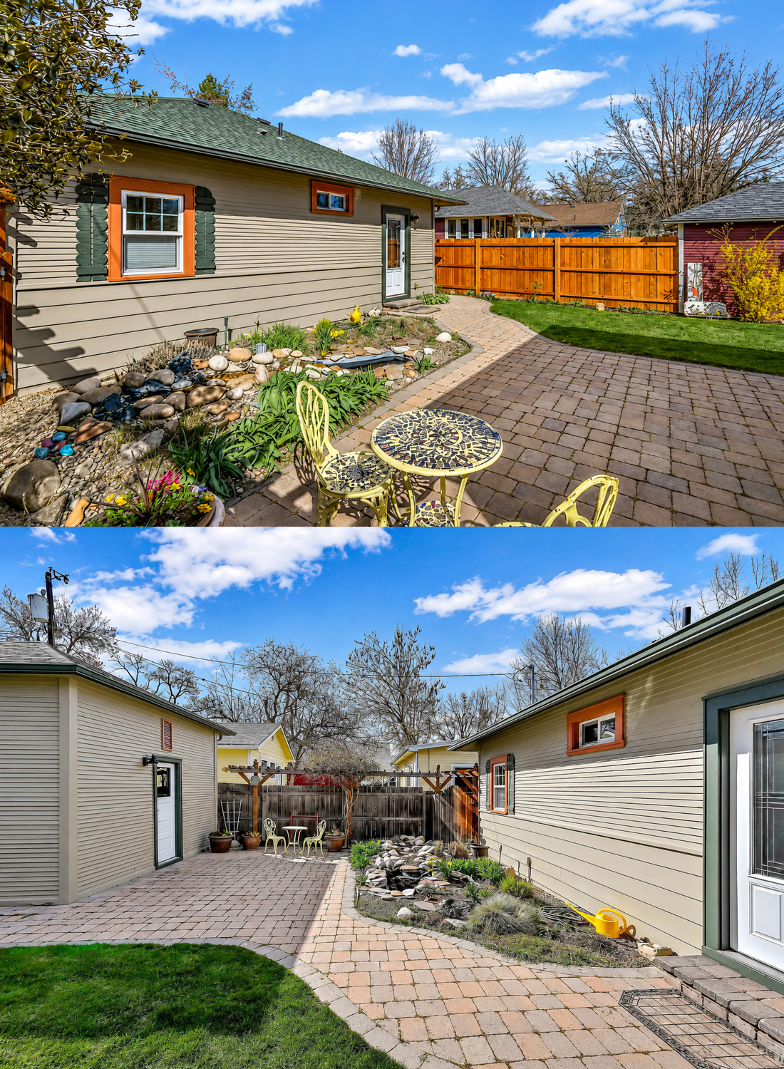
The back garden follows a practical plan.
A wide paver patio fills the space between the house and detached garage. The paving creates a clean surface for a table, chairs, garden pots, or a grill.
The curved edge softens the large paved area. It also guides movement from the back door toward the garage.
A small water garden sits beside the house. River rocks, low plants, and clumps of grass give this narrow strip a natural look. The feature adds texture without taking up much room.
A wood fence creates privacy. Its warm color works well with the rust trim on the house. Small trees and shrubs soften the hard line of the boards.
The detached garage leaves more room around the home. It also keeps a large garage door away from the front façade. As a result, the bungalow keeps its friendly, house-first appearance.
Backyard cues
- Detached garage
- Broad paver patio
- Curved walking route
- Small pond or water feature
- River-rock planting bed
- Wood privacy fence
- Compact café seating
- Open patch of lawn
The Open Living and Dining Area Feels Airy
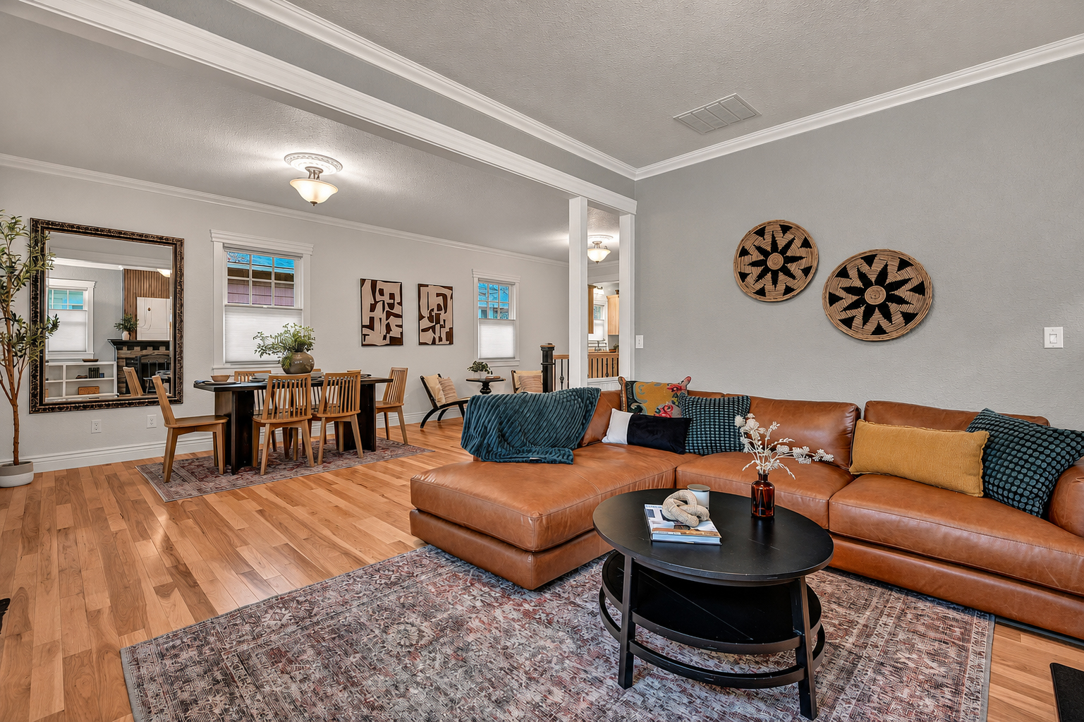
The main living area shows how an older home can adapt.
Instead of two dark, closed rooms, the living room and dining room now flow together. A wide opening separates them without cutting them apart.
White posts and trim frame the opening. These details still mark each zone. However, they allow light and views to pass through.
The same wood floor runs across both spaces. This helps the room feel longer and wider. It also creates a smooth visual path from the front door toward the kitchen.
The furniture layout keeps that path open. A large sectional anchors the living area. The dining table sits across the room. Neither zone blocks movement.
This plan feels casual. People can cook, eat, talk, and relax without feeling cut off from one another.
Still, the home keeps a sense of order. Rugs, furniture, and trim define each area.
Open-plan cues
- Wide cased opening
- Partial support posts
- Shared wood flooring
- Clear walking paths
- Separate area rugs
- Simple furniture zones
- Open sight lines
- Strong front-to-back flow
Warm Wood Floors Unite the Interior
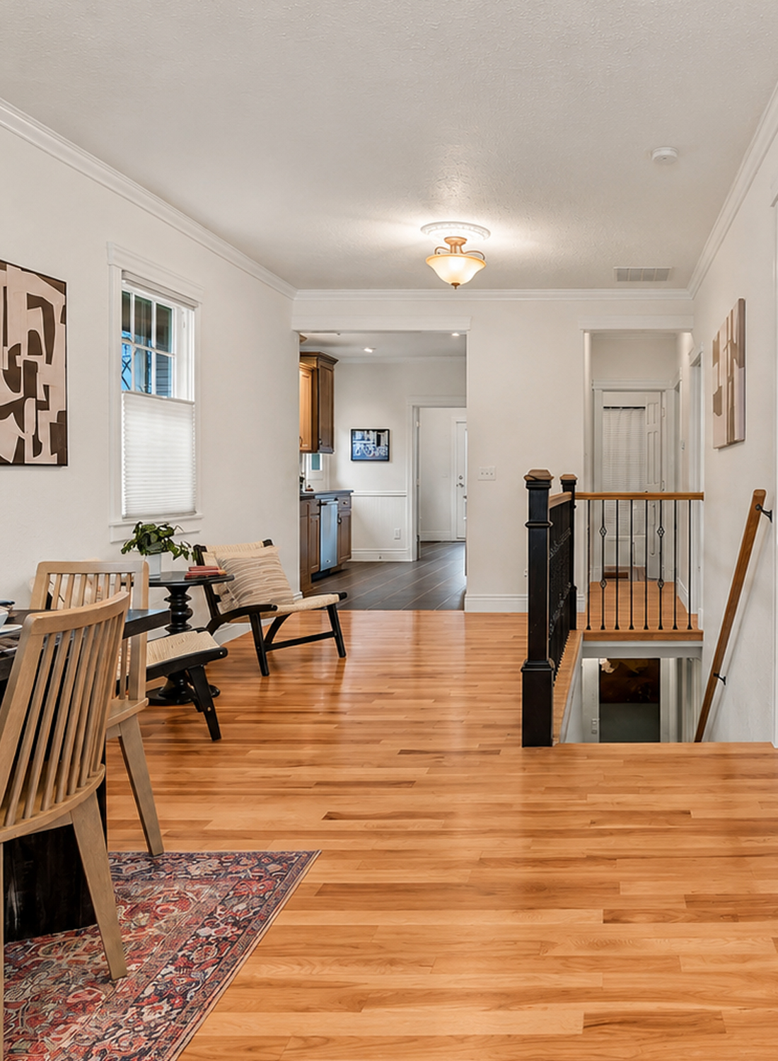
The wood flooring is one of the strongest features in the home.
Its warm honey tone adds life to the pale gray walls. Natural grain brings soft movement across the floor. The boards also reflect daylight, which helps brighten the rooms.
The finish does not look too dark or too red. This makes it easy to pair with both old and new pieces.
The floor works with the tan leather sofa. It also links to the natural kitchen cabinets and wood interior doors.
Because the flooring runs through the front rooms, it makes the layout feel more open. Changing materials at every doorway would break the space into smaller parts.
The kitchen uses tile instead. This change makes sense in a work area. The brown tile also keeps the warm color story going.
Flooring cues
- Warm natural wood
- Visible grain variation
- Continuous flooring in living areas
- Brown tile in the kitchen
- Soft gray carpet in bedrooms
- Darker tile in wet areas
A Living Room Built Around Comfort
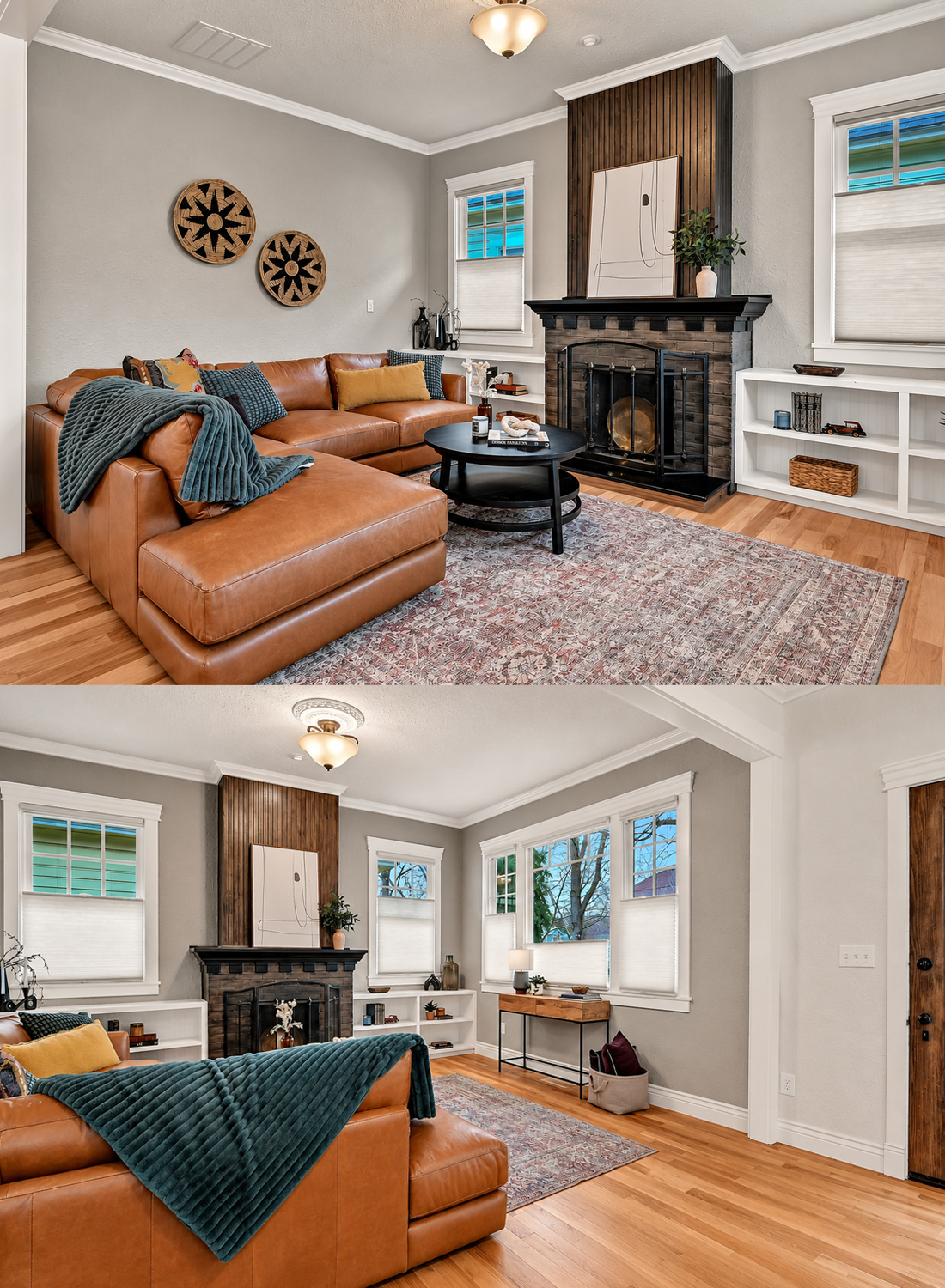
The living room feels relaxed rather than formal.
A large caramel leather sectional fills one corner. Its low back keeps the room open. The chaise gives the space a clear place to stretch out and rest.
A round black coffee table sits in the center. Its curved shape softens the straight lines of the sofa, rug, fireplace, and built-in shelves.
The faded rug adds muted red, gray, and cream tones. Its pattern gives the room depth but does not fight with the other pieces.
Dark teal pillows and a thick throw add cool contrast. Mustard accents bring in a warmer note. These colors suit the home’s earthy exterior palette.
Two woven wall baskets add pattern above the sofa. Their natural texture helps the room feel casual and handmade.
Living-room cues
- Caramel leather sectional
- Low, broad seating
- Round black coffee table
- Faded patterned rug
- Deep teal textiles
- Mustard accent pillows
- Woven wall décor
- Simple modern art
The Fireplace Creates a Strong Focal Point
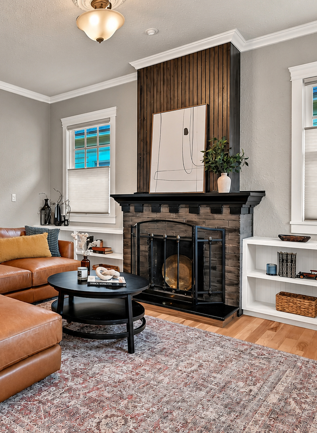
The fireplace gives the living room a clear center.
Dark tile or stone surrounds the firebox. A black mantel adds a bold horizontal line. Above it, vertical wood boards rise toward the ceiling.
This tall wood panel makes the fireplace look larger. It also draws the eye up, which gives the room more height.
The wood has a dark, worn finish. That texture adds age and warmth. It feels more natural than a smooth painted wall.
Low white bookcases sit on both sides of the fireplace. Their simple shape keeps the display area light. They also provide storage without filling the wall with heavy cabinets.
The dark fireplace, white shelves, and warm wood create a useful mix of tones. Each part stands out, yet they still feel connected.
Fireplace cues
- Dark firebox surround
- Black mantel shelf
- Vertical wood accent panel
- Built-in low bookcases
- Balanced windows
- Simple art above the mantel
- Strong dark-and-light contrast
The Dining Area Keeps Things Light
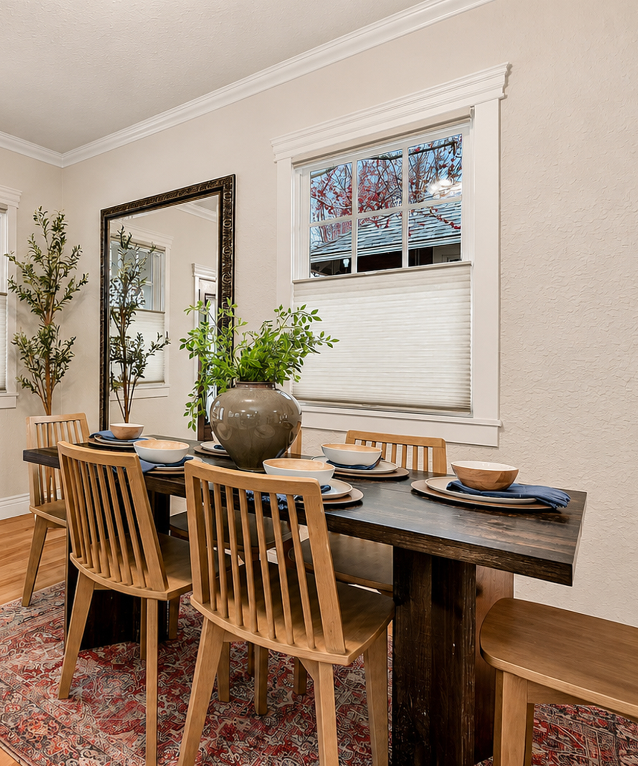
The dining room sits near the front windows. This gives the table plenty of daylight.
A dark rectangular table anchors the space. Light wood chairs surround it. This mix keeps the set from looking too heavy.
The chair backs have narrow vertical slats. Their clean shape works well with the home’s simple trim.
A faded rug defines the dining area and protects the wood floor. It also creates a visual link to the living-room rug.
Two abstract prints hang between the windows. Their black-and-cream pattern adds interest without making the wall feel busy.
A large mirror on the side wall helps spread light. It also makes the room seem wider.
The dining space does not need a large chandelier to feel complete. A simple ceiling light keeps the room useful and bright.
Dining cues
- Dark wood table
- Light slatted chairs
- Soft vintage-style rug
- Pair of abstract prints
- Large wall mirror
- Simple ceiling fixture
- Clear space around the table
A Galley Kitchen With Plenty of Character
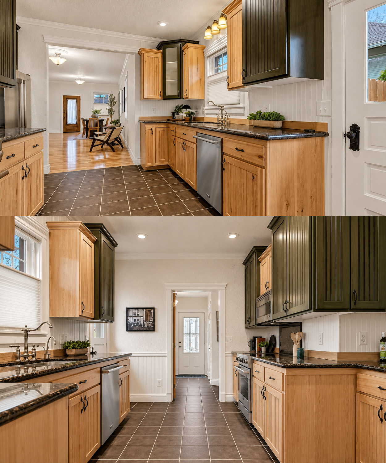
The kitchen has a classic galley layout. Cabinets and worktops line both sides of a central path.
This form uses space well. The sink, range, refrigerator, and dishwasher all sit within a few steps of one another. The narrow plan also leaves room for storage on both walls.
The cabinets bring the strongest design statement. Light natural wood covers most lower doors. Deep green or charcoal stain appears on many upper cabinets.
This two-tone look feels bold, yet it suits the home. The dark uppers add depth. The light lowers keep the room from feeling closed.
Several cabinet doors have narrow vertical panels. This beadboard detail adds a cottage and Craftsman touch.
Dark stone counters create a clean edge above the wood cabinets. Stainless steel appliances give the room a modern finish.
Kitchen layout cues
- Galley floor plan
- Two full cabinet walls
- Clear center walkway
- Separate work zones
- Range on one side
- Sink and dishwasher opposite
- Tall storage near appliances
- Rear door close to the kitchen
Two-Tone Cabinets Add a Handmade Look
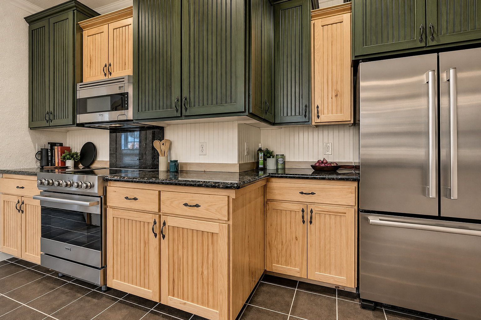
The cabinet finish keeps the kitchen from feeling too new or plain.
Natural wood doors show knots and grain. These marks give each cabinet a slightly different look. That variation feels warm and honest.
Dark upper cabinets create contrast. Their vertical grooves catch small shadows. This texture makes the flat wall feel more layered.
A few upper doors use the natural finish instead of the dark stain. This choice breaks up the long cabinet run. It gives the kitchen a collected look rather than a factory-made feel.
Black curved handles suit both finishes. They add a small historic note without looking ornate.
The cabinet crowns reach close to the ceiling. This helps the room look taller. It also reduces the empty space where dust often collects.
Cabinet cues
- Natural knotty wood
- Dark stained upper units
- Beadboard door fronts
- Mixed cabinet finishes
- Black metal handles
- Tall crown molding
- Full-height storage
- Furniture-like cabinet detail
Simple Surfaces Keep the Kitchen Balanced
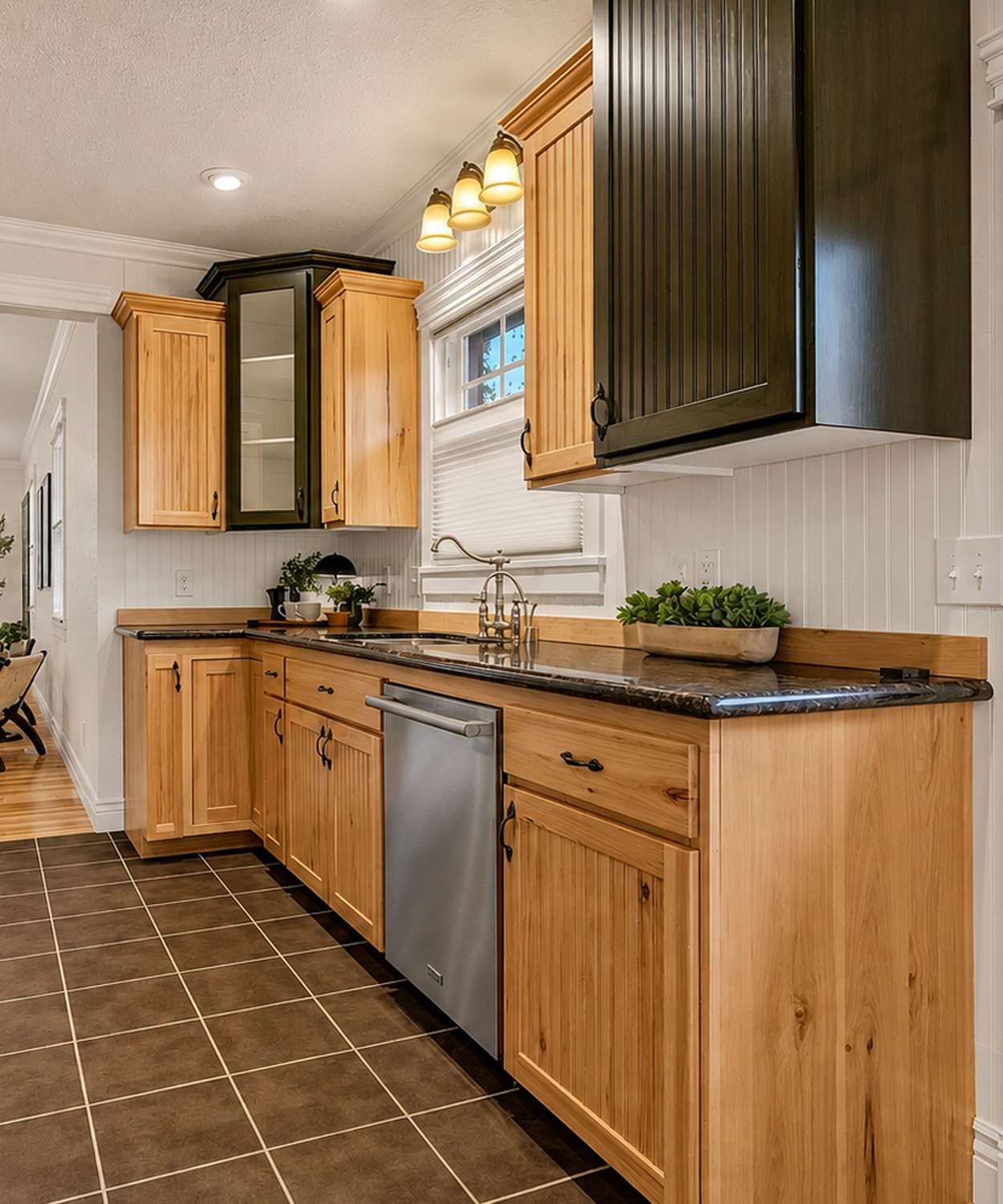
The bold cabinets need quiet surfaces around them.
A white beadboard backsplash brightens the kitchen. Its narrow grooves echo the cabinet doors. This repeated line helps the room feel planned.
The dark countertops add contrast. They also hide small marks better than a very pale surface.
Brown square floor tiles give the room an earthy base. Light grout creates a neat grid. That grid adds order to the mix of cabinet colors and wood grain.
Stainless steel appliances bring a cool metal tone. The finish looks clean next to the black hardware and dark stone.
Recessed lights brighten the work areas. A small set of lights above the sink adds a softer decorative touch.
The kitchen has many textures, but the colors stay controlled. That balance keeps the space warm rather than busy.
Surface cues
- White beadboard backsplash
- Dark polished counters
- Brown square floor tile
- Light grout lines
- Stainless steel appliances
- Recessed ceiling lights
- Metal sink fixtures
- Simple white wall trim
Bedroom Offer a Calm Retreat
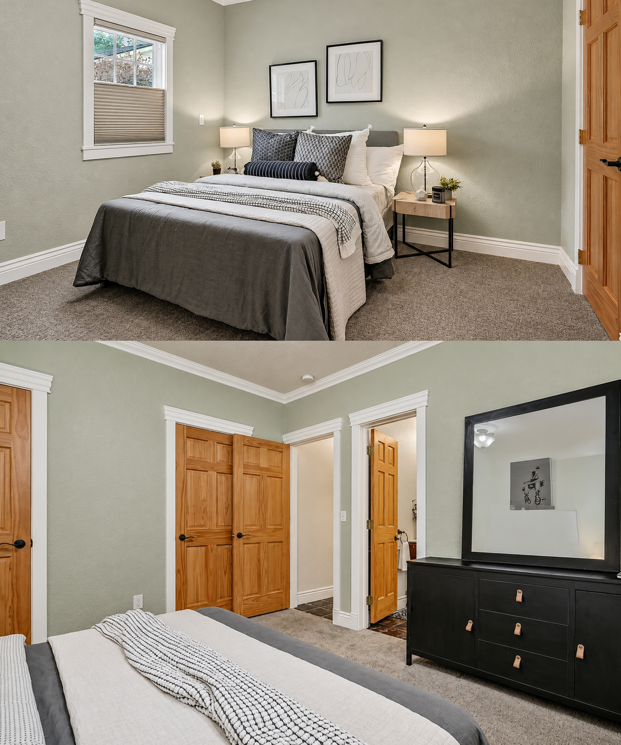
The bedroom shown in the home takes a soft and simple approach.
Pale green-gray walls create a quiet background. White crown molding and baseboards give the room a crisp frame.
A gray upholstered bed sits against the main wall. Black, white, and navy bedding adds pattern without using strong color.
Matching glass lamps create balance on both sides of the bed. Their clear bases keep the small nightstands from looking heavy.
Two black-framed prints hang above the headboard. The loose line art feels modern, yet the simple frames suit the room.
The natural wood doors add warmth. Their grain connects the bedroom to the kitchen cabinets and main-floor woodwork.
Soft carpet makes the room feel cozy. It also reduces sound in the sleeping area.
Bedroom cues
- Pale green-gray walls
- White crown molding
- Warm wood doors
- Gray upholstered bed
- Black-and-white bedding
- Matching bedside lamps
- Simple framed art
- Soft neutral carpet
A Small Bathroom With Traditional Warmth
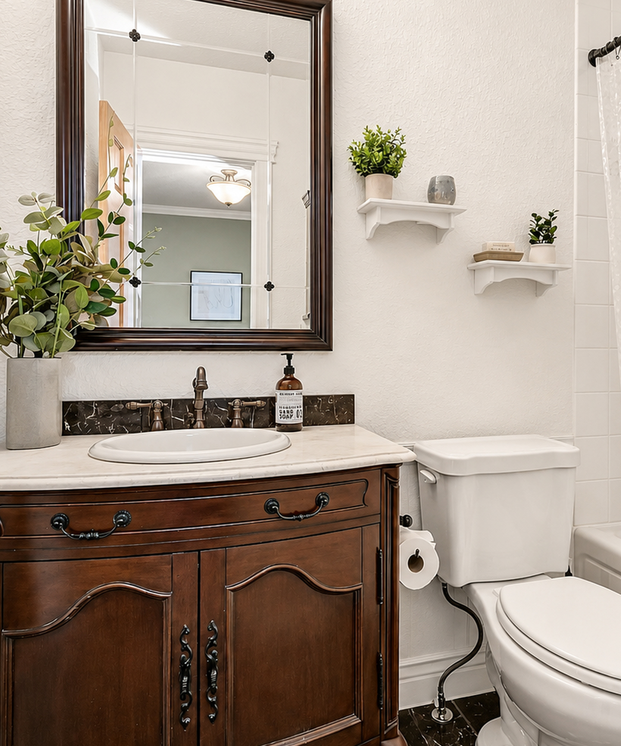
The bathroom makes good use of a compact footprint.
A dark wood vanity fills one wall. Its curved door panels and metal pulls give it a furniture-like look.
A white top keeps the vanity from feeling too heavy. The oval sink also brings a softer shape into the small room.
A tall mirror reflects the light and makes the room seem larger. Its dark frame links back to the vanity.
The tub and shower use a white surround. A white curtain keeps the bathing area bright. Small floating shelves hold plants and a few useful items.
Dark flooring gives the room a stable base. Black hardware adds a crisp final touch.
The bathroom does not try to look grand. Instead, it feels neat, warm, and easy to maintain.
Bathroom cues
- Furniture-style wood vanity
- White sink top
- Dark framed mirror
- Tub and shower combination
- Simple white curtain
- Small wall shelves
- Dark floor
- Black metal accents
The Basement Adds Flexible Work Space
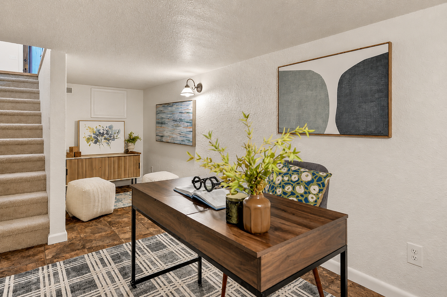
The basement does not have the height of a full living level. Still, it adds useful space.
The plan shows an office or craft room that measures about 8½ by 18 feet. This long room could hold a desk, sewing table, hobby supplies, or exercise gear.
A separate storage area keeps seasonal items out of the main rooms. The utility and laundry zone also moves some practical tasks downstairs.
This lower level helps the bungalow live larger than its main footprint. It gives the household places for work, storage, and equipment.
However, a low basement ceiling needs careful planning. Pale paint, bright lights, and low furniture can help it feel more open.
The stair sits near the center of the home. That location makes the lower level easy to reach without taking up a full rear room.
Basement cues
- Low six-foot ceiling
- Long office or craft room
- Separate utility zone
- Extra laundry space
- Dedicated storage room
- Central stair access
- Flexible non-formal use
Why This Bungalow Still Feels So Inviting
This 1910 bungalow shows that a small home does not need huge rooms or grand features to feel special.
Its charm starts at the street. The deep porch offers shelter. The gable gives the home a clear face. Warm trim adds color and life.
Inside, the rooms feel calm and connected. Wood floors bring warmth. Wide trim gives the home shape. The fireplace creates a natural center. The galley kitchen makes good use of every wall.
Most of all, the design feels personal. It mixes old craft, modern comfort, and a few playful choices. Nothing feels too polished. Nothing feels cold.
That is the lasting appeal of a good Craftsman bungalow. It does not try to impress with size. It wins people over with warmth, detail, and a strong sense of home.