What makes a century-old home feel fresh without losing its soul?
This 1909 Craftsman-style bungalow offers a clear answer. It keeps the details that give the home its age and charm. Yet it also uses light paint, simple furniture, and smart outdoor spaces to support modern life.
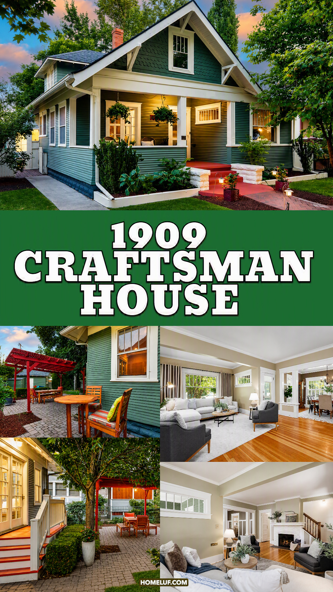
From the street, the house feels cheerful and welcoming. Green siding blends with the lush trees. Cream trim makes each window and roofline stand out. A bright red path adds a playful twist. Around back, a matching red pergola turns the garden into a true outdoor room.
Inside, the mood grows softer. Warm wood floors run through the main spaces. Wide openings connect each room. Original-style trim, built-ins, columns, and wall panels add layers of craft. Meanwhile, soft gray seating and pale walls keep the rooms calm.
The result is not a museum. It is a warm family home with old roots and an easy spirit. Here is a closer look at the design choices that make it work.
1. A Green Craftsman Exterior With Real Curb Appeal
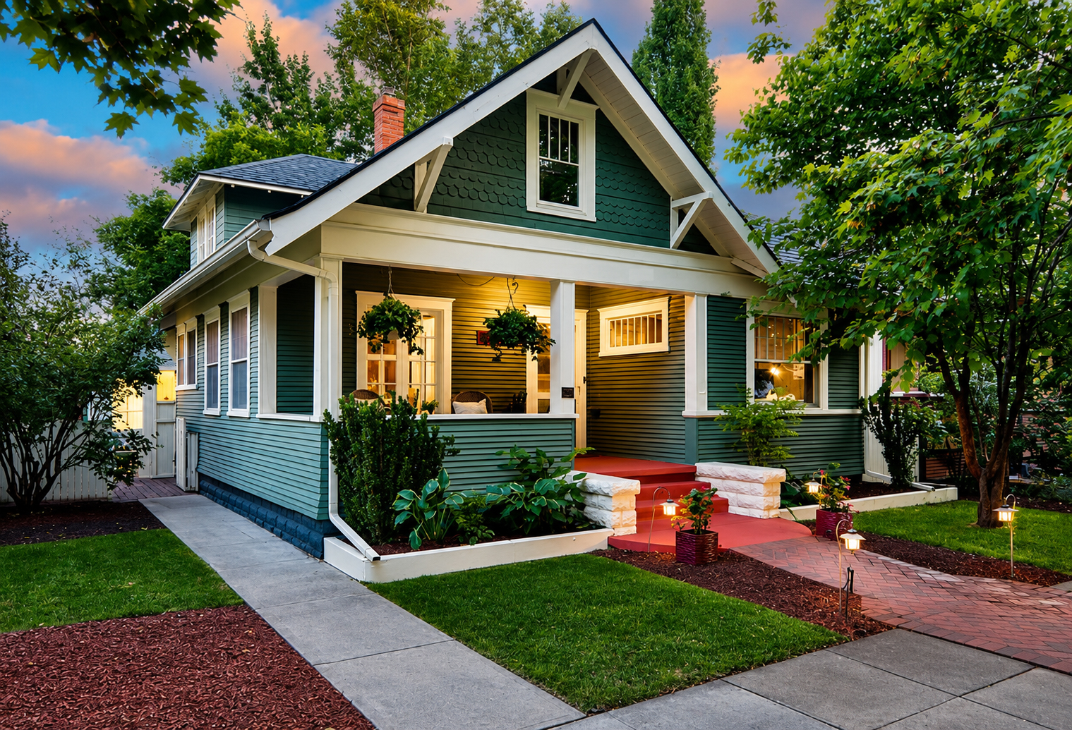
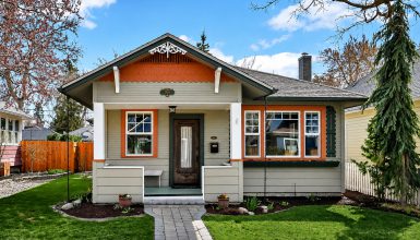
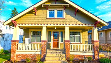
The front of the bungalow sets the tone at once. Its rich green siding feels natural beside the mature trees and deep lawn. The color is bold, yet it does not look loud. Instead, it helps the house settle into the site.
Cream trim brings the structure to life. It traces the porch, windows, beams, roof edges, and front gable. This high contrast makes the craft details easy to see from the street.
The front-facing gable acts as the main focal point. Decorative shingle siding fills the upper wall. Open brackets and simple timber details add depth under the roof. These features give the home the handmade look that defines Craftsman design.
The covered porch also plays a key role. Thick square posts support the roof. Low porch walls make the entry feel safe and snug. At the same time, the wide opening keeps it social and open.
Then comes the surprise. Red-painted steps and a matching path add energy to the classic green-and-cream palette. The warm red hue connects with the brick chimney and hints at the red pergola in the backyard.
Design cues:
- Deep green horizontal siding
- Cream trim with strong contrast
- Decorative shingles in the front gable
- Exposed brackets and timber details
- Thick square porch posts
- Bright red steps and entry path
2. A Porch That Feels Like Part of the Home
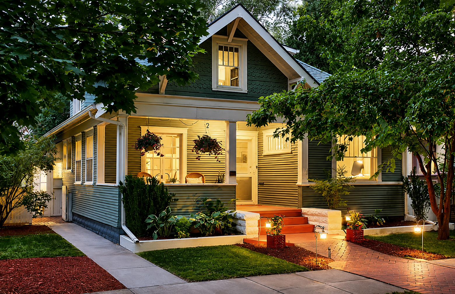
A Craftsman bungalow needs a porch with a strong sense of place. This one delivers that feeling through shelter, scale, and detail.
The porch sits under the main front gable. As a result, it feels built into the shape of the home rather than added later. The low walls give it a sense of privacy. Hanging planters soften the hard lines and bring more green close to the entry.
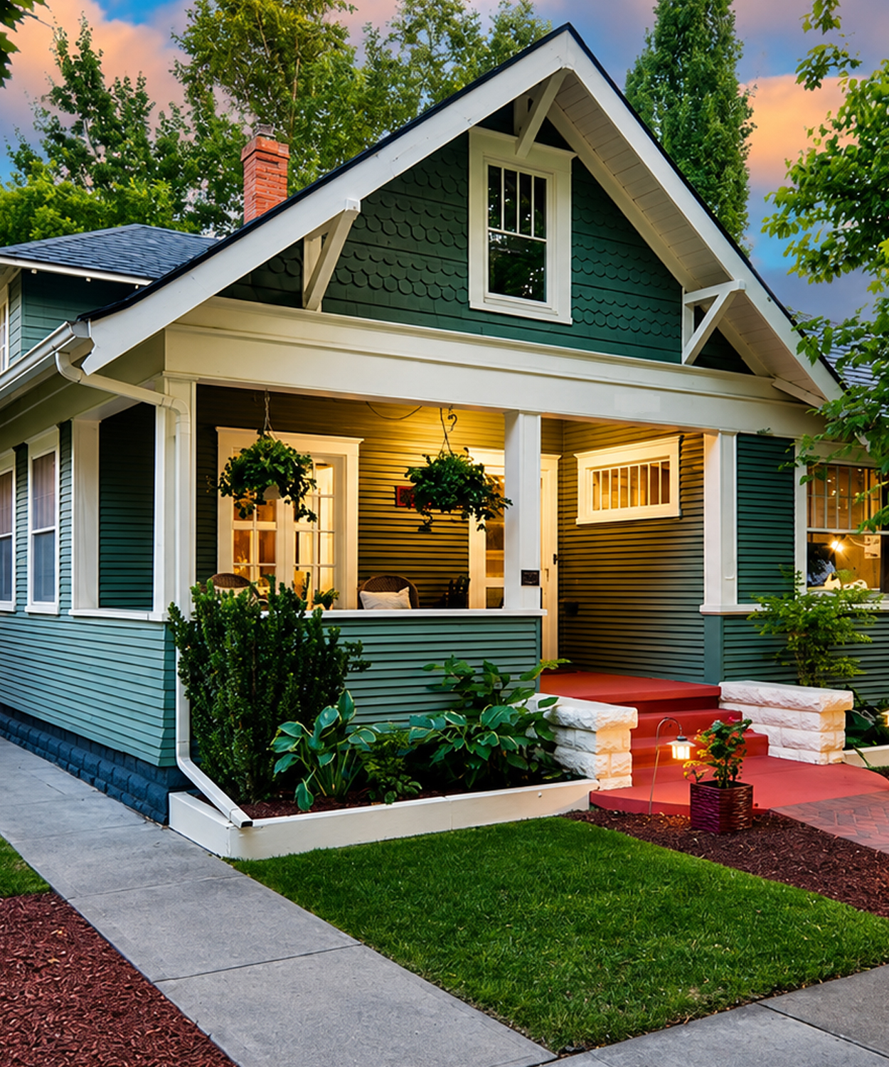
Warm porch lighting creates an inviting glow. It also shows off the siding and white trim after dark. The light feels warm rather than harsh, which helps the space feel more like a small outdoor living room.
The red floor gives the porch its own identity. It also draws the eye toward the door. This is a smart lesson for any small bungalow. A bold floor can add character without changing the main wall color.
The porch does not need a large furniture set to feel useful. A few plants and simple seats would be enough. Its charm comes from the built-in structure.
Design cues:
- Deep roof overhang
- Low porch walls
- Warm wall lighting
- Hanging baskets near the entry
- Bold painted porch floor
- Simple, uncluttered styling
3. A Backyard Built Around Outdoor Living
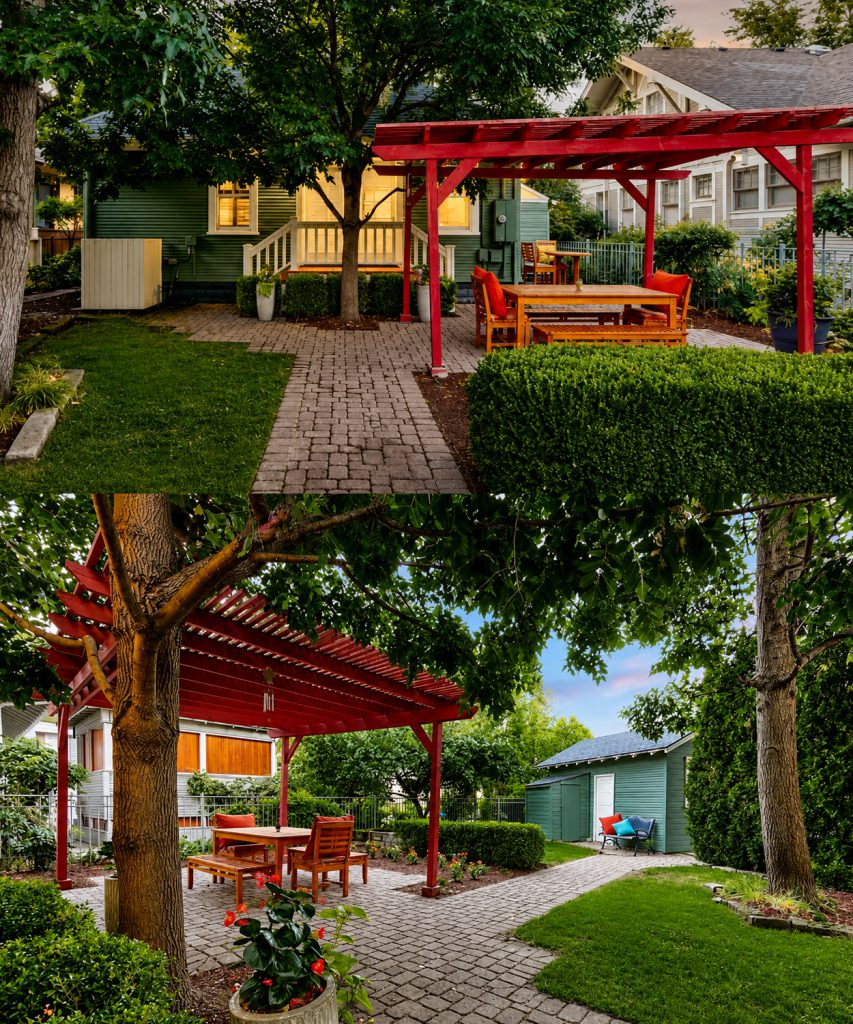
The backyard feels like a private garden room. Mature trees form a tall green ceiling. Low hedges create soft walls. Paver paths guide people through the space.
The red pergola takes center stage. Its strong color stands out against the green lawn and foliage. It also repeats the red from the front walk. That link gives the whole property a clear color story.
The pergola covers a large dining table and bench seating. Its open roof lets light pass through while still defining the area. This creates shade without making the patio feel dark or closed.
The structure also gives the yard height. Without it, the space might feel flat. With it, the garden gains a clear focal point and a sense of scale.
A clipped hedge wraps around one side of the dining space. This simple move makes the area feel more private. It also hides the edges of the patio and gives the hard paving a softer finish.
Design cues:
- Bright red painted pergola
- Large outdoor dining table
- Brick-style paver surface
- Low clipped hedges
- Mature shade trees
- Clear garden paths
4. Several Small Zones Instead of One Large Patio
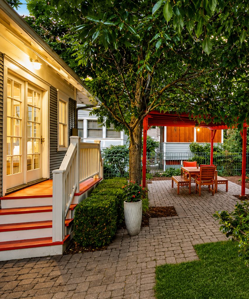
The backyard does not rely on one large seating area. Instead, it offers several small places to sit, eat, and relax.
Near the house, a round café table creates a casual breakfast spot. Farther away, the pergola shelters a larger dining area. A pair of colorful chairs near the garden shed adds one more quiet corner.
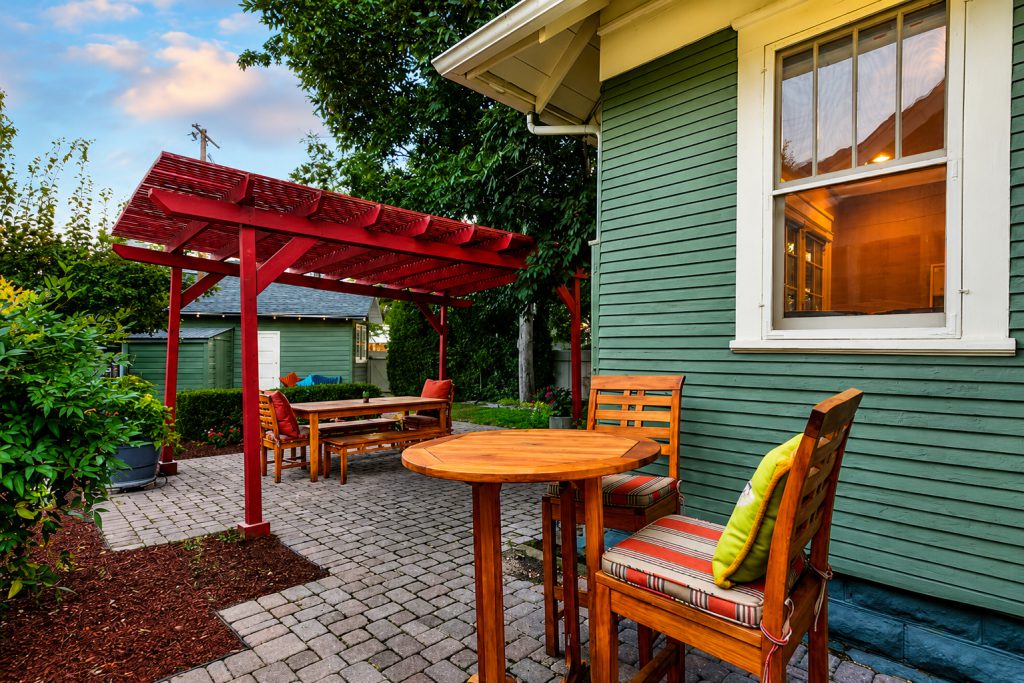
This layout makes the yard more useful. Two people can enjoy coffee near the house. A larger group can gather under the pergola. Someone else can read beside the shed.
The paving connects each zone. Because the same material runs through the yard, the spaces feel linked rather than scattered. Mulch beds and clipped shrubs break up the hard surface and help rainwater reach the soil.
The furniture uses warm wood tones. These shades pair well with the red pergola and green house. Colorful cushions add comfort without taking over the garden.
Design cues:
- Small café table near the house
- Main dining zone beneath the pergola
- Extra seating near the shed
- One paving material throughout
- Wood furniture with bright cushions
- Mulch beds between hard surfaces
5. A Light Living Room With Strong Architectural Bones
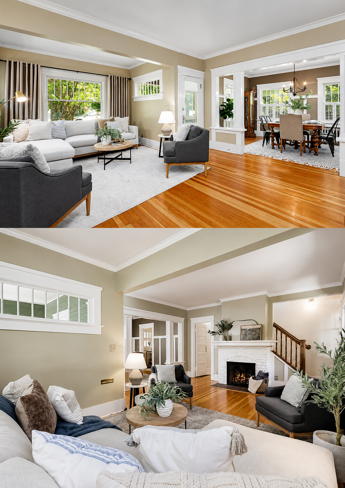
Inside, the first living area feels calm, bright, and open. Soft beige-gray walls create a gentle base. Crisp white trim frames the ceiling, windows, doors, and floor.
The room uses pale seating and dark gray accent chairs. This mix keeps the palette from looking flat. It also lets the old wood floor stand out.
A large transom-style window sits high on the wall. It brings in light while leaving room for furniture below. The shape also suits the age of the bungalow.
The white-painted fireplace forms a clear focal point. Its simple surround feels sturdy and classic. The darker firebox adds contrast. A few pieces of art and greenery keep the mantel relaxed.
The staircase rises behind the fireplace. Warm wood rails and turned spindles add detail without feeling too ornate. Since the stair is open to the room, it becomes part of the decor.
The furniture placement keeps the center clear. This helps people move between the living room, fireplace, stairs, and dining area.
Design cues:
- Warm gray wall color
- White crown molding and baseboards
- High transom-style window
- Painted brick fireplace
- Dark accent chairs
- Clear walking paths
6. Wide Openings That Connect the Main Rooms
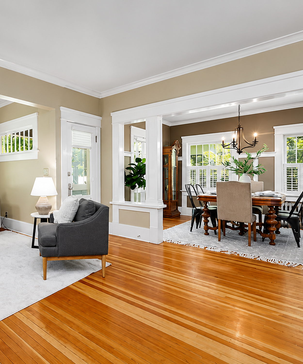
The main floor feels open, but it does not feel like one large box. Wide cased openings link the living and dining rooms. Thick posts and low dividers still give each space a clear purpose.
This is one of the best features of an older Craftsman home. The layout offers flow while keeping a sense of order.
White trim makes the openings look even larger. It also adds depth to the walls. The broad frames feel like pieces of built-in furniture.
The hardwood floor runs from one space to the next. This creates a strong visual link. Yet rugs mark the seating and dining areas, so each room still feels complete.
The furniture also supports the flow. Low sofas and open-leg chairs do not block the view. Slim tables keep the floor easy to see. As a result, the room feels larger than it may be.
Design cues:
- Wide framed openings
- Thick square posts
- Low wall dividers
- One wood floor across several rooms
- Large rugs to mark zones
- Low-profile furniture
7. A Dining Room Framed Like a Work of Art
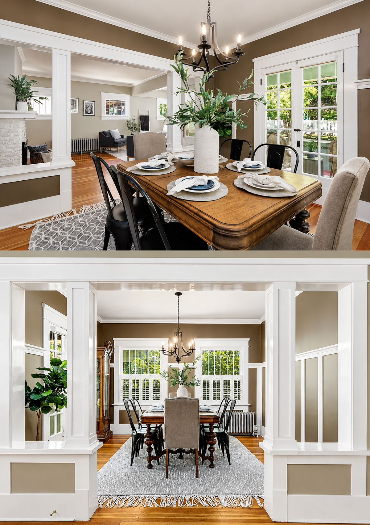
The dining room sits behind a large opening with built-in columns and half walls. This feature turns the view into a strong design moment.
From the living room, the table appears centered inside the white frame. The effect feels formal, yet the room is still easy to enter. This balance suits the Craftsman style very well.
Tall wall panels add structure to the lower walls. A darker taupe color fills the upper section. White trim then creates a sharp line between the two.
The dark walls make the white woodwork look even brighter. They also give the dining area more depth than the pale living room.
Two windows bring in natural light. White shutters offer privacy and keep the look neat. A black chandelier adds a simple focal point over the table.
The rug softens the wood floor and centers the furniture. Its pale pattern keeps the room from feeling too heavy.
Design cues:
- Framed opening with side columns
- Half walls with broad ledges
- White wall paneling
- Dark taupe upper walls
- Centered black chandelier
- Pale patterned dining rug
8. A Dining Mix That Feels Collected Over Time
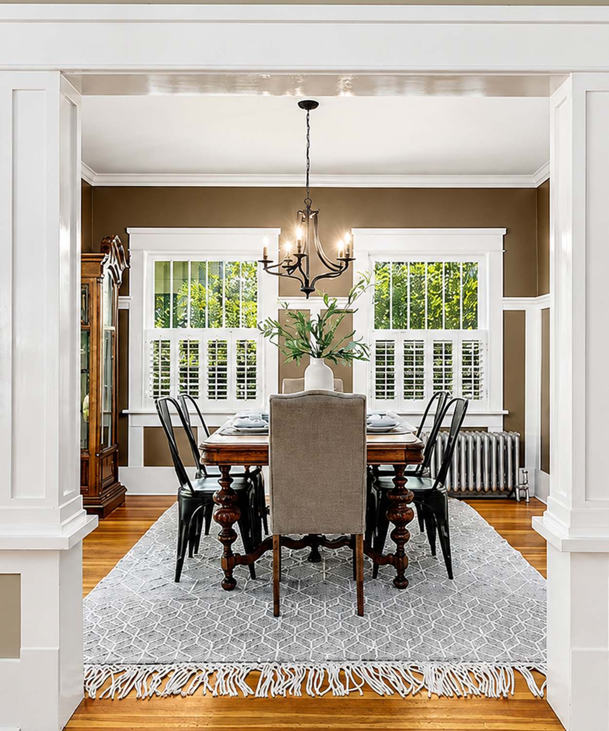
The dining set does not look like it came from one box. A warm wood table forms the base. Black metal chairs sit along the sides. Soft upholstered chairs mark the ends.
This mix makes the room feel relaxed. It also gives the formal architecture a more modern mood.
The table has a rich grain and rounded edges. These details add weight and warmth. The black chairs echo the chandelier, while the pale end chairs link to the rug and trim.
A tall white vase filled with loose green branches forms the centerpiece. It has height, but the airy leaves keep it from blocking the room.
French doors open from the dining area to the garden. Their many glass panes add charm and bring outdoor light deep into the space.
The doors also turn the backyard into part of the view. The red pergola becomes a bright color accent beyond the glass.
Design cues:
- Solid wood dining table
- Mixed chair styles
- Black metal accents
- Large vase with leafy branches
- Glass-paned French doors
- Simple white place settings
9. A Garden-Facing Sitting Room
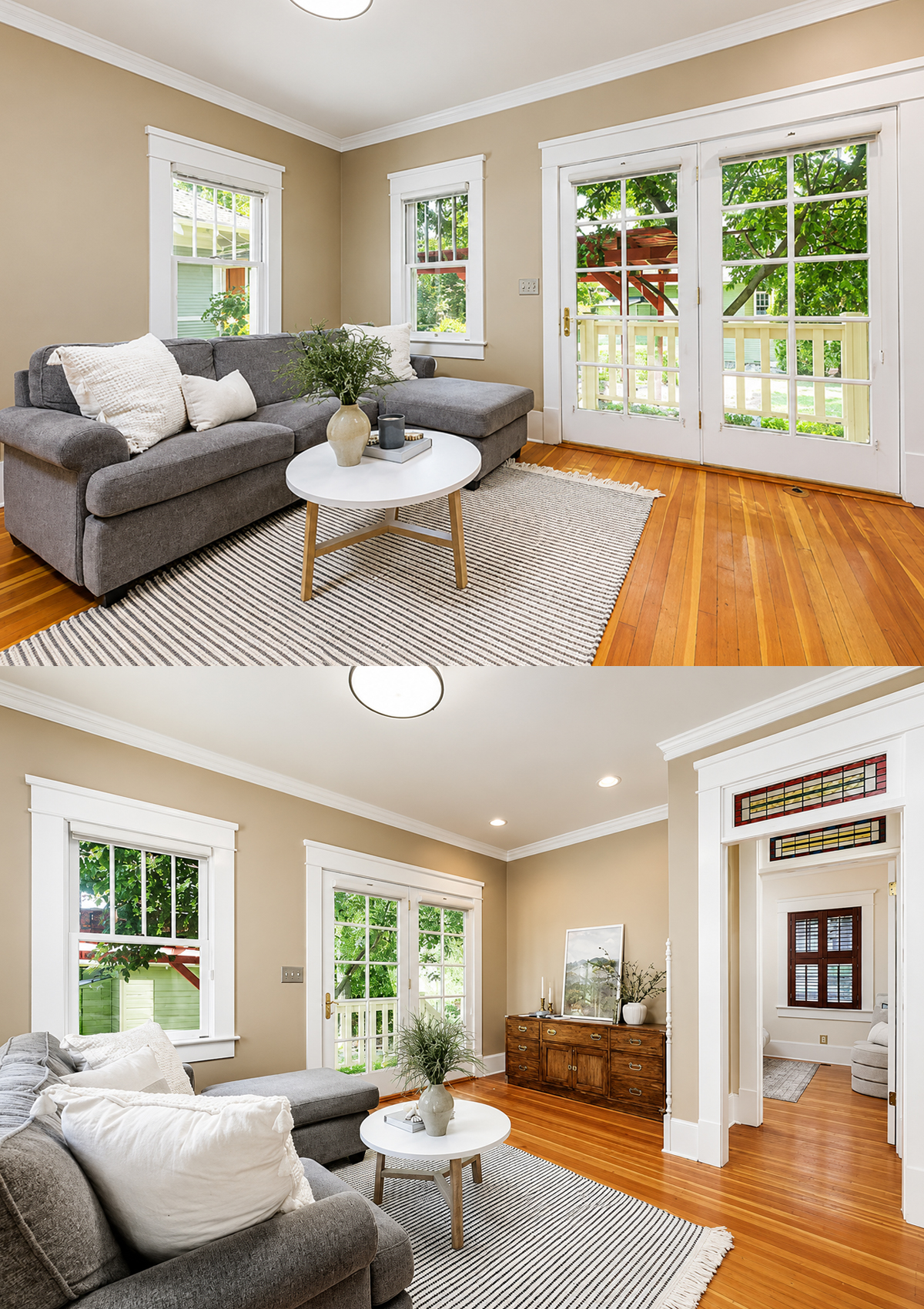
A second sitting room opens straight to the porch and garden. The design feels simple, sunny, and useful.
A gray sectional provides plenty of seating without filling the room with separate pieces. The chaise creates a natural place to stretch out. Pale pillows soften the dark fabric.
A round white coffee table adds contrast. Its curved shape also makes it easier to move through the room. This is a smart choice near busy garden doors.
The room has several tall windows, so sunlight enters from more than one side. Thick white trim gives each opening a strong frame.
The French doors become the star. When open, they make the room feel like part of the porch. When closed, the glass still keeps the view open.
A wood console adds warmth along one wall. Its low shape leaves space for art above and does not fight with the windows.
Design cues:
- Compact gray sectional
- Round white coffee table
- Tall windows on two walls
- French doors to the porch
- Low wood storage piece
- Minimal accessories
10. A Warm Wood Kitchen With Plenty of Storage
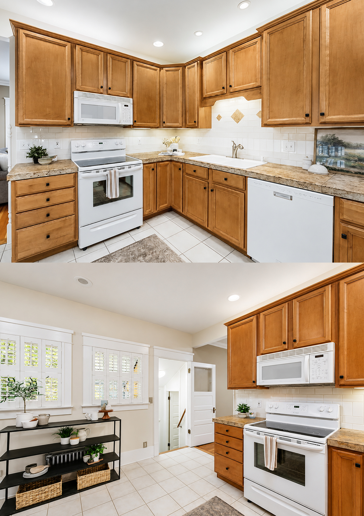
The kitchen takes a more practical path. Honey-toned wood cabinets fill the walls from end to end. The warm finish suits the Craftsman home and links to the original floors nearby.
Raised-panel doors give the cabinets a traditional look. Small dark knobs add contrast without drawing too much attention.
White appliances brighten the room. They also help the kitchen feel clean and simple. A white subway tile backsplash continues that light look.
The countertop uses a warm stone pattern. Its tan, gray, and cream tones bridge the wood cabinets and white tile.
A corner sink makes good use of the L-shaped plan. Cabinets above and below offer storage in a spot that can otherwise become wasted space.
Recessed lights keep the counters bright. Under-cabinet lighting adds another soft layer near the work surfaces.
Design cues:
- Honey-toned wood cabinets
- Raised-panel doors
- Small dark knobs
- White appliances
- White subway tile backsplash
- Warm stone-look counters
11. Open Storage Gives the Kitchen Breathing Room
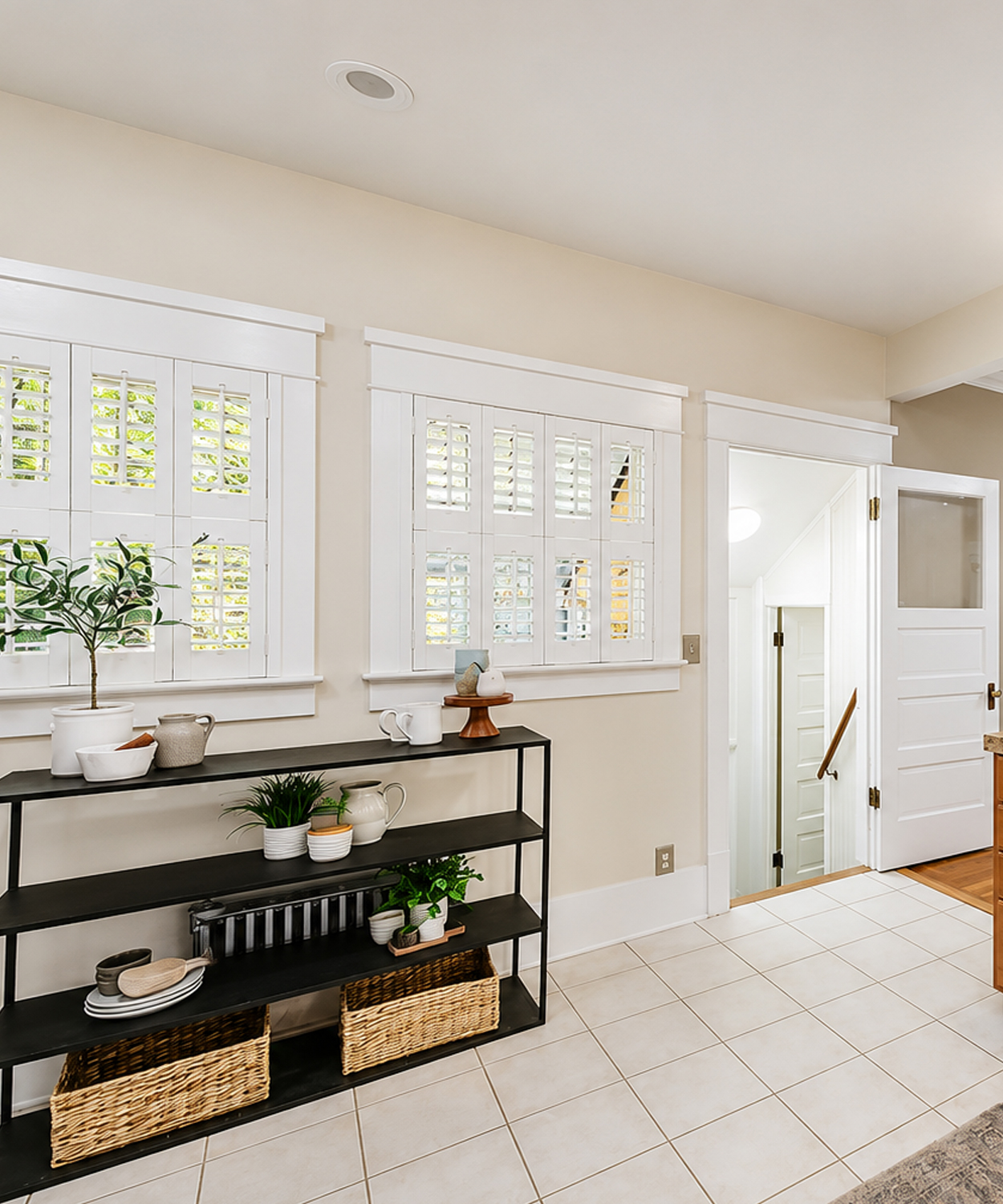
On the other side of the kitchen, a slim black shelf sits beneath two wide windows. This creates a welcome break from the wall of wood cabinets.
The open shelf holds plants, dishes, baskets, and small serving pieces. It adds storage without blocking light. Black metal also brings a modern edge to the older home.
Woven baskets help hide less attractive items. Plants add soft shapes and fresh color. Because the display uses only a few tones, it stays neat.
White shutters cover the lower parts of the windows. They control privacy while allowing light to enter from above. Their slatted form also suits the historic feel of the home.
A white tile floor keeps the kitchen bright. The grid pattern gives the room a clean, simple base.
Design cues:
- Slim black open shelving
- Woven storage baskets
- Small plants and neutral dishes
- White window shutters
- Pale square floor tile
- Open wall space around windows
12. A Quiet Main-Level Bedroom
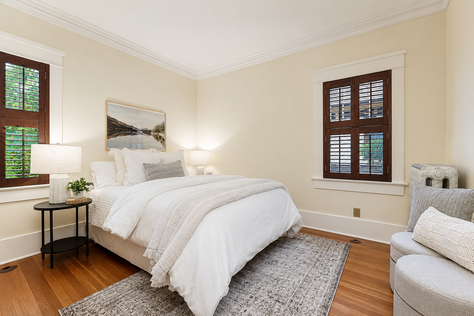
The first bedroom follows a soft and restful palette. White bedding fills the room with light. Gray accents add just enough contrast.
The bed sits between two windows. This balanced layout gives each side of the bed natural light. Small black side tables keep the space open.
Dark wood shutters bring warmth to the pale walls. They also repeat the rich tones in the floor. Because the shutters fit inside the frames, the window trim remains easy to see.
A faded rug sits beneath the bed. It softens the hardwood and gives bare feet a warmer landing.
A gray chair creates a simple reading spot in one corner. Its light wood arms add another natural note.
The room avoids extra furniture. That restraint lets the old windows, trim, and floors become the main design features.
Design cues:
- White layered bedding
- Bed centered between windows
- Dark wood shutters
- Small round side tables
- Soft vintage-style rug
- One compact reading chair
13. An Attic Bedroom That Uses Every Angle
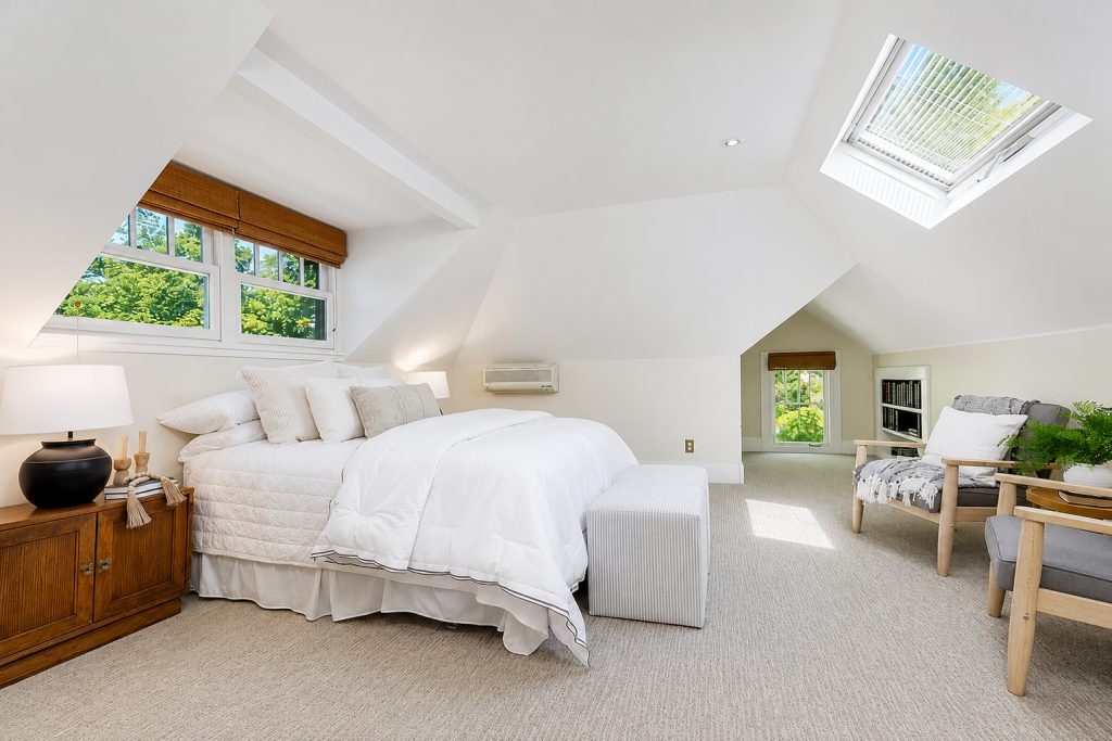
The attic bedroom proves that sloped ceilings can feel charming rather than awkward.
The bed sits below a row of low windows. A wide bamboo shade adds texture and warmth. It also draws attention to the unusual window shape.
White walls and ceilings keep the upper level bright. The single pale shade helps the roof angles blend together. As a result, the room feels larger and calmer.
A skylight brings daylight into the center of the space. It also makes the roofline feel less heavy.
The room has enough space for a sitting area at one end. Light wood chairs and simple side tables keep that zone airy. Soft carpet adds comfort and helps control sound.
The bed uses white linens with thin gray stripes. This quiet pattern works well in a room with many roof angles.
Design cues:
- Sloped white ceilings
- Low windows behind the bed
- Woven bamboo shade
- Large skylight
- Soft wall-to-wall carpet
- Small sitting zone
14. Two Bathrooms With Bold, Historic Color
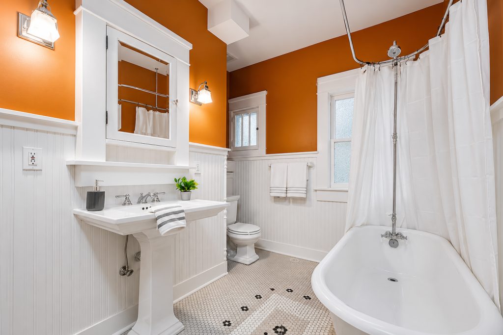
Both bathrooms use warm orange-brown wall colors. These shades feel bold, yet they work because white trim covers much of each room.
The first bath has beadboard on the lower walls. A classic clawfoot tub sits behind a simple curtain. The curved tub shape adds a soft focal point.
Small white floor tiles create a vintage base. Scattered black accents form a simple pattern. A pedestal sink and framed medicine cabinet complete the old-house mood.
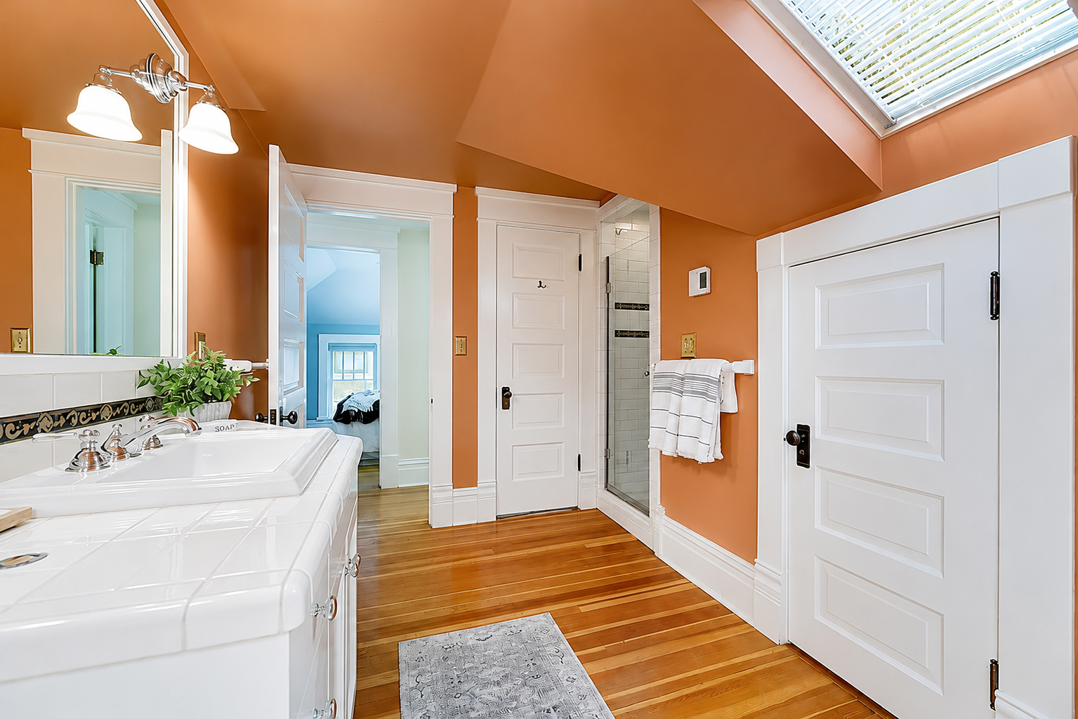
The second bath uses the same warm color in an upper-level space. White trim wraps the doors, skylight, and baseboards. A pale tile counter keeps the long vanity bright.
A skylight sends light down from above. This helps the deep wall tone feel rich rather than dark.
Both rooms show how to use strong color in a small space. The key is balance. Warm walls add personality. White fixtures and trim keep the look crisp.
Design cues:
- Burnt orange or clay wall color
- White beadboard paneling
- Clawfoot bathtub
- Pedestal sink
- Small mosaic floor tile
- Thick white door and window trim
15. A Tiny Library Tucked Beneath the Roof
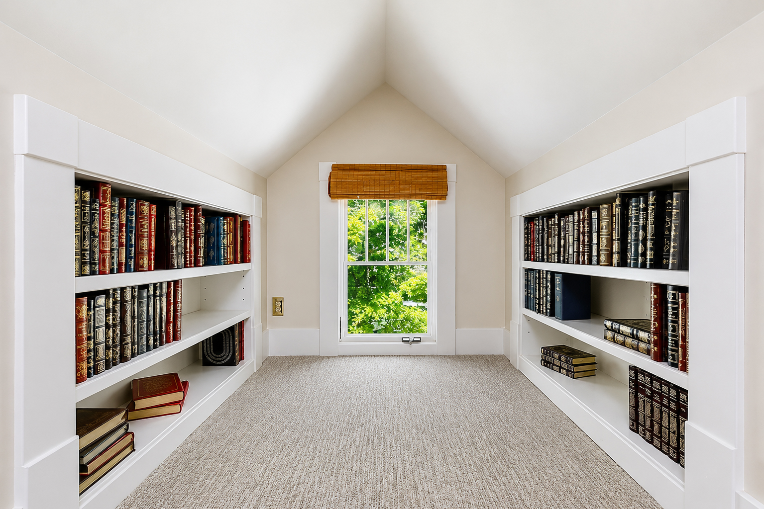
One of the most charming spaces sits beneath the attic peak. Built-in bookcases line both sides of a narrow nook. A single window fills the far wall.
The shape feels almost like a secret room. The low, sloped ceiling makes the area snug. White paint stops it from feeling closed in.
The bookcases use thick frames and deep shelves. Their bold scale matches the rest of the home’s trim. Dark book spines add color and texture.
A woven shade softens the window and brings in a natural material. The pale carpet keeps the nook warm and quiet.
This small room could work as a reading area, study, play space, or private retreat. It shows how good design can turn leftover roof space into something special.
Design cues:
- Built-in shelves on both sides
- Narrow layout beneath a roof peak
- Single centered window
- White walls and bookcase frames
- Woven window shade
- Soft neutral carpet
Conclusion
This home works because it respects contrast.
The exterior mixes deep green with crisp cream. Bright red details add a fun spark. Indoors, warm wood floors sit beside pale walls and soft gray furniture. Dark dining room paint makes the original-style trim stand out. Bold bathroom walls give small rooms their own mood.
At the same time, the home avoids clutter. Furniture stays simple. Rugs define each space. Plants bring life without hiding the architecture. Modern pieces sit beside old trim with ease.
Most of all, the design lets the home’s craft show. The porch posts remain strong. Wide room openings frame clear views. Built-ins add purpose. French doors link the main rooms to the garden. Even the attic angles become part of the charm.
That balance gives the bungalow lasting appeal. It feels rooted in 1909, yet ready for life today.