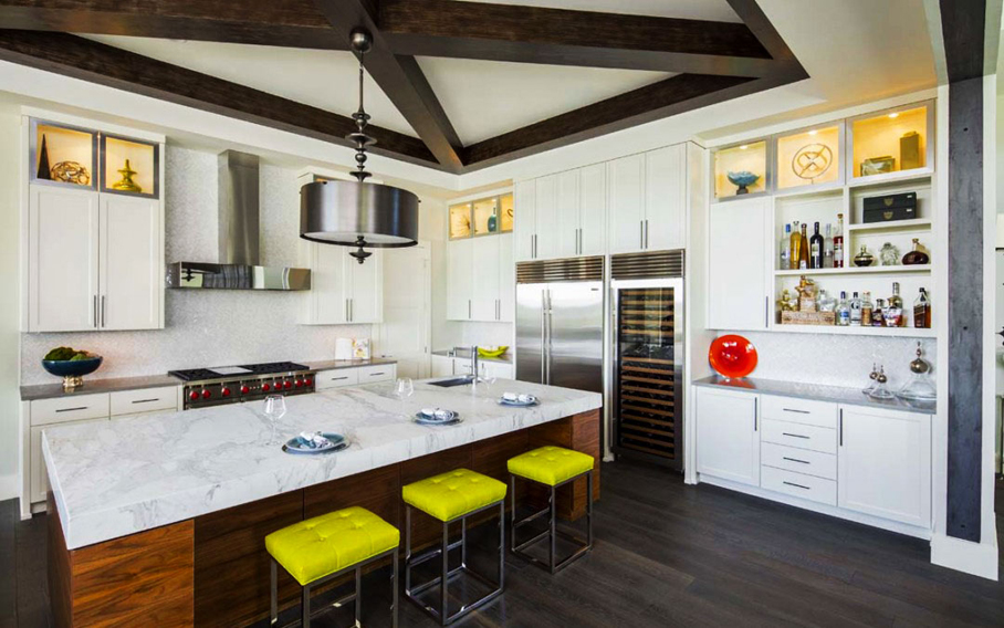
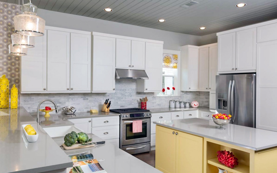
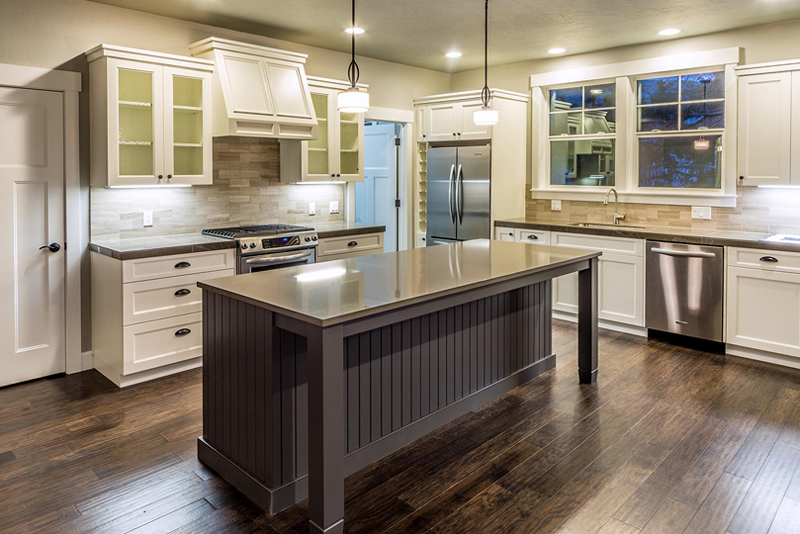
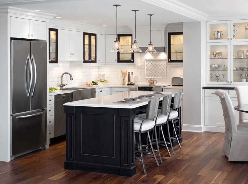
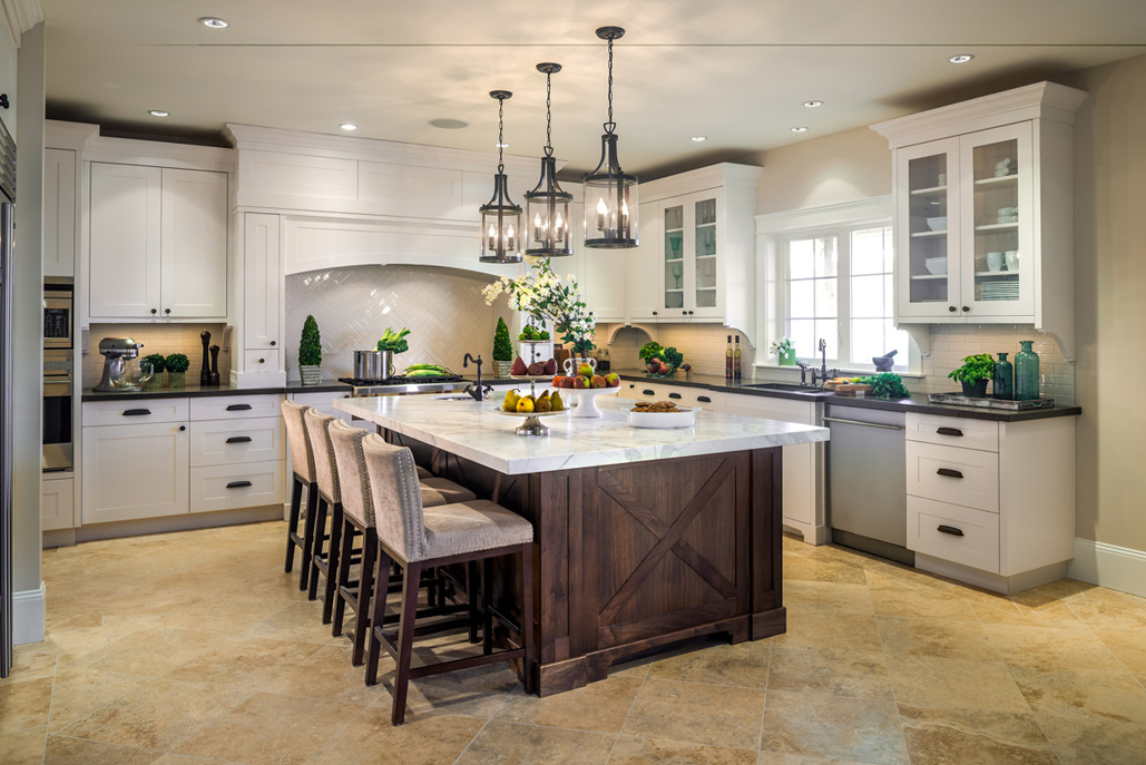
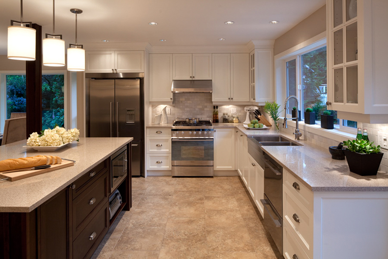
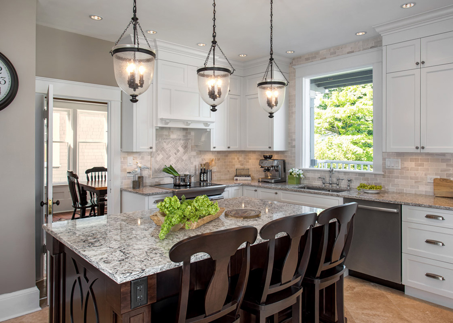
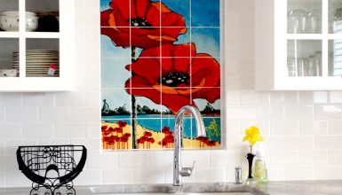
This is truly a kitchen that looks like it belongs in an art exhibit. With so many colors, it still maintains its “White kitchen” look – which is intriguing. Image via: Wpldesign.com
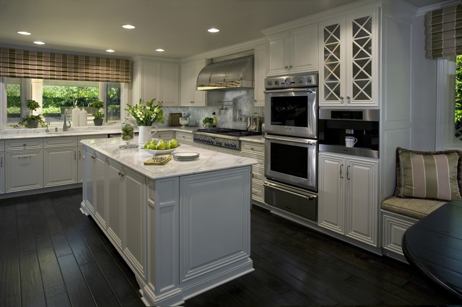
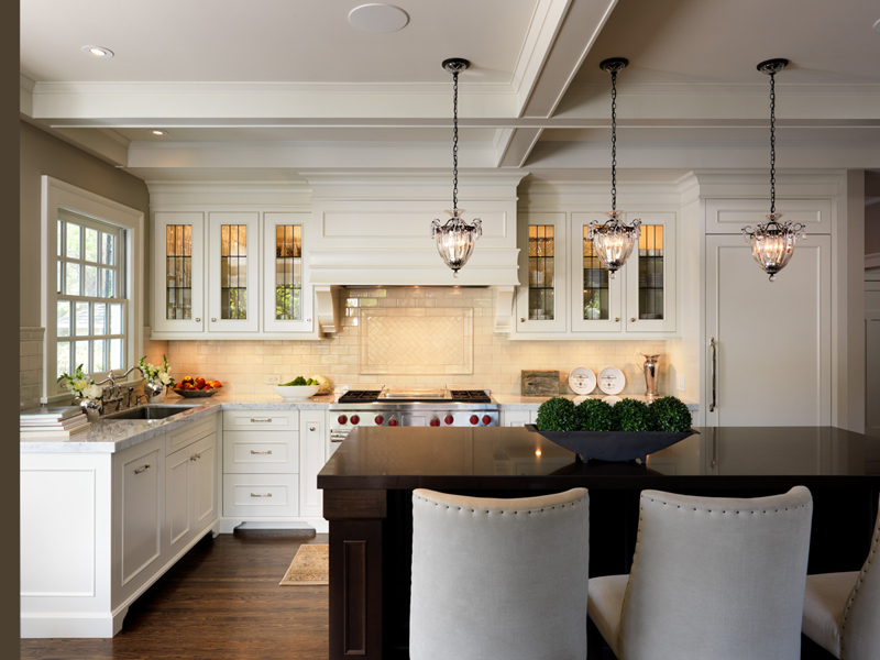
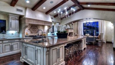
When you think of luxury, dark wood floors and brown countertops make an appearance. That’s the case here, and it definitely isn’t something that needs changing. Image via: Wpldesign.com
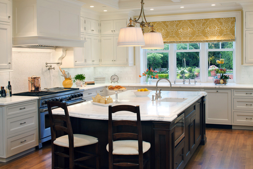
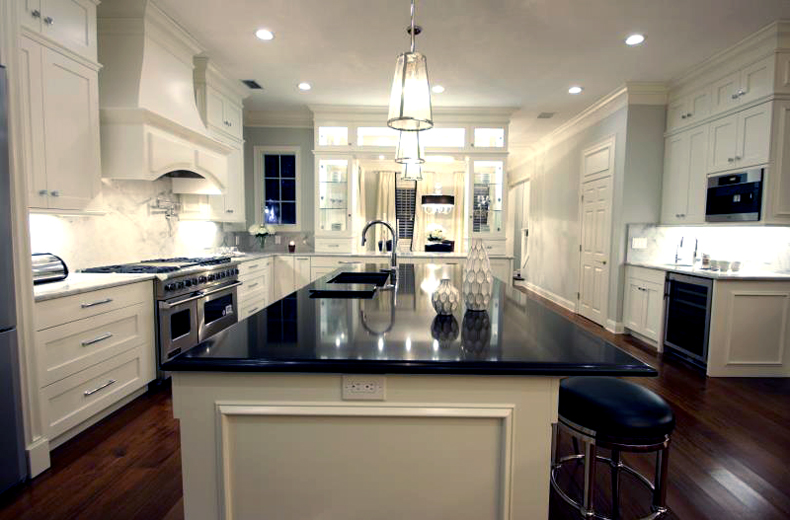
Black kitchen islands are becoming increasingly popular, as they offer up more than enough space to serve your meals. It’s also great for preparation space! Works well with white, too. Image via: Ejinteriordesign.com
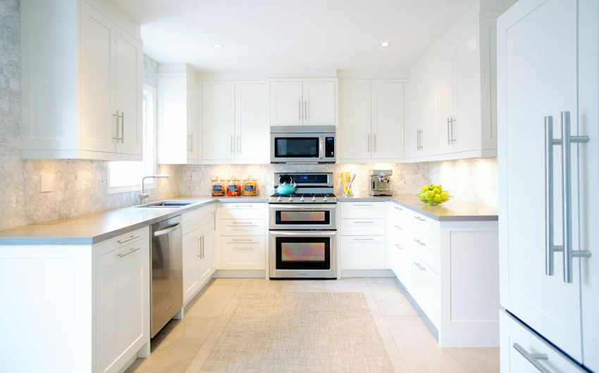
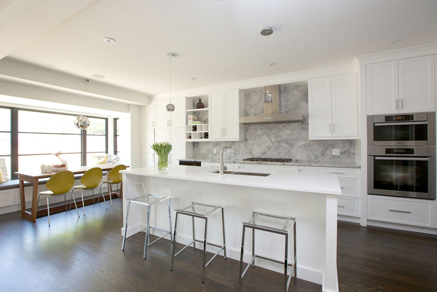
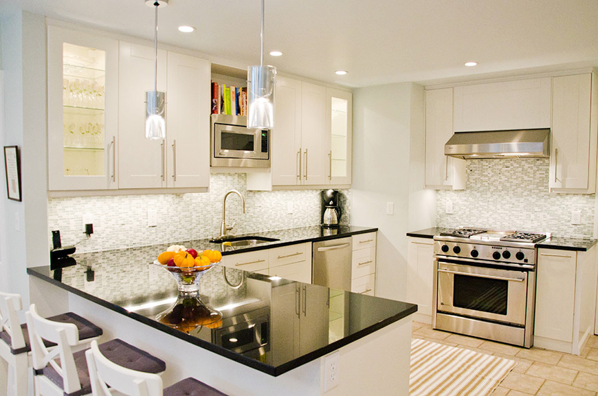
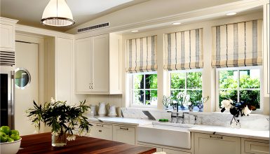
The word “simple” comes up often with white kitchens. In this instance, there’s no island; an ideal situation for anybody that doesn’t really have a need for one! Means there’s more room to cook. Image via: Barlowreid.com
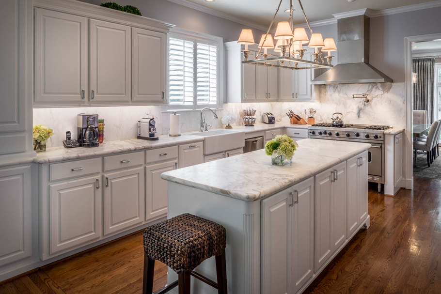
The dining table and kitchen island are two different colors, which goes well with the white cabinets and grey marble backsplash. Image via: Barlowreid.com
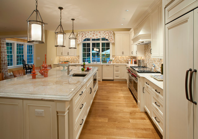
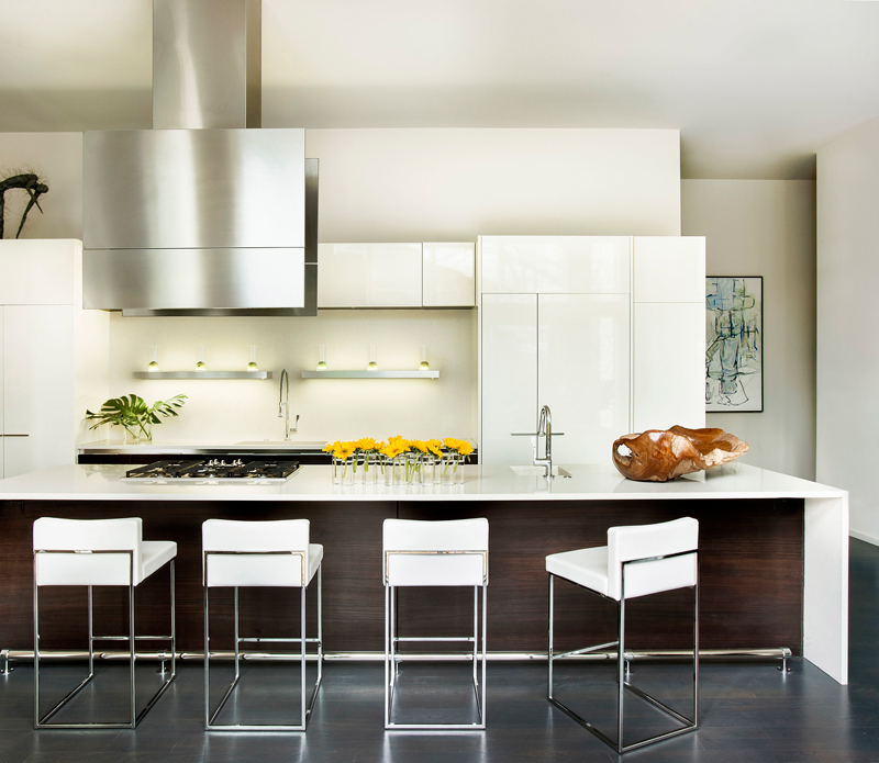
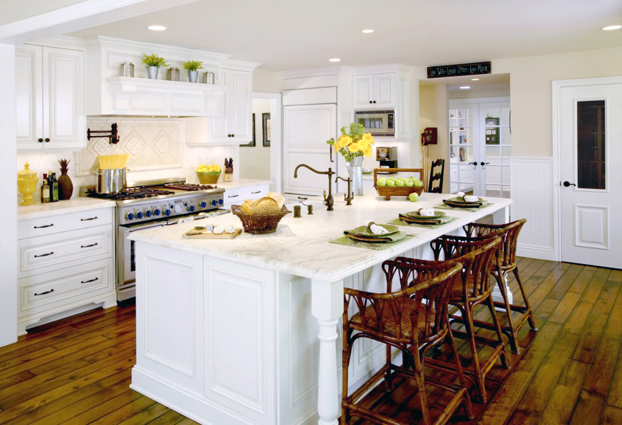
This kitchen sports a very long island, fitted with a white countertop and brown bottom. Even the fridge and such is white in this design, which looks pretty nice. Image via: Joelkelly.com
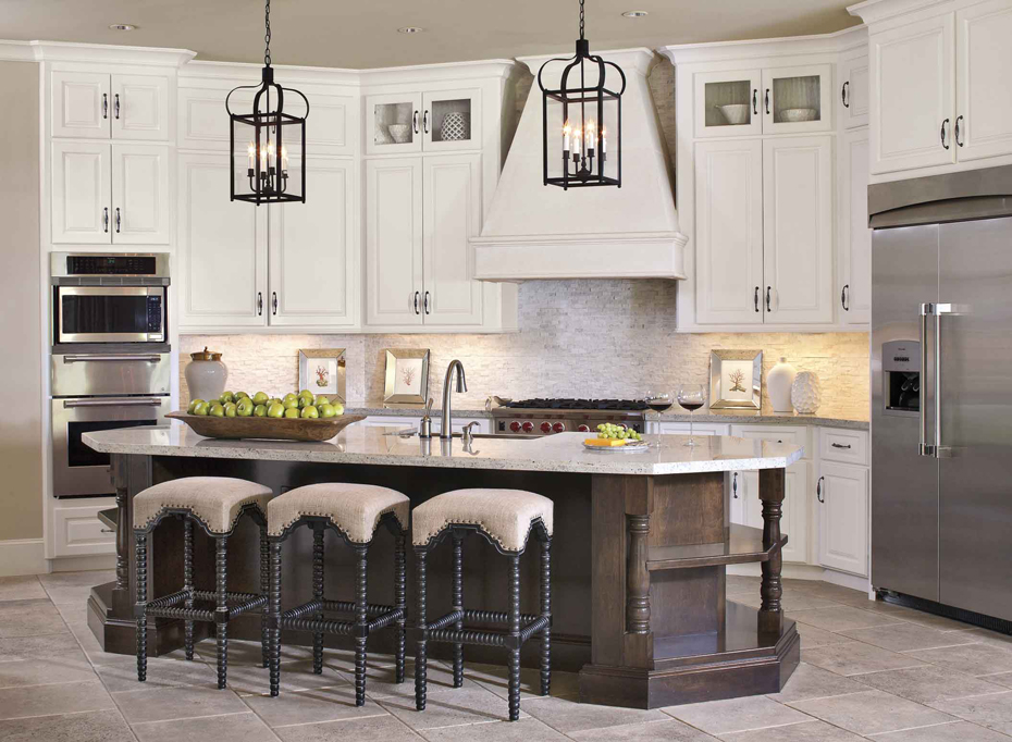
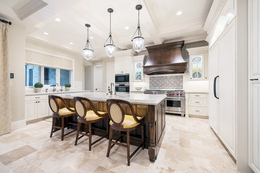
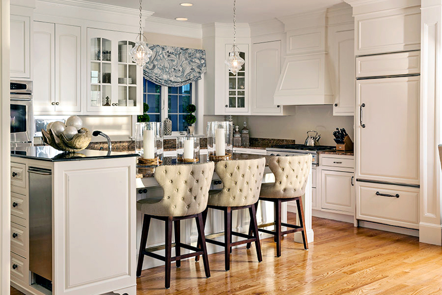
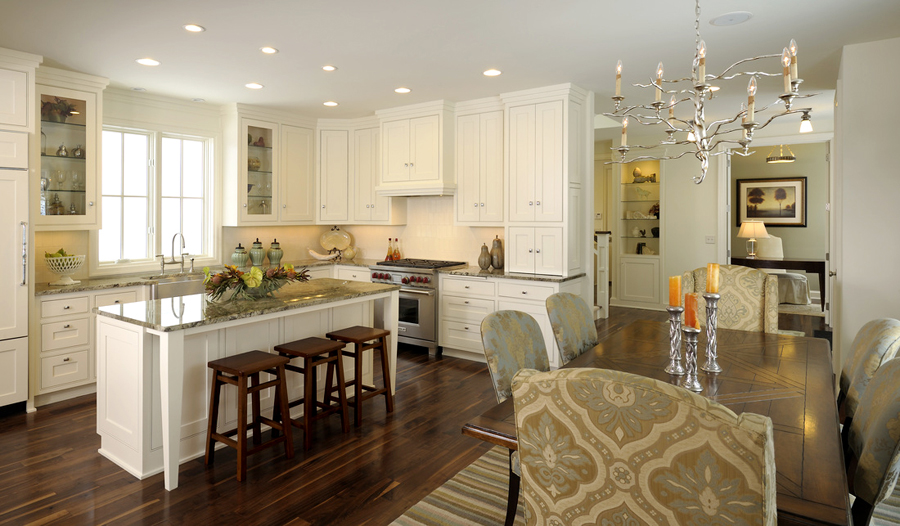
Tile flooring, granite countertops and bar stools that look like they were taken out of a castle. This is luxurious dining inside your home, truly! Image via: Lpearsondesign.com
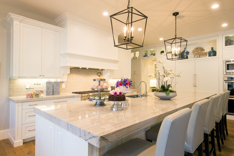
If you have a family and are interested in a new kitchen, this a reasonable design. There’s a lot of table space on the island, and the layout is perfect for serving food to guests (or loved ones!). Image via: Lismanstudio.com
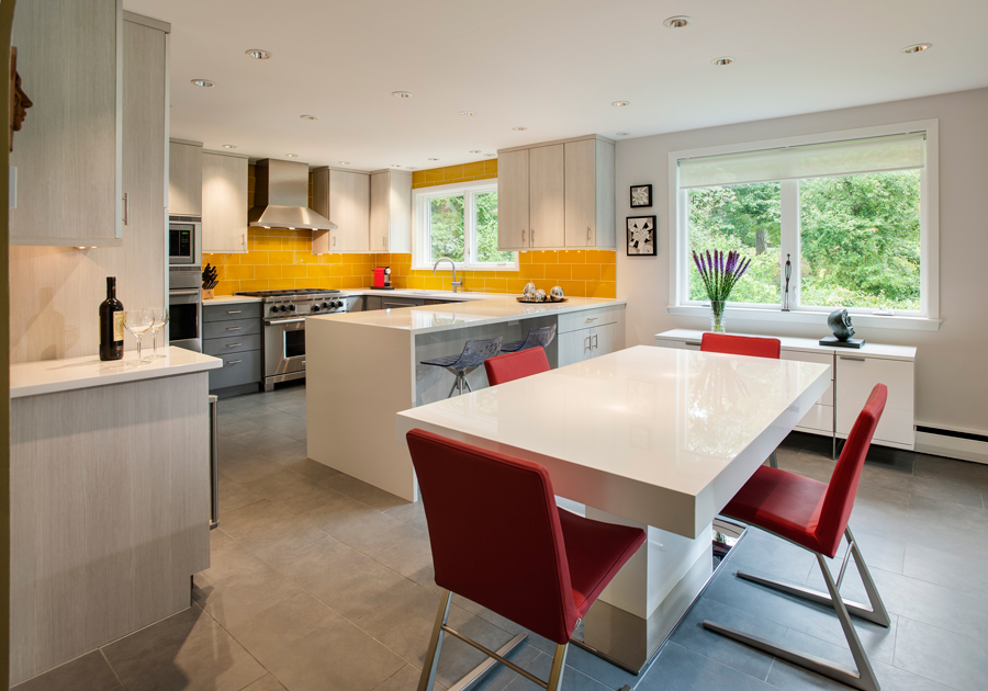
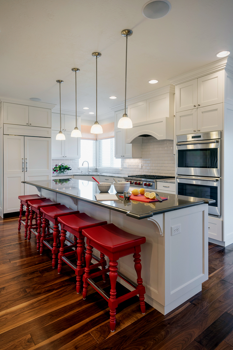
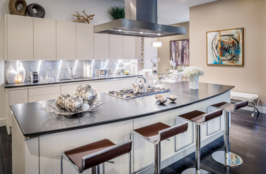
Red bar stools definitely aren’t a common sight to be seen, but they do add a lot of flare to this kitchen design. It’s almost like spicing up a winter night! The countertops are very sleek as well. Image via: Lismanstudio.com
Grand and bodacious, this kitchen has a very rich sort of base. The dining chairs go well with the grill and kitchen island, and the countertops seem to work well with everything else (including the lights). Image via: Lismanstudio.com
Since it’s 2016, it calls for kitchens that are much more futuristic. We have here one that sports a large kitchen island with granite countertops. Whenever there’s granite involved, there’s good times to be had. Image via: Lindsayocreative.com
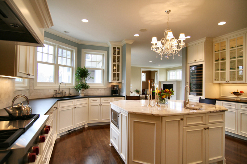
Another granite countertop white kitchen design, this one has an immaculate lighting set up. It brings the entire kitchen to life, breathing in a new sense of love for your food. Image via: Setthestage.net
One thing you can always count on when it comes to kitchens? The fact that they’re always pushing the envelope. This white kitchen design is definitely trying to reach new heights! Image via: Mauricionavadesign.com
One could say that granite countertops are out of trends, but one would also be wrong! They’ll never go out of trend, especially when it comes to designing the perfect kitchen. Image via: Mauricionavadesign.com
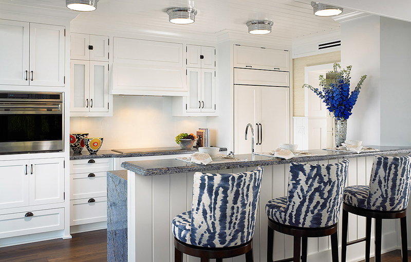
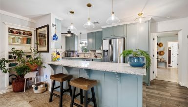
Blue and white go together like I’ve said numerous times before. With this particular design, they went above and beyond the normal threshold – adding more and more color! Image via: Cindyray.com
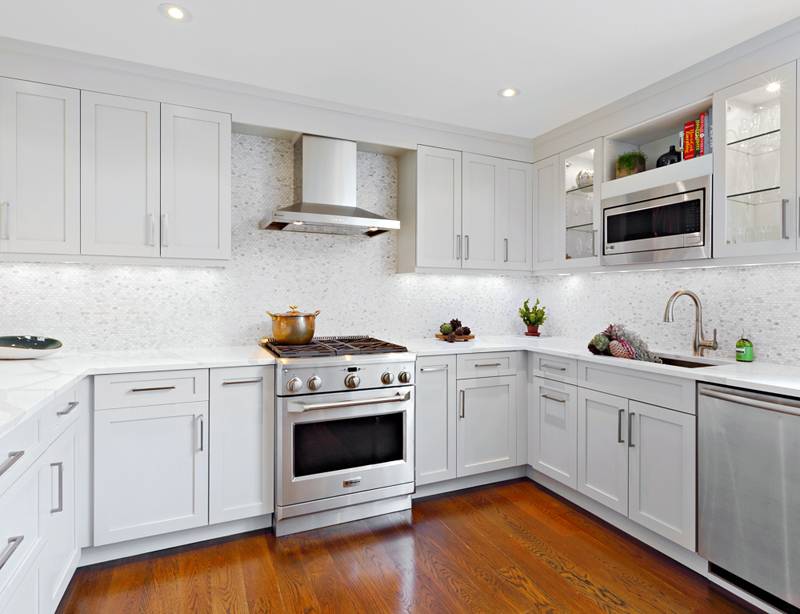
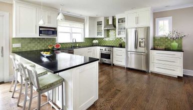
Straight-forward is the best way to approach things sometimes. With a white and black look, this kitchen is appealing for an abundance of different reasons. Image via: Cindysmetanainteriors.com
When you’re going down the all-white route, it’s tough to decide on your secondary color. At the end of it all, you can’t go very wrong when it comes to brown and white.
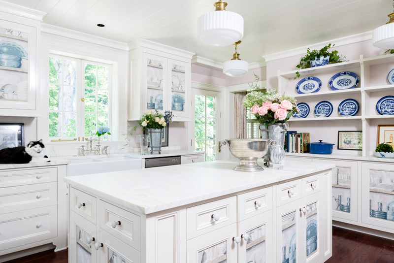
Once again, another blue and white kitchen design. Not only that, but there’s a cat included in the mix this time around! Image via: Toddrichesininteriors.com
The dining chairs that sit at the island in this picture look comfortable, and the countertops create a secondary source of color; something that’s needed in white kitchens. Image via: Casabellainteriors.com
When you have this much space to work with in a kitchen, there’re limitless options! The big kitchen island in the middle is an enjoyable concept, to say the least. Image via: Interiorsbyholly.com
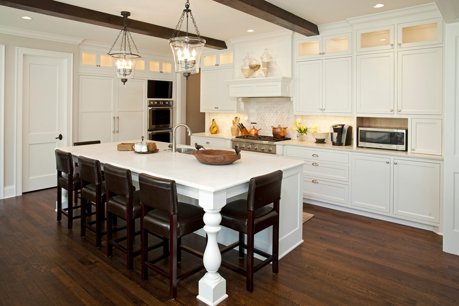
Dark brown leather dining chairs and an all-white kitchen island make for a relaxing dining experience. Dinner will seem much richer when you’ve got a design like this! Image via: Interiorsbyholly.com
Once again, another kitchen that blends white and brown together with ease. Those are two easy tones to use for a kitchen, which is why you see it on such a frequent basis. Image via: Interiorsbyholly.com
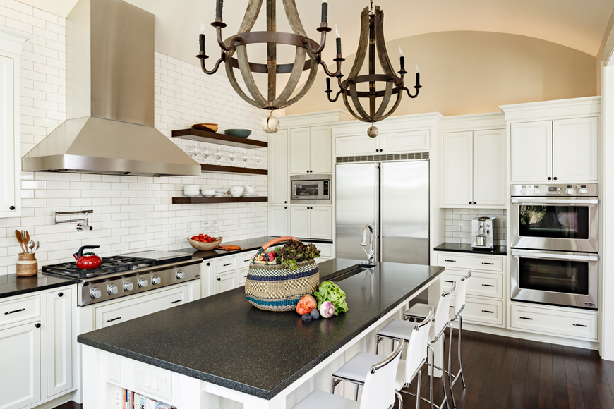
Wooden chandelier lights? Sign me up! Not only do they look cool, but they work with the entirety of the kitchen. Black quartz countertops are a fantastic addition as well. Image via: Jennileasiadesign.com
This white kitchen has a lot more black than you would usually see, but it’s still a great look. Not only does it keep the space available in a reasonable manner, but it’s just a perfect looking project altogether. Image via: Taliankodesigngroup.com
Light wood floors and grey marble countertops seem like they’re a match made in heaven, which is why they frequent high-quality kitchen designs (like this one) so often. Image via: Designharmonyinfo.com
Stellar lighting and black leather bar stools are what makes this kitchen so interesting. The black laminate countertops add to the entire thing in a positive manner, and there’re tons of cabinets! Image via: Instudioandco.com
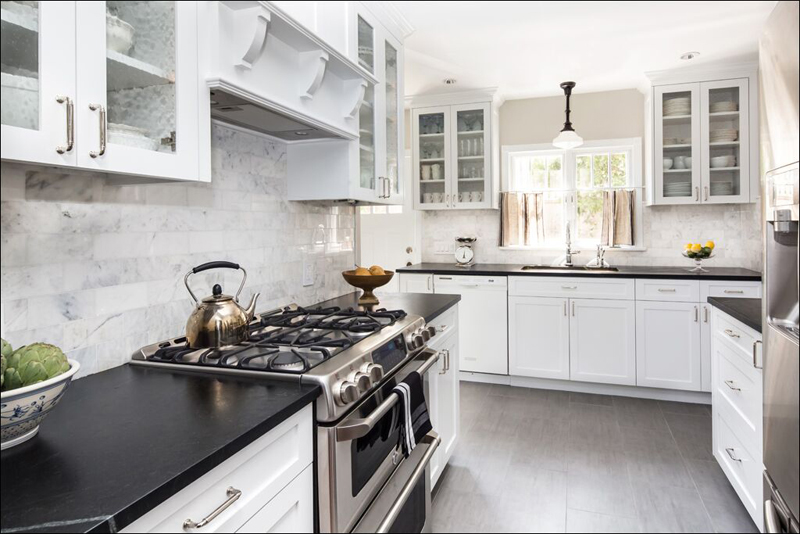
If you’re ready to put together a brand new kitchen, this is one that can spark your imagination. Tile flooring, black laminate countertops and a backsplash that would look amazing on canvas! All stuff that equals an awesome kitchen. Image via: Rajnialexdesign.com
If you want to keep things as common and simple as you can, this is a design that you’ll fall in love with. It’s just plain brown and white with a simple sort of backsplash to look at. Image via: Rajnialexdesign.com
The amount of contrast in colors that I’m experiencing here is outrageous! There are shades of yellow and brown, as well as black to look at here; a mix that wouldn’t usually be seen. It works, though! Image via: Gingerwooddesign.com
Light brown, grey countertops and a dark wood flooring? This kitchen seems like it’s all over the place, but it comes together quite nicely. Surprising, isn’t it? Image via: Gingerwooddesign.com
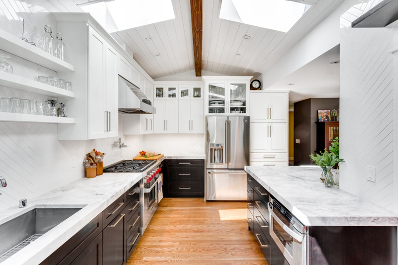
Under cabinet lighting is a commodity that doesn’t grace most kitchens, but it has made its way into this one. There are a lot of colors to look at here, although the focus is still white; therefore, it applies. Image via: Pattyjonesdesign.com
Effortless is a word that I would use to describe this kitchen. It looks amazing, with a black kitchen island and white countertops – the dark wood flooring is pretty much an obvious choice here. Image via: Jennymartindesign.com
How often do you see mini pendant lights as beautiful as these ones? There’s also a dark-brown kitchen island with a wooden countertop, which is more than capable of handling your needs. Image via: Jennymartindesign.com
Larger kitchens like this one are always going to have a kitchen island of sorts (for the most part), and it’s a good thing that this one looks great. With dark wood as a base and granite countertops, it’s great for just about everyone. Image via: Jennymartindesign.com
White kitchens like this one are often mistaken as something else, because of the many different colors and features included within. Ceramic tile flooring also makes a surprise appearance! Look good, cook good. Image via: Jennymartindesign.com
Wood swivel bar stools are always going to look unique, but when you pair them alongside pendant lights like the ones you see here (and, of course, a beautiful kitchen island), there’s lots to love. Image via: Jennymartindesign.com
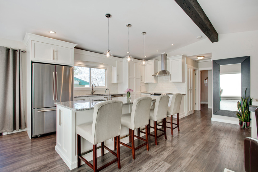
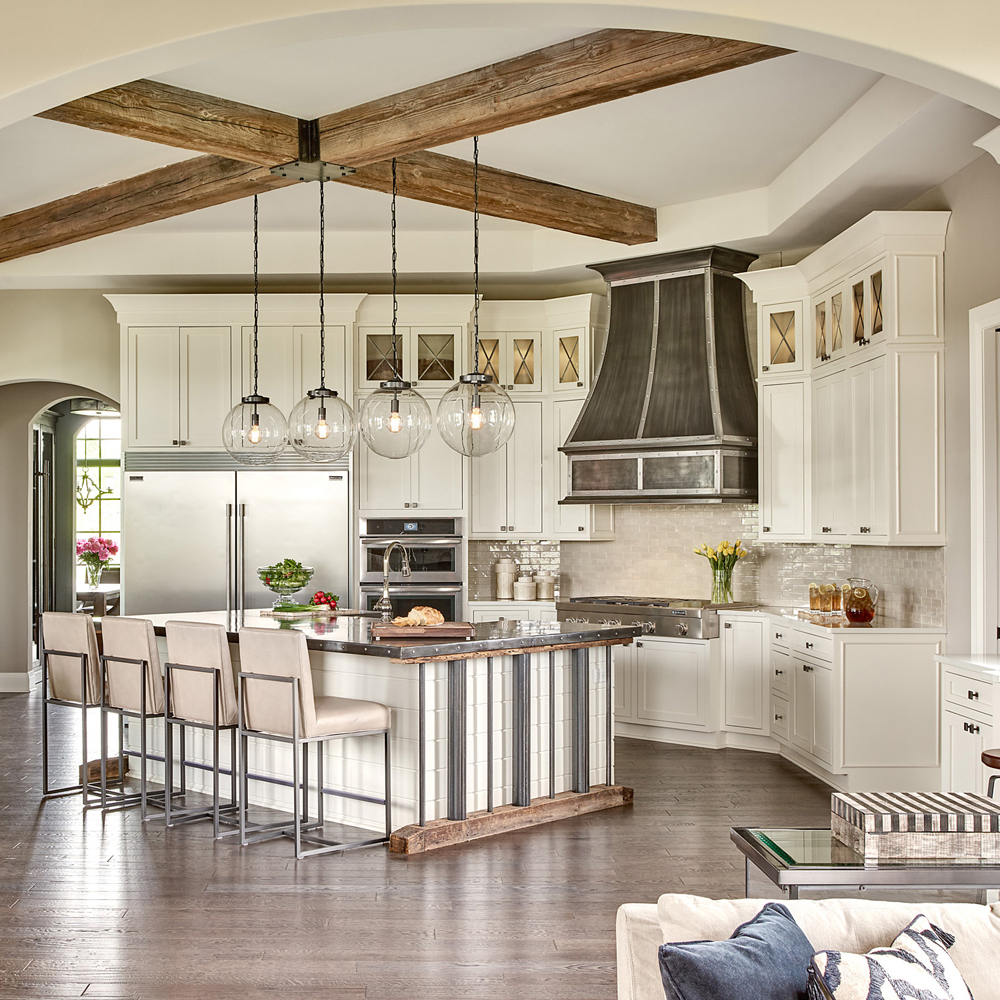
The way they made use of the support beams to this home is one of the coolest things I’ve ever seen! Not only that, but the island has a very sought-after countertop. Cream leather dining chairs create a sense of belonging. Image via: Marycook.com
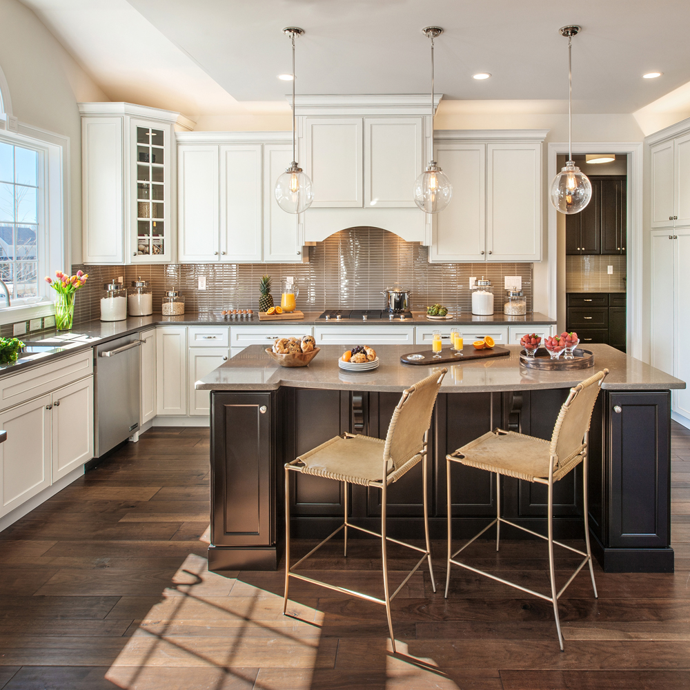
The backsplash for this particular kitchen would be brown glass tile, which isn’t commong by any means. The kitchen and dining chairs also look very “out of this world” – which is perfect for people who like to stand out. Image via: Marycook.com
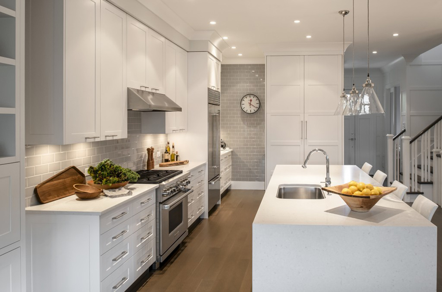
The gray subway tile backsplash in this design goes well with the all-white kitchen island; the island itself is one entire piece and looks excellent at any angle. Image via: Mygoodspace.com
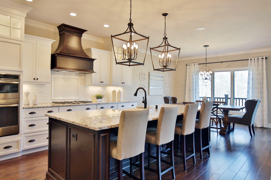
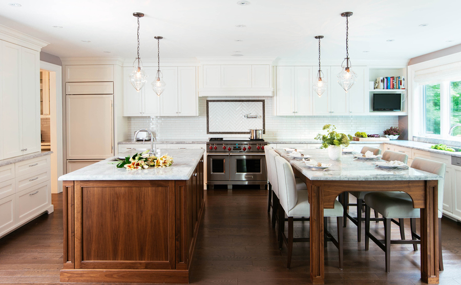
Perhaps the most relaxing setting you could find in a kitchen, this design makes use of many different brown undertones. The floor, the kitchen island, and the table follow that trend – and it looks good! Image via: Meghancarterdesign.com

