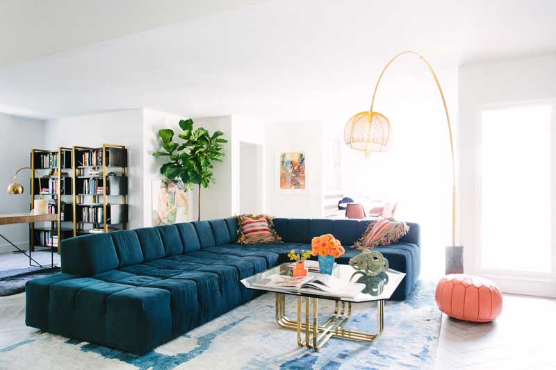
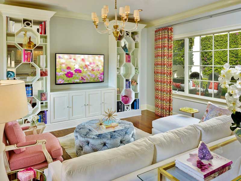
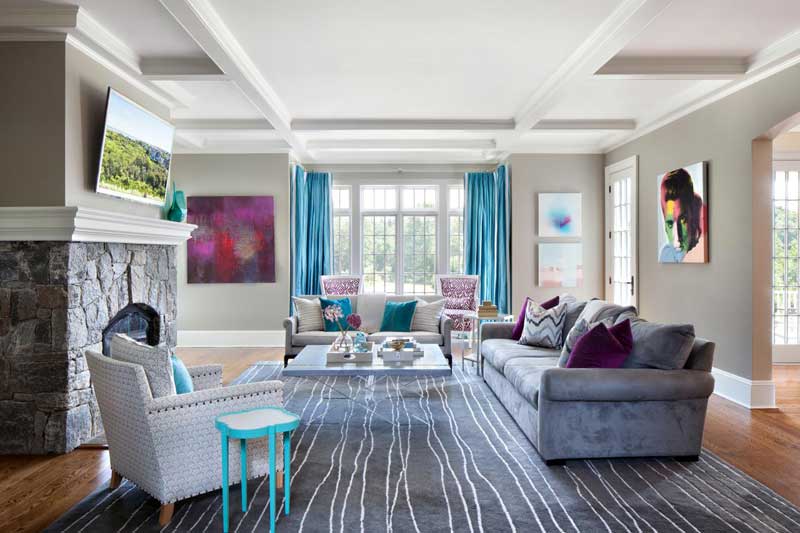
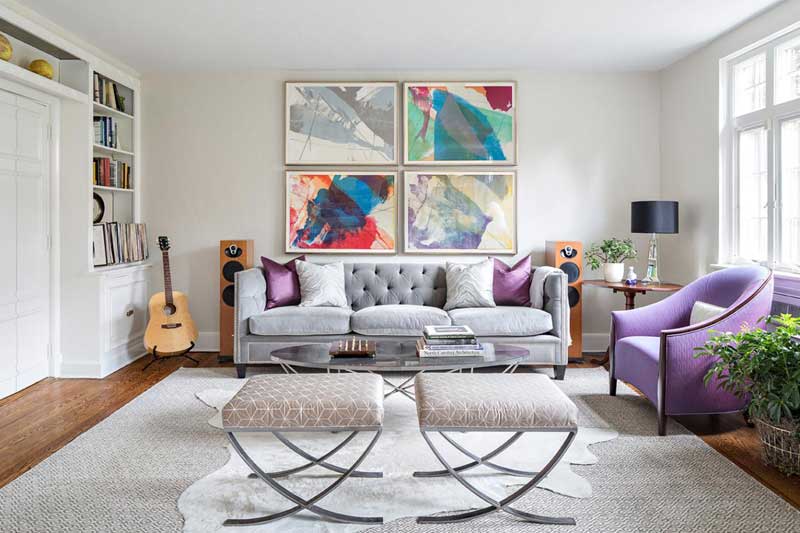
Finding the right decoration ideas for your living room can be daunting, and even after you’ve come up with some good ideas, it can be difficult to bring them together to create the beautifully coordinated living room you’ve always wanted.
Everybody has different ideas about how to decorate a living room, so you’ll probably have to look at a lot of finished living rooms before you find one that’s perfect for you. That’s where the 55 living room design, decor and remodel ideas on this page come in!
When you look through the series of pictures, they will spark your creativity and imagination and point you in the right direction. If you’re lucky, you’ll find something that’s perfect for you as it is – but even if you don’t, you’re sure to get a lot of great ideas for a design for your living room that you – and your visitors – will love.
55 Pictures of Living Room Design
Image via: jamieherzlinger.com
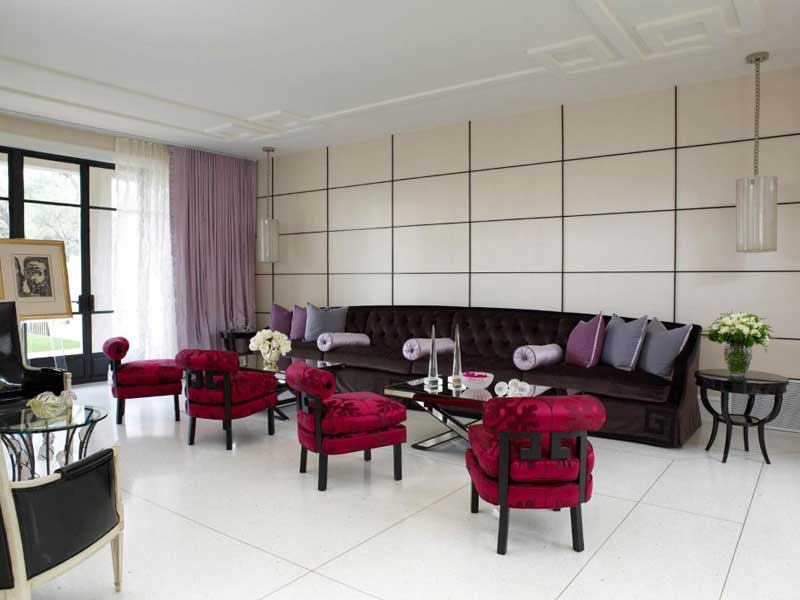
This room looks palatial; there is a lot of space here for a large family. Although the basis of the color scheme is indisputably cream, it’s nicely complemented by the brown sofas and the adjoining red tables. The window on the right side takes in a lot of light, which helps to illustrate the genuineness of this living room.
Sometimes too much space can make a living room look vacant and lonely, but in this case, the extra space gives candor to the whole setting, creating a welcoming and attractive atmosphere.
Image via: caitlinmccarthydesign.com
This living room is a classic – and classy – design, and as such it exudes simplicity. The color on the walls matches that of the background perfectly. It’s not complicated, and that makes it an excellent choice for minimalists, or those with small families. In fact, it’s simple enough that it would be interesting to play with the idea of creatively adding a few elements if you’re looking for something with more visual complexity.
Image via: butterlutz.com
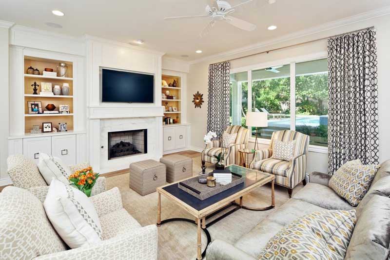
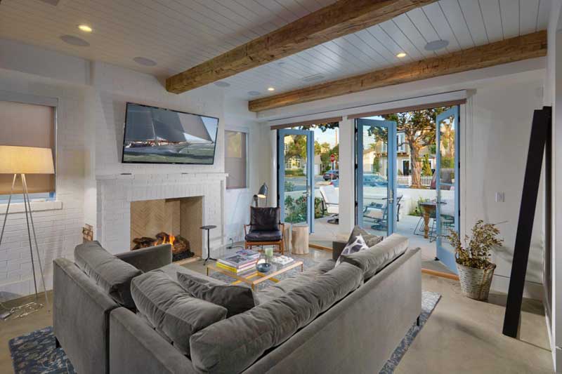
This living space is another classic design with a two-color palette. There’s nothing fancy here, which means it won’t be too difficult to pull off if you’re a DIY remodeler. But it’s also very well coordinated.
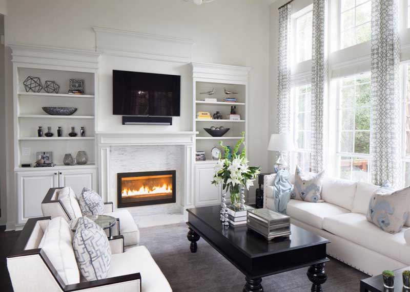
Look at the coffee table in the middle of the room and how it brings out the color of the sofas surrounding it. The fireplace is immersed in white so that its dark opening makes a beautiful contrast.
The windows allow in enough of a view to enjoy the scene outside. The two cupboards on the each side of the TV give you the storage space to ensure the room stays uncluttered.
Image via: colordrunk.com
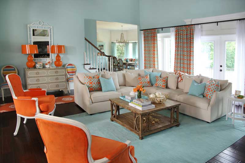
This is a large room, which always lets you be more creative. For example, look at the orange chairs near the sofas – how innovative! They’re well placed, and they match the color of the cotton pillowcases and the two lamps standing at the far end of the room. They also make an exciting contrast to the light blue and brown colors dominating the room.
Image via: dawsondesigngroup.com
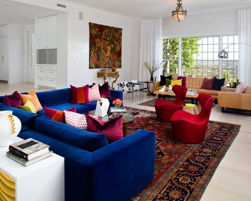
This room is furnished with vibrant blue sofas that make a beautiful contrast with the overall white color. The rest of the furnishings have smooth textures that blend naturally into the room and include a couple of fabulous red chairs that seem to glow in the light from the large windows. They keep an otherwise plain room from being bland, making it exciting and full of life instead.
Image via: alisonkandler.com
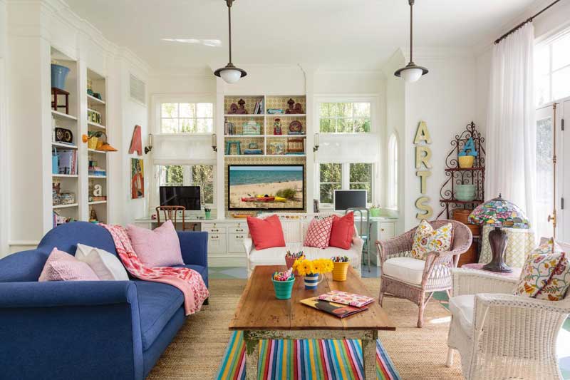
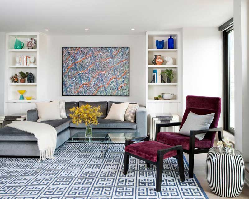
The way the blue sofa jumps out from the whole setting makes you fall in love with this room at first sight. Yes, it’s a little cluttered, with items lying on the coffee table and scattered about, but the overall arrangement produces a peaceful scene that is also easy to replicate. The white walls and the low hanging chandelier bring more color and art to the room and keep it warm and inviting.
Image via: blackbanddesign.com
Here, style and color combine in a traditional setting in a beautiful dance. The items speak simplicity and minimalism. If you don’t like clutter and flash, this simple yet assured style is for you. Looking closely at this room, you can see only three colors playing together, making the color palette the focus point. When cream shades into white, which then transitions into gray, you can’t help but marvel at the simple beauty.
Image via: spaziorosso.com
This unique room makes a big impression the first time you see it, with its rich creams and background colors and the beautiful textures of the surrounding elements. The coffee table is delicately carved and highlighted with gold, and with decent lighting from the outside, the colors begin shining. The artwork on the wall will send different colors dancing around the room at various parts of the day. This is a great living room if you are in an area with a lot of sunny days.
Image via: jbalisinteriors.com
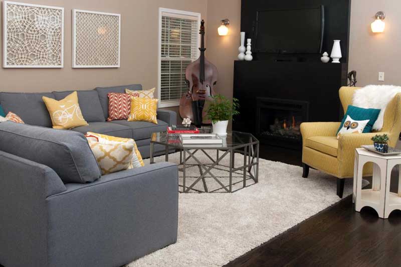
The black door is the first thing that catches your eye, followed by bright yellow and gray sofas. The walls are painted in neutral beige for a vivid contrast. Extra sharp contrast is a common element in most modern living room designs – and here, it’s done right, doing nothing at all to detract from the elegance of the living room.
Image via: kellyandcodesign.com
This is a very open room; a large window keeps visitors entertained with views of the outside, and leaving the door ajar allows a direct breeze to flow through the living room. But the lighting is also dim, as bright light would clash with the room’s colors.
Image and style come into play with the artwork presented in the living room; it is striking, aristocratic-looking, maybe even daunting at first glance, but is as simple as the rest of the chamber. This kind of room doesn’t take a lot of imagination to pull off, just consistency and persistence.
Image via: pineapplehouse.com
The main focal point in this room is the paintings on the wall, but that doesn’t mean that’s all there is to see here. The other items in this room also contribute to its inviting character. You could easily turn this into a study room since there’s more than enough lighting from the large glass doors. Cream prevails here, but if this is not your favorite color you could use brown or beige to match the blue table in the middle.
Image via: kristinawolfdesign.com
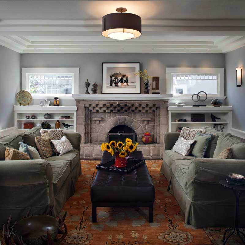
The ambiance here is peaceful and elegant. Although it is a small space, the arrangement of the items makes things look simple and uncrowded. The chandelier and the shelves of bric-a-brac on either side of the fireplace create a warm and cozy feeling, and the furniture is well arranged and appropriate in size and form. The dark coffee table (holding the vase) is the focal point of which the sofas look straight at each other, creating an excellent dynamic for an elegant room.
Image via: caitlinmccarthydesign.com
Look at this aristocratic living room. Simple yet inviting, and a perfect fit for a small family. The couch is the main item here and is very kind of you but not all that expensive, ideal for someone looking for a budget décor. You could even just reupholster an old couch to get a similar effect.
The present color scheme works fine, but this is one room that could look good in a different color if you prefer something else. The gleaming lamp and coffee table further enhance the graphic details of this living room.
Image via: johnmcclaindesign.com
This room is a work of art and a work of imagination. Although there is nothing fancy here, the look and feel speak volumes. If you love nature and art, you can see many things coming into play here. The faux candles hanging on the chandelier, the plants outside the window, the delicately curved table in the middle – all of them are telling a story. The colorful chairs are part of the artistry, but the comfortable sofa is going to be where you spend the most time.
Image via: cleandesignpartners.com
This feels like a modern home plopped down in the countryside. If you have a large space, you don’t have to let it go to waste; magnificent but empty living rooms can be alienating. It won’t be hard to make this simple but artistic design your own. The portrait hanging above the sofa balances the room, while the white armchair on the left is well situated to create a warm and inviting environment.
Image via: cleandesignpartners.com
This is a large living room that manages to be straightforward and uncluttered without being empty. Everything is arranged in the right dimensions and forms, leaving enough space for storage and introducing newly acquired items to complement the boldness of the room. The focal point here is the two designer stools facing the sofa. There is good contrast between the white walls and the wooden floor, and the windows let in a lot of light for a clearer view of the interior.
Image via: heatherscotthome.com
White and black have been used for living room design practically forever, and they always form a right combination. The fireplace draws attention even in daylight, and the simple contrast here is better than many of the most artistic designs of modern interior decorating. This room is a simple representation of minimalism and is suitable for a small family.
Image via: isarchitecture.com
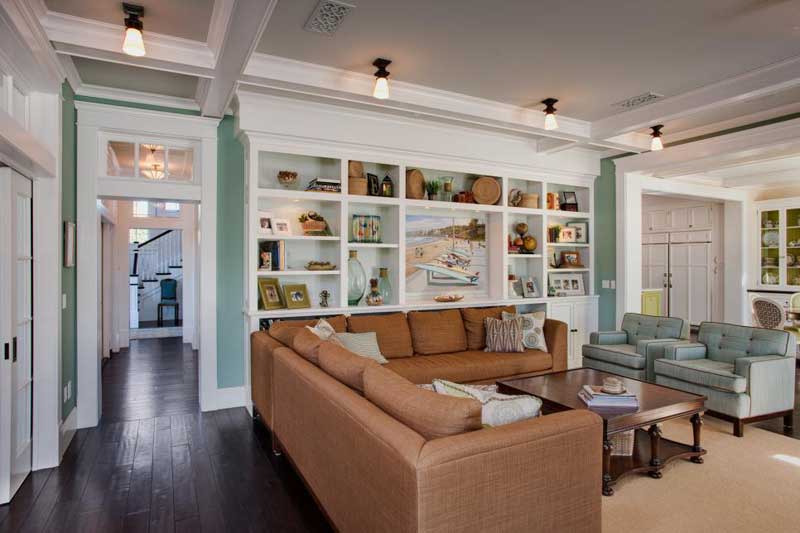
The lighting is one of the most important things in any interior design – it has to match the overall feel of the design. If the light is pleasant, the ambiance will be too. This is what is happening in this room. There are simple light-brown furnishings and a beautiful color palette that doesn’t overburden the eyes. The narrow blue passage leading into the room extends the warm feeling emanating from this setting.
Image via: caitlinmccarthydesign.com
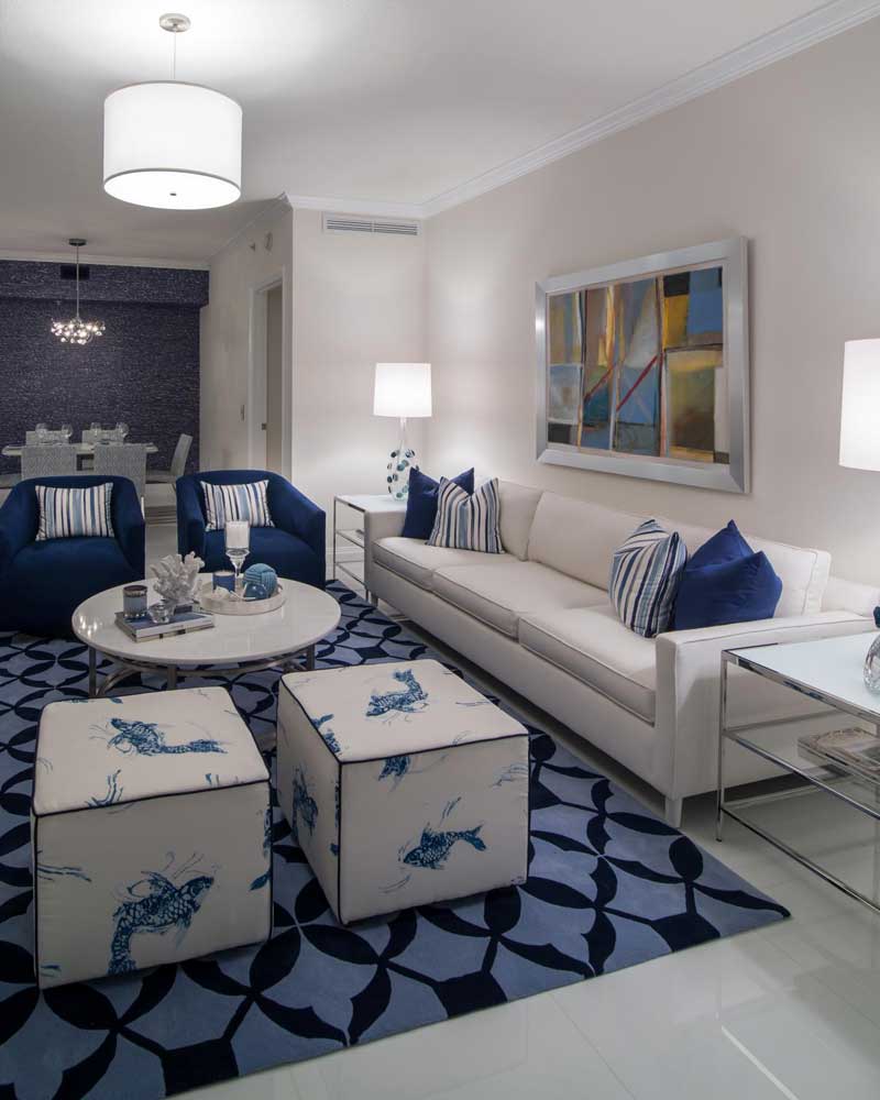
This one is beautiful – it will wow your visitors. There is plenty of artistic creativity here to challenge the imagination. It looks like an exotic Oriental living room, but it’s very easy to design this kind of room.
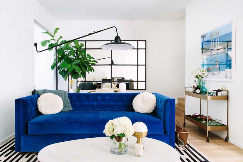
The blue sofa is brilliant and well matched to the sharp white color of the walls. The coffee table sitting in the middle is crafted to match the color of the walls. The open floor does not depart from the overall design.
The secret to this type of design is two or three color contrast. The fewer colors used, the more efficient this will be. In this design, there are four colors: white and blue, of course, but also golden-brown and black.
Image via: beylablue design
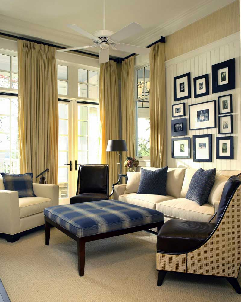
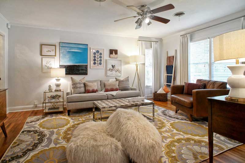
This is a traditional living room, and you can make something like it very easily. One caveat you have to be creative, or this could get boring. Pay attention to the items on the wall and the bold color of the rug – these are the attention grabbers.
Before selecting items for a room like this, look around and consider what colors will fit best. This one has been done very well. It’s beautiful and has had a lot of thought go into it. The brown sofa on the right-hand side matches the fan and the stand beside it, for instance.
Image via: perceptionsinteriors.com
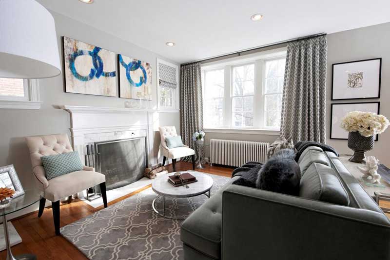
The charcoal sofa is the main item here, which is great if you have a limited budget for your living room remodel. The large windows let the sun into a spacious living room with tasteful paintings. The coffee table in the middle is delicately curved and low profile while the stand-alone chairs on either side of the fireplace draw more attention. You can see that the small space of the room is well managed, and items are arranged neatly, achieving a clean and tidy look for the room.
Image via: dawsondesigngroup.com
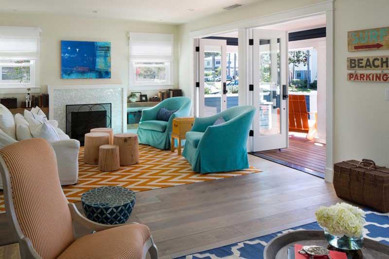
All you can see here is a vibrant living room. The beauty of this décor is that it allows you to be creative. You are not stuck with particular pieces, and most importantly, something like this can easily be implemented into your existing living room.
If you are doing a complete remodeling, you should pay attention to some of the essential elements such as the floor color, the large doors and the beautifully designed sofa and chairs. Here, the dominant color is white, but yours doesn’t have to be the same color.
Pay attention to how things go together, though. You can see that the light blue chairs match the color of the hanging above the fireplace and the four round objects in the middle complement the color of the striped chair in the foreground.
In this room, the painting on the wall and the color palette are the essential elements of the decor. There is a bright white light emanating from the lamp holder on the ceiling that matches the color of the sofas. Notice that there is a little contrast here; the focus is on a warm environment and a sleek design. Sometimes, you achieve the sweetest designs by being straightforward and minimal in the use of materials – which is what makes this room elegant and stylish.
Image via: anitaclarkdesign.com
Break the rules or change them; turn your living room into a second bedroom. As people get busier, modern designs are increasingly incorporating this element into the living room. Draw the curtains and you could have a quick nap on the sofa under the windows. It’s a small, comfortable space, intended to allow some relaxation into a busy schedule with its cool-toned color palette.
Image via: hgtv.com
Unless you’re a confirmed bachelor, you may find this one too masculine. With just a few items here – just the sofa and a soft cream colored table in the middle – it’s set for complete simplicity. You can toss things on the floor, not clean for a week, and still come back to a functional living room. Don’t forget that the windows are an important element in this room – they introduce a beautiful blue accent that makes things cool and inviting.
Image via: faiella-design.com
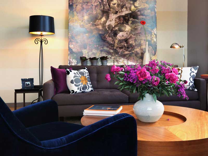
This room’s use dark brown color palette. With all the leather and dark textures, you will love this if you like to keep things subdued if you don’t like too much light and too many details. It’s not dull, though: the dim lighting brings the wall painting and the gray tufted sofa to muted life. The blonde wood of the coffee table holding the flower vase is noticeable as the lone spot of brightness, making it a natural focal point.
Image via: tobifairley.com
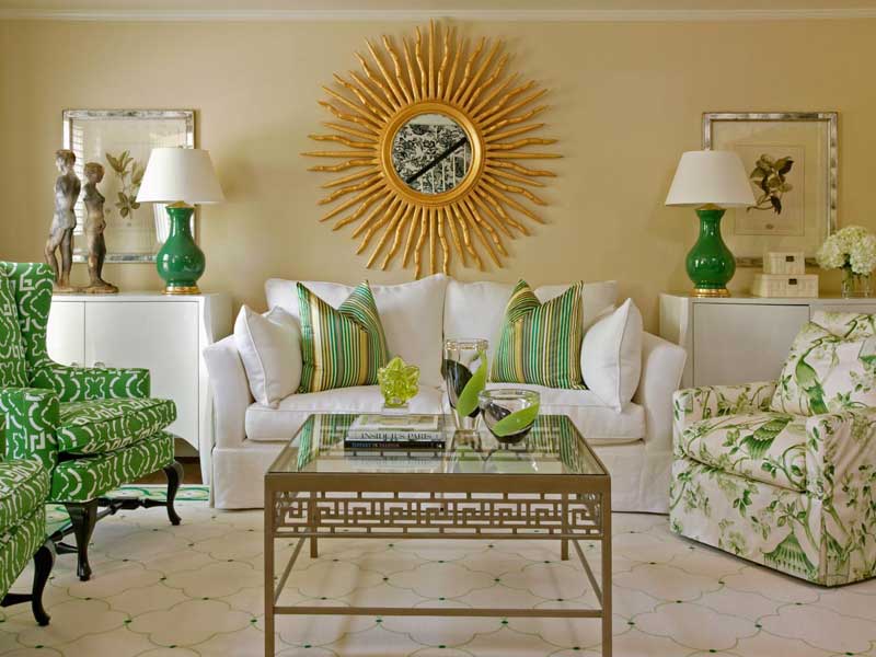
Every element in this setting speaks with its style. The cream background color brings out the beautiful ambiance of the light green armchairs and metal-and-glass picture frames and coffee table. The focal point is, of course, the blazing yellow sun over the white sofa, which is so over-the-top that it apparently took a lot of creativity to match it with the surrounding items. It’s a successful integration, though, that comes off as elegantly outré rather than garish.
Image via: mieramelba.com
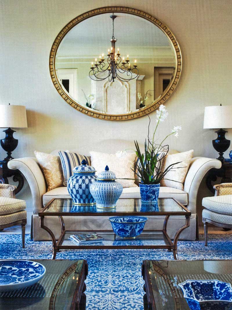
This is an excellent combination of common sense and artistic creativity. But you don’t have to hire an artist to create a room that has this killer look. The big round mirror shows off the candle-laden chandelier to spectacular effect, and the beauty of the blue vases far outstrips that of any of the furniture, but the comparative simplicity of everything else only seems to add to the room’s elegance.
Image via: amyelbaumdesigns.com
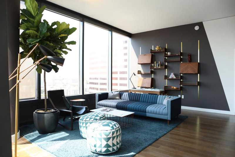
This room shows a modular setting, which has become a common element in modern décor. It has a lot of storage space and allows a lot of flexibility – you can reorganize and rearrange the items in the room to your taste and preferences. While practical, the room has enough style and contrast to make its elements come alive. The only colorful piece, the armchair, is nicely placed right in front of a window and would make a great reading spot.
Image via: kerriekelly.com
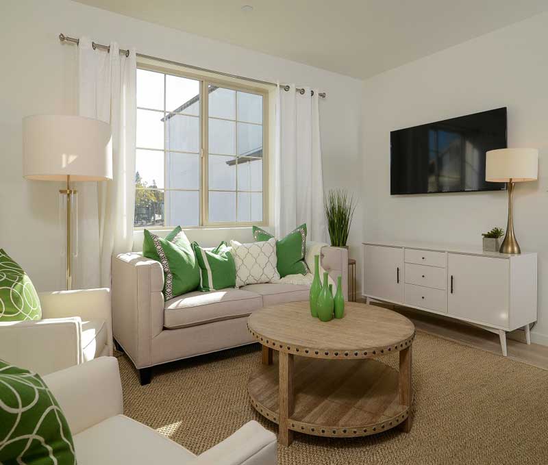
The focal point here is all over the room – it’s the color white, which is used for the walls, ceiling, and furniture. Since the floor and the small round coffee table at the middle are a neutral beige, the real contrast is provided by the green pillows, bottles, and plants. This intermittent green ‘striping’ creates an unusual look and feel to this little space. Although there aren’t many personal touches here, the atmosphere is warm and feels like home.
Image via: redeggdesigngroup.com
Traditional setting with a cool modern color palette. The blue glass on the wall just over the pillow-stuffed sofa creates an elegant ambiance, and the armchair on the right brings a lighter tone to the whole setting. Sliding glass doors give open a big window to the outdoors. The little round coffee table in the center reflects the blue color of the wall hanging to complete the story.
Image via: butterlutz.com
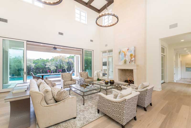
This isn’t so much room as space, with a sky-high ceiling, sliding glass doors substituting for one wall, and a large passageway leading out in another direction. Nothing is confining here, just a huge amount of natural light and a great view of the beautiful outdoor areas around the home. Unique circular chandeliers add visual interest to the upper reaches.
Image via: reganbakerdesign.com
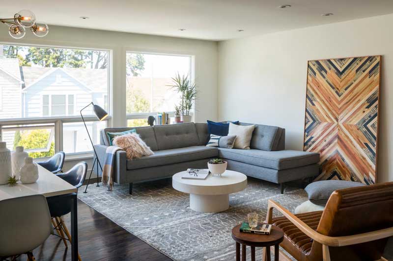
This is a little crowded, but it feels like home nonetheless. It is warm, calm and inviting. The geometric wooden artwork leaning against the wall jumps out at you first, but when your eyes become accustomed to that you see different colors and styles dancing in a more subtle details of the rest of the room. The plainest of all is maybe the most important – the little round coffee table in the middle effectively fills in an otherwise empty area without taking up too much physical space.
Image via: antoniomartins.com
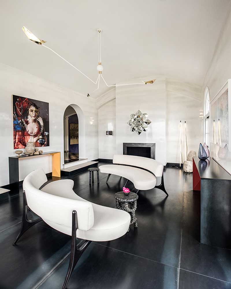
Sometimes the colors you choose become the most important aspect of a living room. In this case, the white stands out over the black floor, giving the room a classy look. Note that this is a small room; the table and the couch make it look more spacious than it is. The painting on the wall provides the only color, which further adds to the beauty of the room. The overall style matches perfectly with the color scheme, demonstrating just how attractive a modern living room can be.
Image via: newhousebuilder.com
There are always some designs that depart from the norm – this is one of them. The dining room here is carved out of the living room for an unusual but pleasant look. The brown floor complements the white on the sofas and the high walls nicely, an effect that’s heightened by the astute use of lighting. The downside is that this design wouldn’t work in many spaces, and it would be pretty expensive to carry out. If you have the right sort of room and an adequate budget, though, this could be ideal.
Image via: andreaschumacherinteriors.com
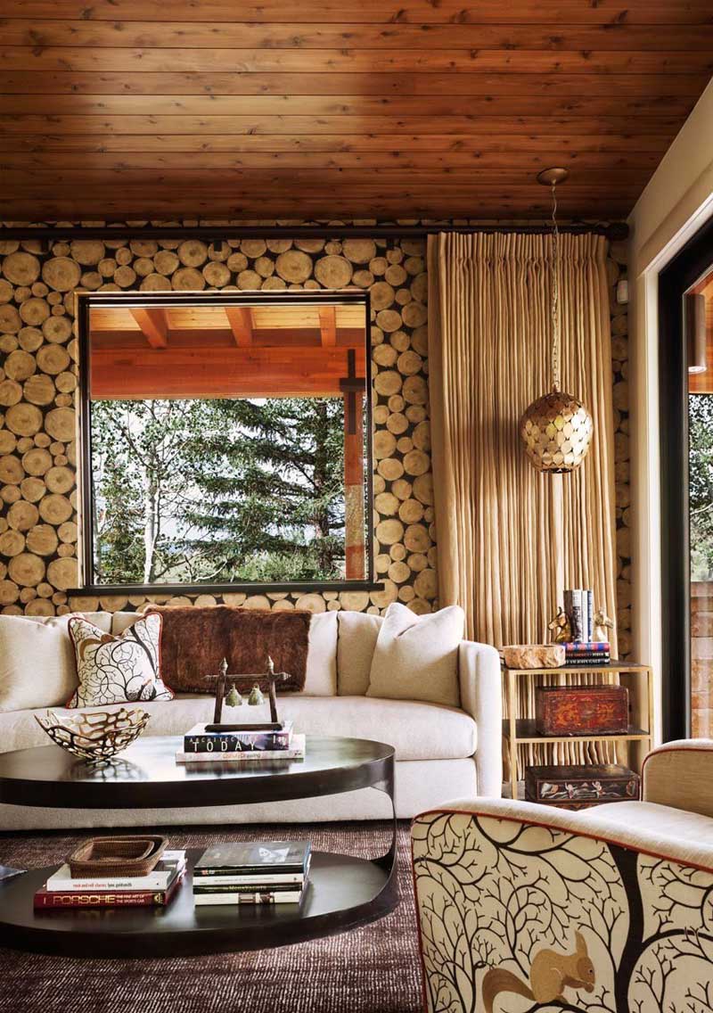
If you love nature, there are a lot of good ways to bring it into your living room. This room is filled with artistic woodcarvings and comfortable furniture. In this setting, styles, colors, and art blend with the surroundings to create a warm, peaceful atmosphere. The rustic elegance embodied by this room would be perfect for a vacation home or a weekend cabin.
Image via: annlowengart.com
This well-balanced room is full of earth tones; the color contrast is with the green of the trees visible through the windowpane. It’s a very soothing view for reading or relaxing, with a modern ambiance despite the traditional styling of the room. Did you spot the chandelier? It’s almost out of view near the high ceiling but is also very impressive.
Image via: annabraund.com
The incredible amount of contrast and style here shows the skill of an artist. Everything seems unique and yet simple. Sometimes the difference between the traditional and modern results in an unexpected but pleasant experience. For example, the cream sofa in this room matches the floor in an entirely conventional manner – but then you glance at the dining room and see something charmingly different in the unique design of the ceiling.
Image via: tobifairley.com
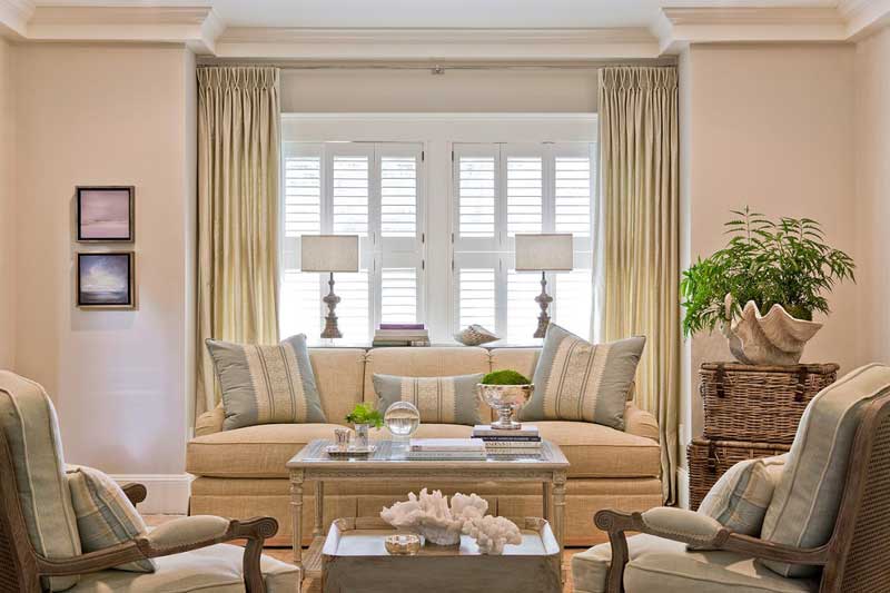
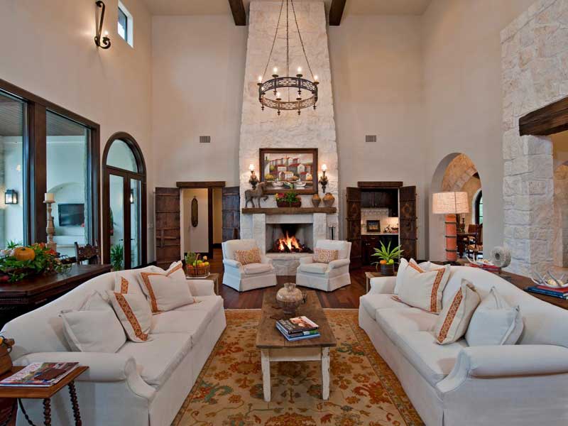
The neutral combination of cream and brown and beige has long been used in living rooms and various art forms. You can see it playing out here too. Some cool light blue accents add color without being too distracting, and the rushes on the top of the fireplace help bring life to the contrast. The overall effect is warm and cozy. Sometimes style and color used can determine how you feel in a given environment, and this has been employed particularly well here.
Image via: studio10interiordesign.com
The simple design makes this spacious room look elegant and stylish. The giant windows mean that the outdoors and the sunlight are never far away. This décor is practical as well as versatile – there are many seating options, and there’s plenty of space to reorganize things. Even the chandelier far above does not depart from the overall décor. In a relatively traditional room, the only element that shines through as modern is the two big balls beside the coffee table.
Image via: touchinteriors.com
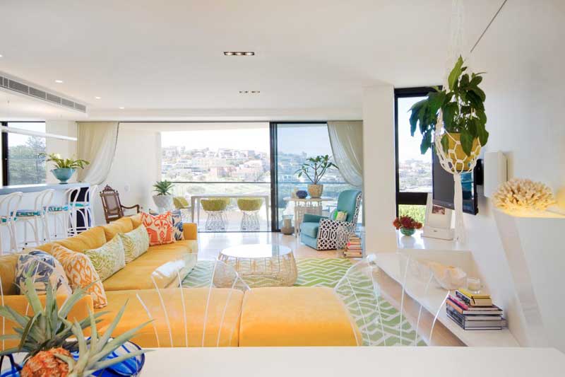
It’s colorful, soft and serene – and there’s a lot more to it than just the beautiful yellow sofa and some plants. The fusion of color gives way to a clear view of an exotic cityscape. This kind of setting makes you want to relax and enjoy. It feels exciting and homelike at the same time. The beautiful layout of the furniture gives the room a striking and aristocratic look, and the money that undoubtedly went into creating this place seems to have been well spent.
Image via: ashleyfurniturehomestore.com
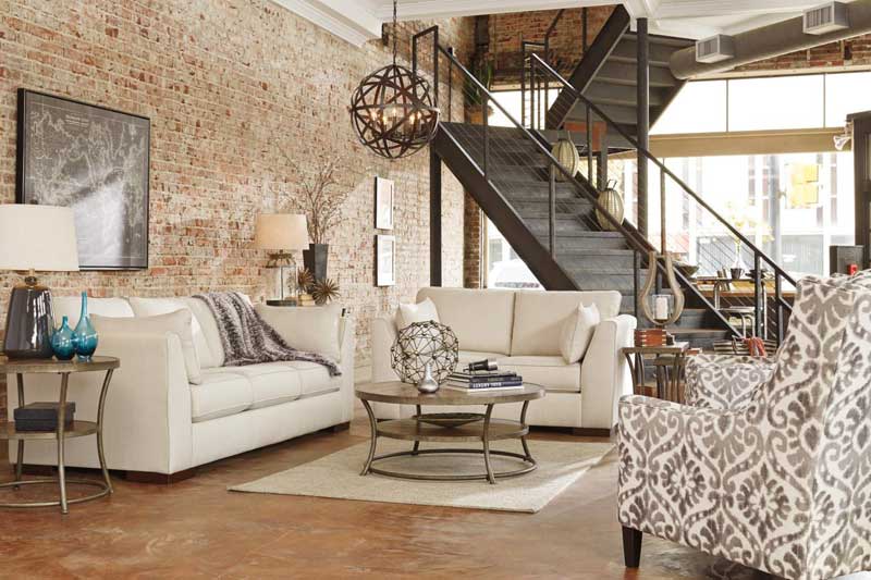
This is beautiful, as well as being spacious and simple at the same time. Many things here – especially the massive stairs – would only apply to big rooms. There’s a lot of room to add a few pieces without losing the overall beauty of the décor. The brick wall and iron stairs are crafted to give a traditional feel to the atmosphere.
Image via: duneierdesign.com
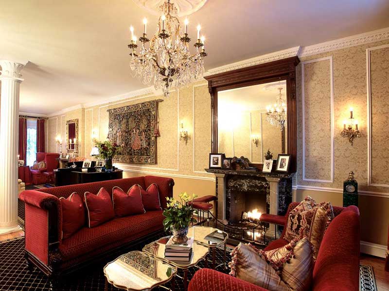
There is a multitude of contrasts here. You can see how the contrasting shades, colors, and textures add to the originality of this living room. The warm colors are centered around the fireplace, while the rest of the room displays cooler shades. Looking near the column to the left, you can see that a narrow window brings in enough natural light to complement the golden light of the chandeliers and candelabras. This is a beautiful contrast on many levels.
Living Room Design & Remodeling Ideas Before and After
Image via: amberinteriordesign.com
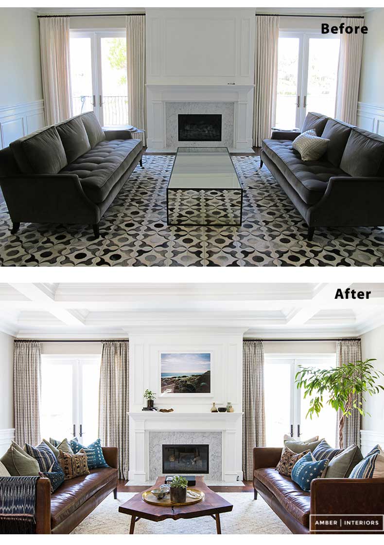
In the first picture, the combination of white and brown makes this room elegant and bold. The most important element in a modern design is the space, and here you can see that even though there is not much space, the arrangement of the sofas makes the room look large and airy. However, the room lacks the real attractiveness that could spark excitement in a visitor.
In the second picture, the introduction of a brighter color palette and a few live plants make the whole room look more inviting and homey. The carpet’s been changed, too, but the sofas remain in the same position to preserve the original spaciousness.
Image via: amberinteriordesign.com
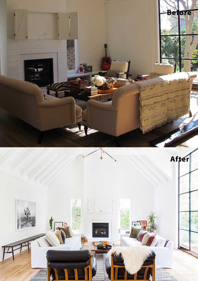
The architectural design of this living room is a masterpiece. The windows give you a level of natural light that breathes life into the room. The shelves above the fireplace are a great storage idea, and the fireplace itself will make this room exceptionally cozy on winter nights.
But in the first picture good architecture has been ruined by poor interior design; the contrast is dull and the color palette used does not take advantage of the room’s abundant natural light.
When you look at the second picture, the whole character of the room has changed. It is now vibrant, colorful, and inviting. Remodeling is all about rethinking what is possible and going for it.
Image via: studio-mcgee.com
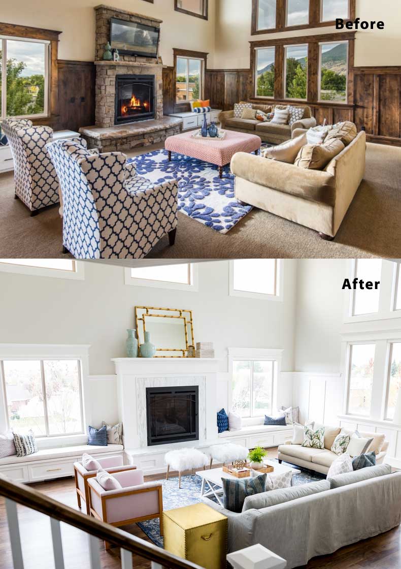
The room in the first picture is well furnished, with bold brown and cream colors. The blue and white armchairs and rug lighten and brighten it up a bit, so it’s not a terrible design by any means.
What’s missing here, however, is the attractiveness which is present in the second picture. The bright white color that predominates is more charming, and the atmosphere is more vibrant and reassuring than before.
Image via: studio-mcgee.com
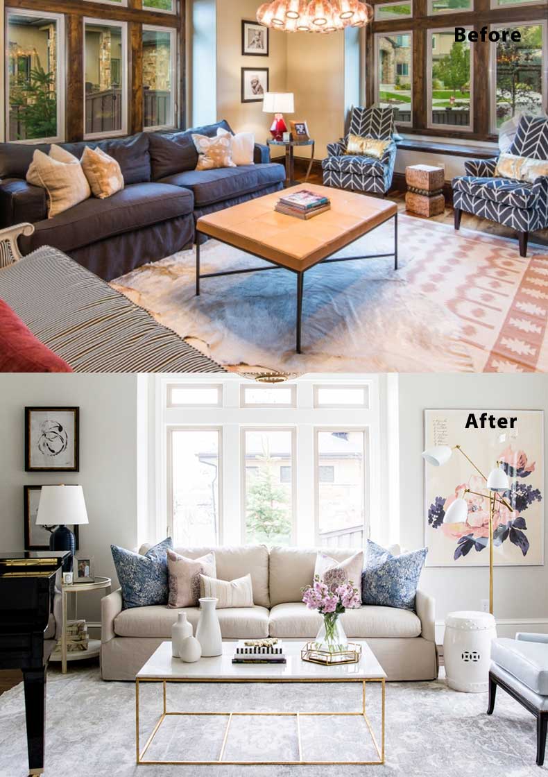
The first room is pretty impressive. Imagine having this classic look in an urban environment – you’d be proud to have your colleagues, or even your boss, over for cocktails.
The most important part of this design is the wall lighting. If you look carefully, you can see that the two colors of the chandelier match those of the carpet and pillows. Everything just comes together seamlessly.
The difference in the second picture is the reuse of space. Here, the sofa is closer to the front window, which lets in more light and breeze and has a better view. That eliminates the need for a chandelier. The rearrangement also makes more economic use of space, creating a tighter, cleaner look.
Image via: carlaaston.com
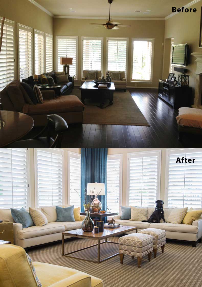
The before picture is another classic design. It’s not fancy here, but look at how the table in the middle matches with the other one and the cupboard on the right.
Everything else comes together as well in a gorgeous two-color scheme. However, the floor might need some work, and the sofa could be rearranged to create something more personal.
You can see the simple changes in the after picture have made this an entirely different room. Making the floor covering more attractive, rearranging the sofas, and changing the color palette from dull to bright have improved the whole room.
Image via: designconnectioninc.com
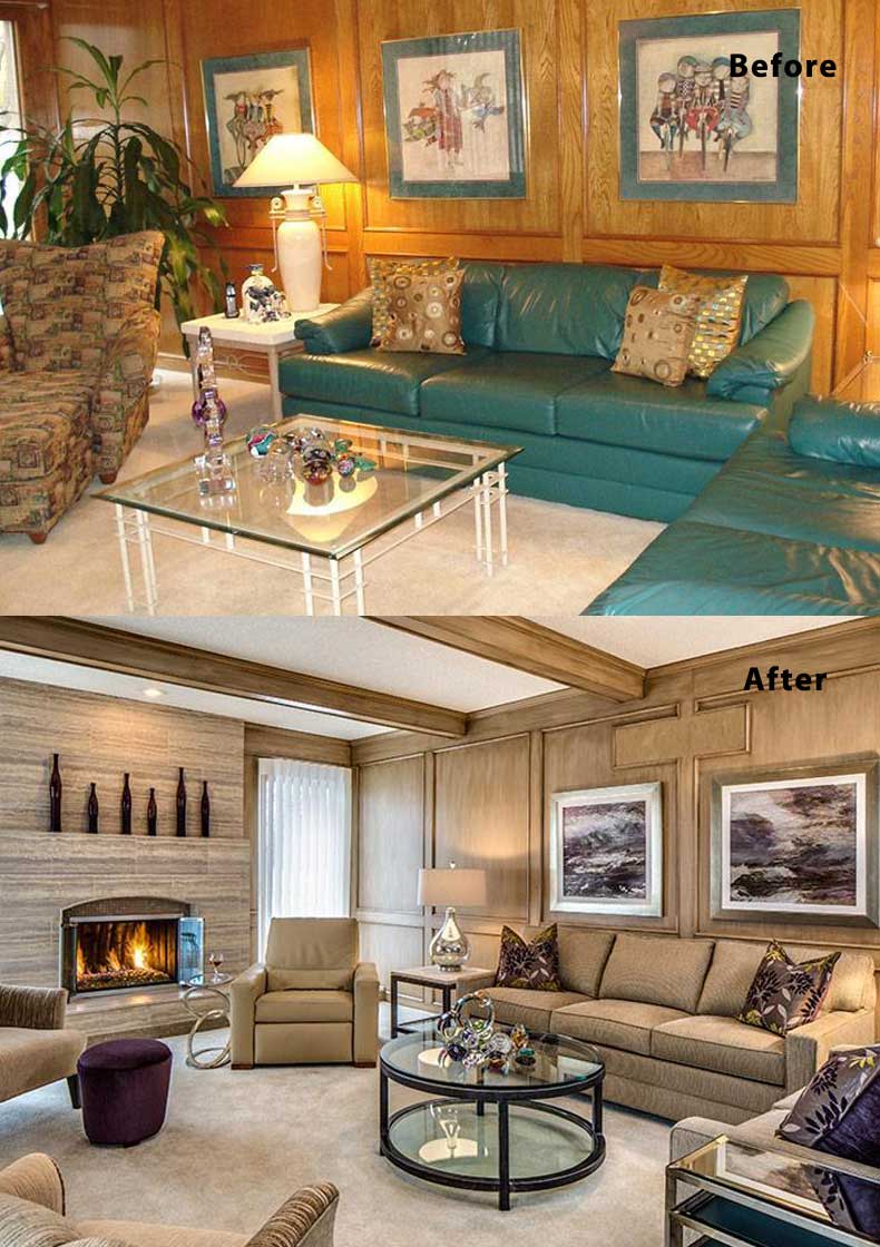
The main attraction in the first room is the paintings on the wall; the rest of the room looks cluttered, dark and dull. Unless you are going for an ultra-traditional look, your room needs a more modern color palette to make it exciting.
The after picture makes things simpler and more elegant. Notice that it still has the same wood paneling on the walls – it’s just been refinished to a lighter color.
Image via: designconnectioninc.com
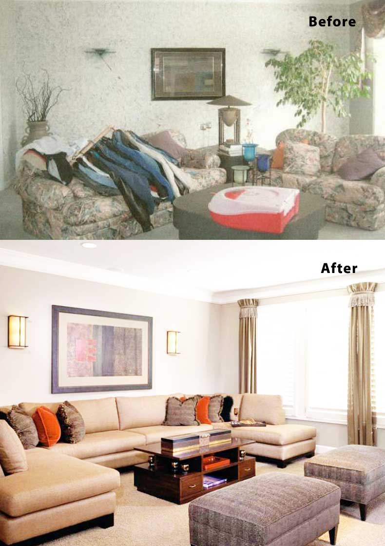
Even without the clothes strewn on the couch, the first picture is unappealing, and there is nothing really exciting about the room.
In the second picture, it’s a whole different ball game – beige and cream furniture and flooring with white walls creates a beautiful atmosphere. A larger painting has been added to keep the wall behind than the sofa from looking so bare.
Image via: plotbrooklyn.com
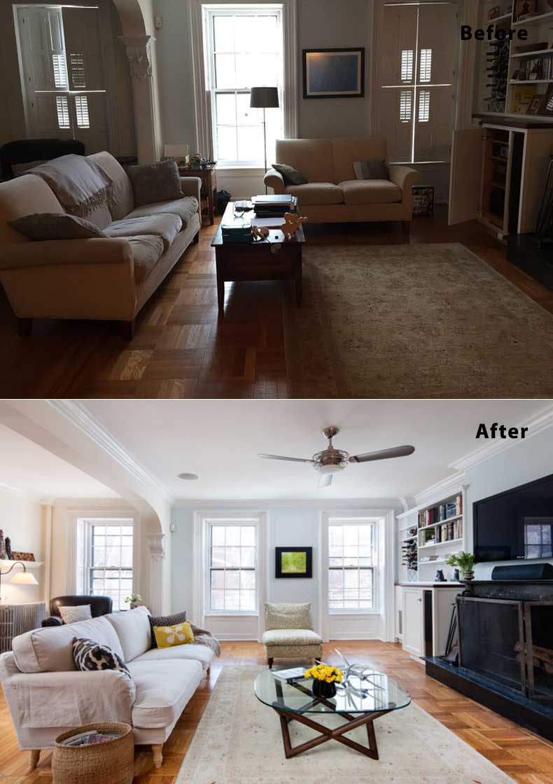
The first picture is a model of a traditional living room. Fifty years ago nobody would have noticed anything wrong with it, but it’s dark, and there is a lot of space that goes to waste here.
When you look at the second picture, the whole room looks elegant, peaceful, and inviting. The modern entertainment center to the right helps a lot, as does the symmetrical décor.
Be aware that a remodeling this extensive would take a lot of work – you would need to go through color change, flooring change and overall rearrangement of the whole room.
Image via: sallyjenseninteriors.com
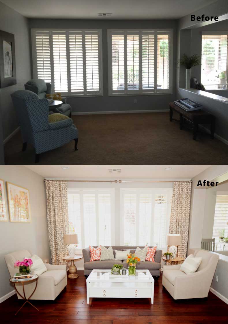
Aside from being too dark, the room in the first picture is so empty that it looks barren and uninviting.
In the second picture, the blinds have been removed, so the two large windows become more useful as a source of natural light and outside views. The room is completely cream in color, which is now common in modern design.
Image via: designmanifest.com
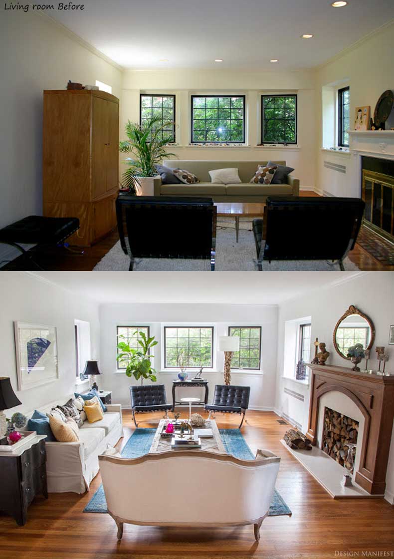
The second living room is comfortable, with soft, warm colors. The color palette features the classic triad of brown, beige and white, and the subtle lighting further helps to add warmth to the room.
The accent wall features a rusty metal mirror and there is adequate space between the sofa, coffee table and fireplace to make movement easy. The décor and the natural light promote an inviting and engaging atmosphere.
Contrast this with the first picture – there was not much imagination and creativity, and you can see why it had to get an overhaul.
Image via: jhalvorsondesigns.com
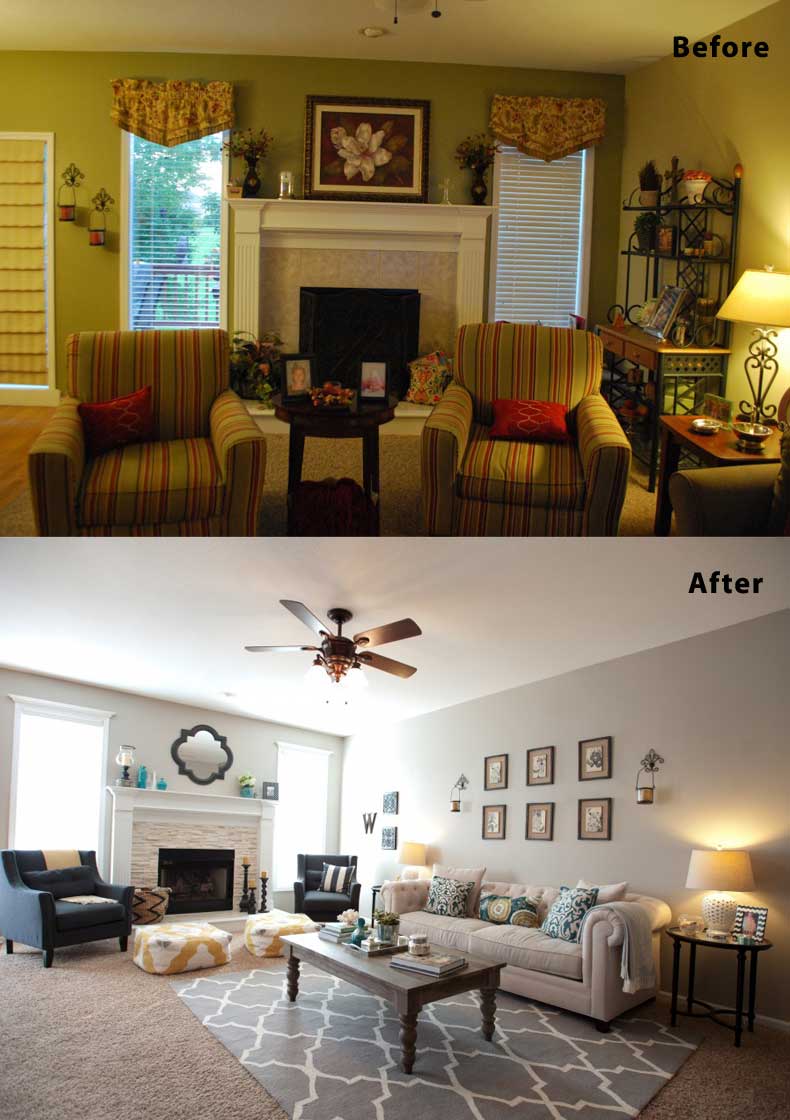
The first picture shows a decent design for a small room that could work with some color schemes. However, it’s crowded, and the style and color palette used here would hardly have universal appeal.
Décor has to fit not only the budget but also taste and lifestyle. In this setting, the dominant yellow-green and low lighting give the whole room a dull.
After remodeling, you can see the color palette is now clean, and the room is neater. The cream color on the wall succeeds in making the room look bigger.
Image via: awelldressedhome.com
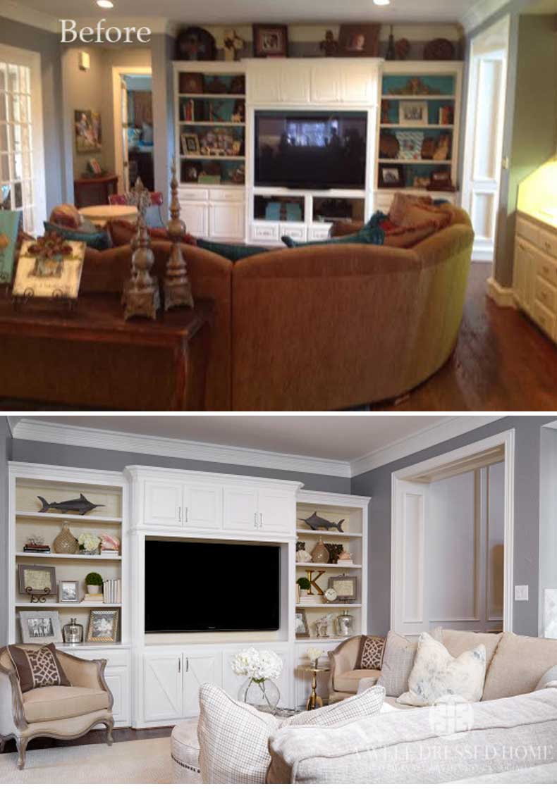
To someone who cares about modern design, the first picture is just terrible, dull and totally unacceptable. You can see there is no creativity in this living room, and it desperately needs to be remodeled.
As often happens, brightening up the color scheme has turned things around completely in the second picture, and classy new furniture has replaced that ugly brown sofa. This is another project that could take you weeks to finish, but you’d be well satisfied with the result.

