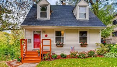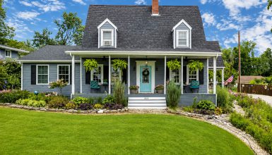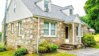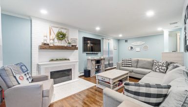
What makes a small house feel grand without making it feel formal? This Cape Cod exterior offers a clear answer. It uses a simple shape, a steep roof, neat dormers, and a calm black-and-white color plan. Then it adds warmth through brick, aged roof shingles, soft lighting, and lush green plants.
The result feels fresh but not trendy. It looks polished, yet it still has the ease of a true family home. Every part has a clear role. The dormers add height. The shutters frame the windows. The brick path pulls the eye toward the door. Meanwhile, thick hedges make the white walls look even brighter.
The front may get the first look, but the side and rear spaces matter just as much. A small deck creates an outdoor room. A brick patio rests under mature trees. Tall hedges turn the yard into a private garden.
Here is a closer look at the design choices that give this Cape Cod house so much charm.
1. A Simple Cape Cod Shape
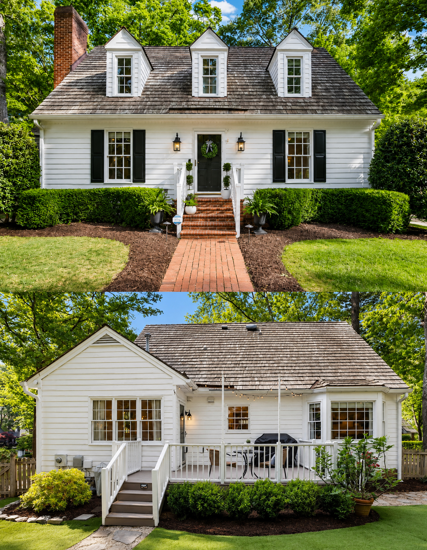
The home begins with a long, low form. Its main section looks neat and balanced. A steep roof covers most of the upper level, so the house still feels like a cozy one-and-a-half-story cottage.
This compact shape is one of the main signs of Cape Cod style. Early Cape homes used plain forms because they were easy to build and heat. Modern versions often add dormers, larger windows, and rear rooms. Even so, the basic shape stays simple.
That simplicity gives this home a calm look. There are no large towers, deep front porches, or busy roof lines. Instead, the design depends on balance, scale, and fine trim.
The wide front wall also creates a strong base. The roof then becomes the main visual feature. This makes the home feel grounded, while the dormers keep it from looking too flat.
Design cues:
- Long and simple front shape
- One-and-a-half-story form
- Steep roof with few breaks
- Low eaves that add a snug feel
- Balanced front layout
2. A Bright White Exterior
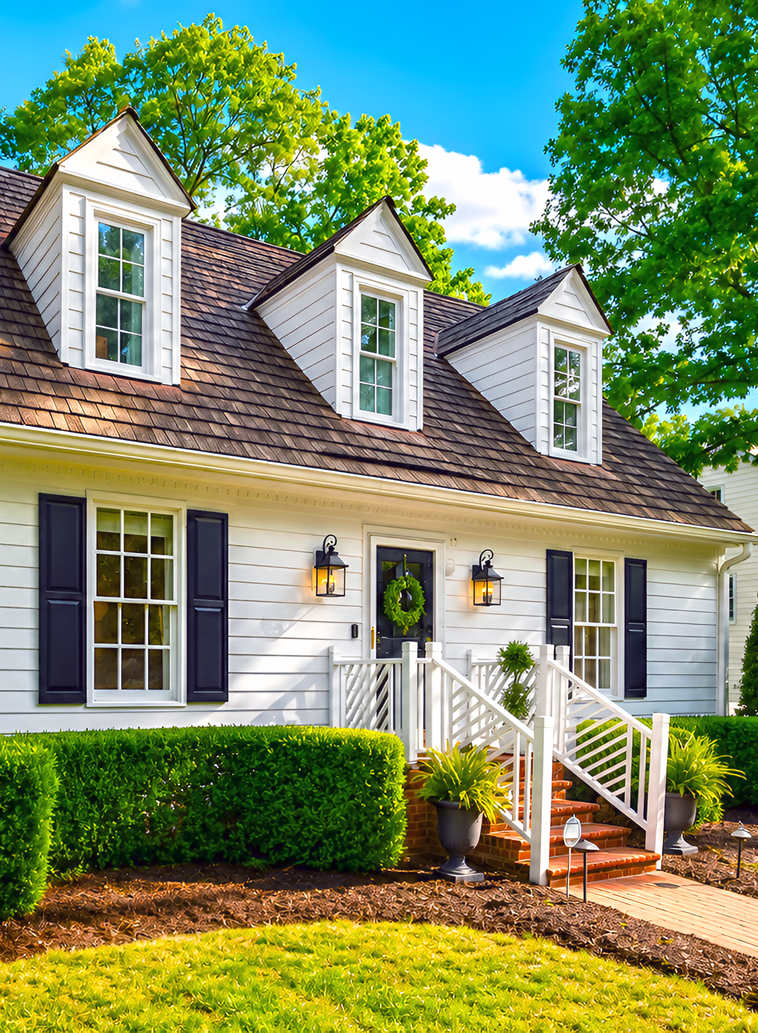
White siding gives this Cape Cod house its crisp, clean mood. It reflects the light and helps the home stand out beneath the deep green tree canopy.
The color also fits the simple form. A bold wall color might draw too much focus from the roof, brick, and windows. White lets each feature play its part without making the front feel busy.
The siding runs in clean horizontal lines. This helps the broad front feel even wider. It also adds fine texture without adding strong color.
White trim blends with the siding, yet the layers remain easy to see. The window frames, eaves, corner boards, and dormers all share the same light tone. As a result, the shell looks smooth and whole.
This style works well in a shady setting. Even when tree branches cast moving shadows across the walls, the home stays bright.
Design cues:
- White horizontal siding
- Matching white trim
- Light-painted dormers
- Clean corner boards
- Soft contrast with the garden
3. Black Shutters That Frame the Windows
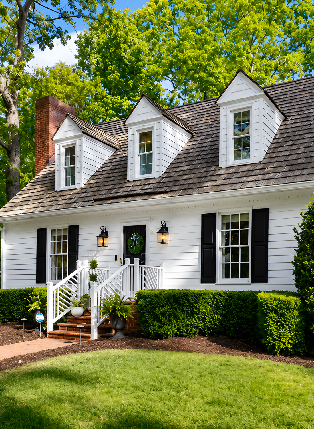
The black shutters give the front a clear rhythm. They sit beside the lower windows and create bold vertical lines against the white siding.
This contrast feels classic. It also helps the windows look larger and more important. Without the shutters, the front might feel too plain. With them, each window becomes a neat design feature.
The simple raised-panel style suits the home. It does not add fussy trim or ornate shapes. Instead, it supports the direct and practical nature of Cape Cod design.
Black also connects several parts of the exterior. The shutters relate to the front door, lanterns, patio furniture, and rear screen door. Repeating one dark shade keeps the whole property tied together.
The key is restraint. Black appears in small, useful doses. White still leads the design.
Design cues:
- Black raised-panel shutters
- Strong contrast with white siding
- Matching dark door and lights
- Simple shapes with little trim
- Even spacing around the windows
4. Three Gabled Dormers
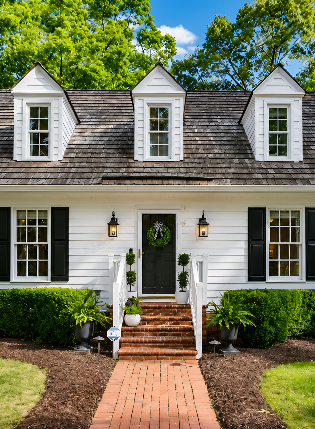
Three dormers rise from the front roof. They give the upper floor more light, more headroom, and a clear sense of order.
Each dormer has a small gable roof. White siding wraps the sides, while white trim frames the tall window. The narrow shape keeps the dormers in scale with the modest house.
The three-part layout works well because it forms a steady beat across the roof. The middle dormer sits above the entry, which adds focus to the center. The two outer dormers then support the balanced look.
Dormers can easily become too large. Here, they stay slim. Plenty of roof remains visible around them. That open roof space helps the house keep its cottage feel.
The gable faces also add bright white peaks to the darker roof. This brings the eye upward without making the home look tall or heavy.
Design cues:
- Three evenly spaced dormers
- Narrow vertical windows
- Small gable roofs
- White siding and trim
- Center dormer aligned with the door
5. A Weathered Shingle Roof
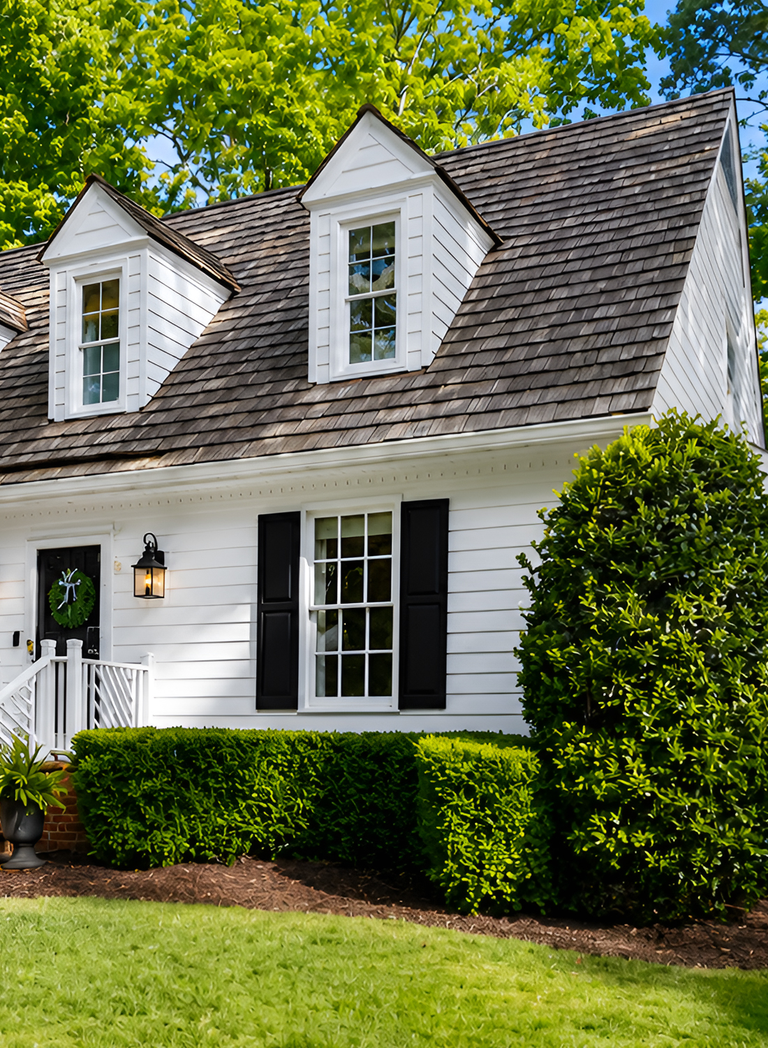
The roof brings warmth and age to the clean white walls. Its brown and gray tones have a soft, weathered look. This keeps the exterior from feeling too sharp or new.
The small shingle pattern adds rich texture. From a distance, the roof looks calm. Up close, each row creates a fine mix of natural tones.
This is an important part of the design. A solid black roof would create a much bolder look. It could also make the front feel more formal. The softer roof tone gives the home a relaxed garden-cottage mood.
The shingles also blend with the tall trees around the house. Brown trunks, green leaves, brick, mulch, and roof tones all feel linked.
Because the roof covers so much of the front, its color has a strong effect. The warm shade balances the cool white siding and black trim.
Design cues:
- Brown and gray roof tones
- Small-scale shingle texture
- Soft, aged surface
- Deep roof slope
- Natural colors that suit the trees
6. A Traditional Brick Chimney
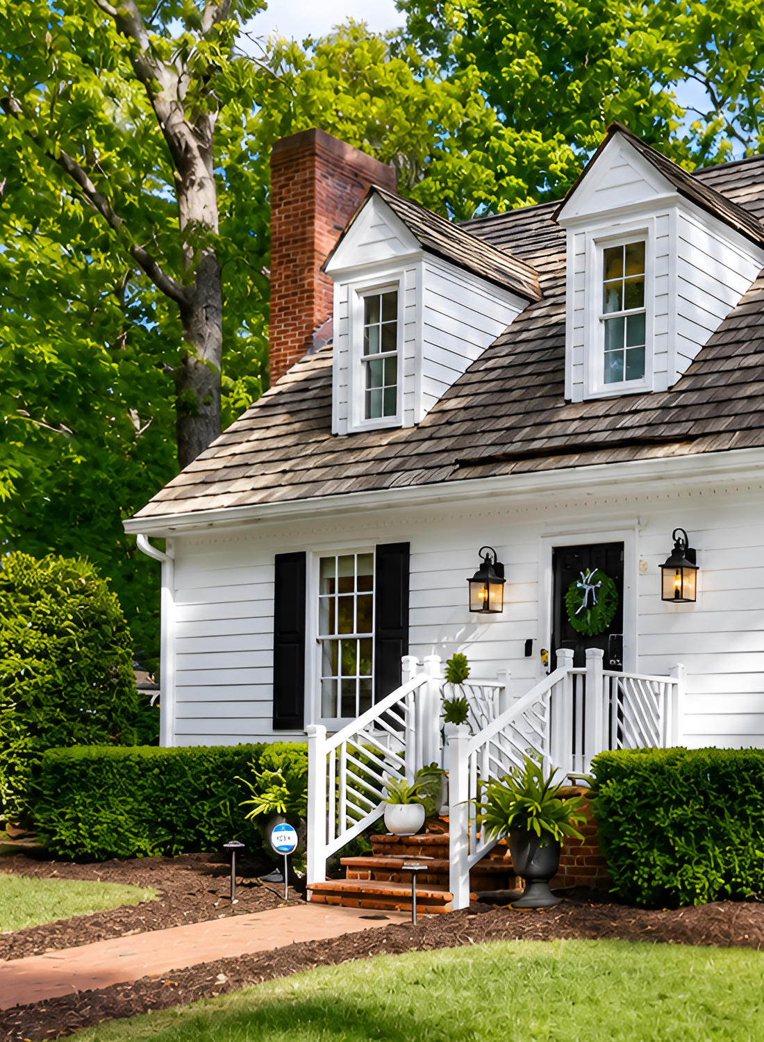
A tall brick chimney rises at one end of the house. Its warm red tone breaks up the white and adds a strong sense of history.
The chimney also gives the roof line an anchor. Dormers fill the center, while the chimney adds weight at the side. This slight lack of perfect balance makes the house feel real and lived in.
Brick works well with Cape Cod style because it brings a plain, useful material into the design. It also links the roof to the brick steps and front walk.
The brick does not cover a large part of the front. That makes it more effective. It acts as an accent rather than a full wall finish.
Its weathered color also fits the setting. Fresh, bright red brick might feel harsh beside the old roof. Here, the deeper mix of reds and browns feels soft and settled.
Design cues:
- Tall side chimney
- Warm red and brown brick
- Simple rectangular form
- Brick repeated at the entry
- Slightly weathered finish
7. A Centered Front Entry
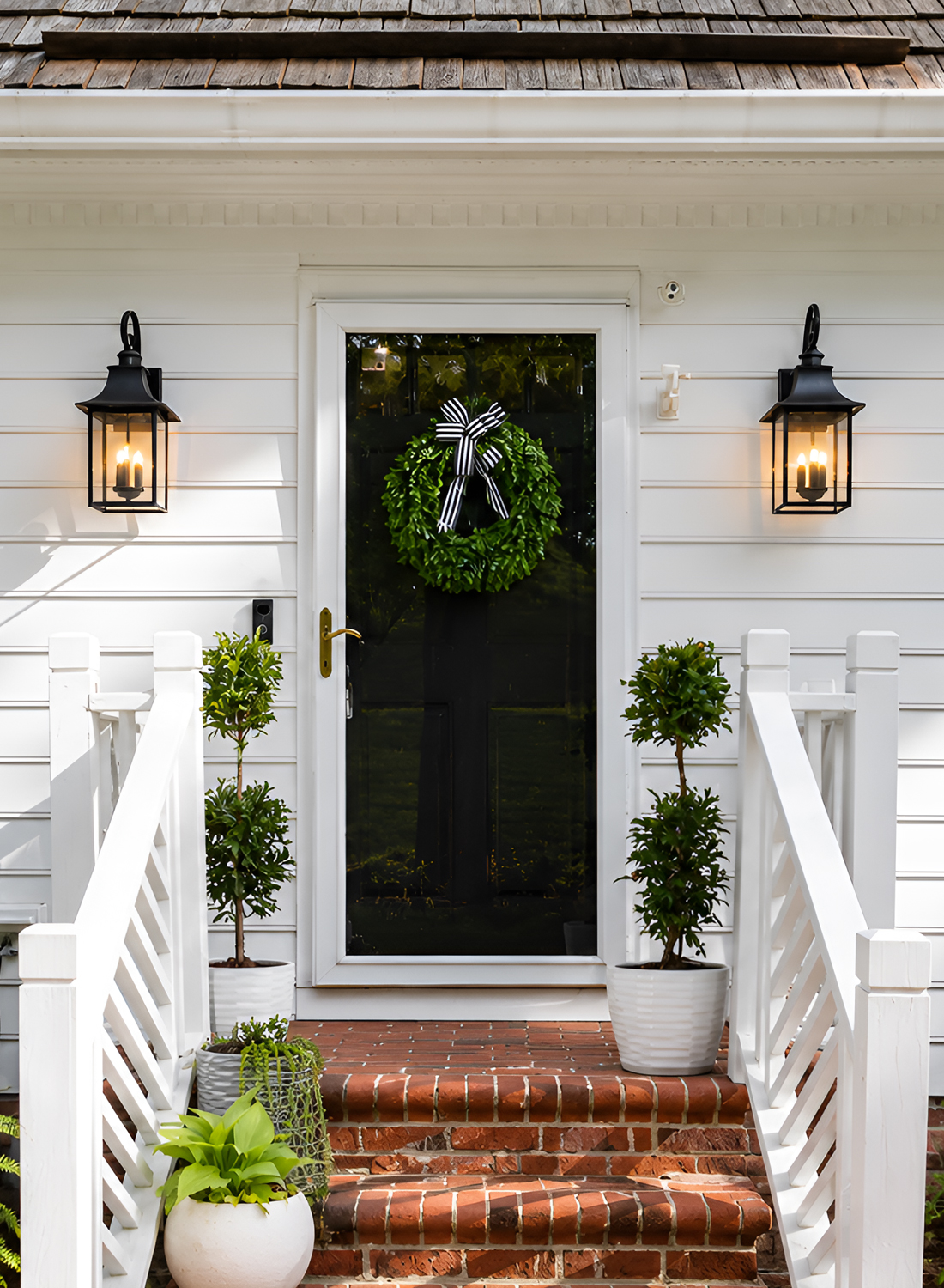
The front door sits close to the center of the house. Windows on both sides help create the classic balanced look linked to Cape Cod and Colonial homes.
A dark screen door adds depth without hiding the lighter trim. The glass panel also lets the door area feel open. A green wreath softens the black surface and adds a friendly note.
The entry has no large covered porch. Instead, brick steps and white rails create a small landing. This keeps the main shape easy to see.
The door area feels formal enough to mark the entrance, yet it does not feel grand. That scale suits the home. It tells guests where to go without taking over the front.
Small topiary plants stand beside the door. Their slim shapes frame the entry and repeat the neat style of the dormers above.
Design cues:
- Near-centered front door
- Dark door or screen door
- Clear glass panel
- Green wreath for soft color
- Matching potted plants on each side
8. Brick Steps and a Straight Walk
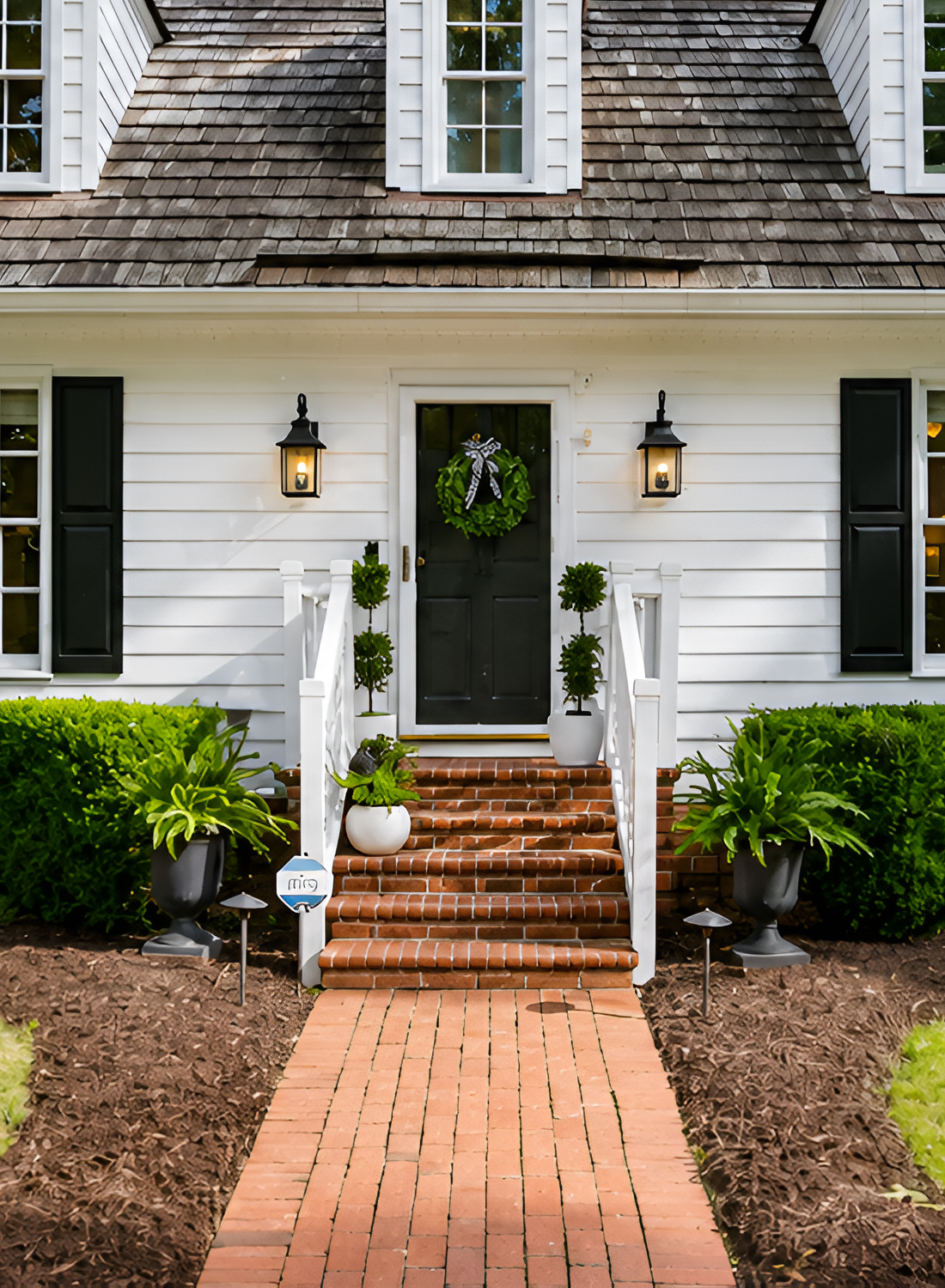
The brick path creates a clear line from the lawn to the front door. This simple move makes the small entry feel more important.
The path is narrow, which fits the scale of the house. It does not cut too much into the lawn or garden beds. Instead, it forms a warm red strip through the green yard.
At the base of the entry, the path meets several brick steps. The matching material makes the walk feel like part of the house rather than a later add-on.
Brick also adds useful texture. The white siding is smooth. The black details are flat and bold. Brick brings small color changes, rough edges, and an old-home feel.
The straight route strengthens the front symmetry. It leads the eye to the door, then up to the middle dormer.
Design cues:
- Straight front walkway
- Red and brown brick tones
- Brick steps with simple edges
- Narrow path in scale with the home
- Direct link between street and door
9. White Railings with Diagonal Detail
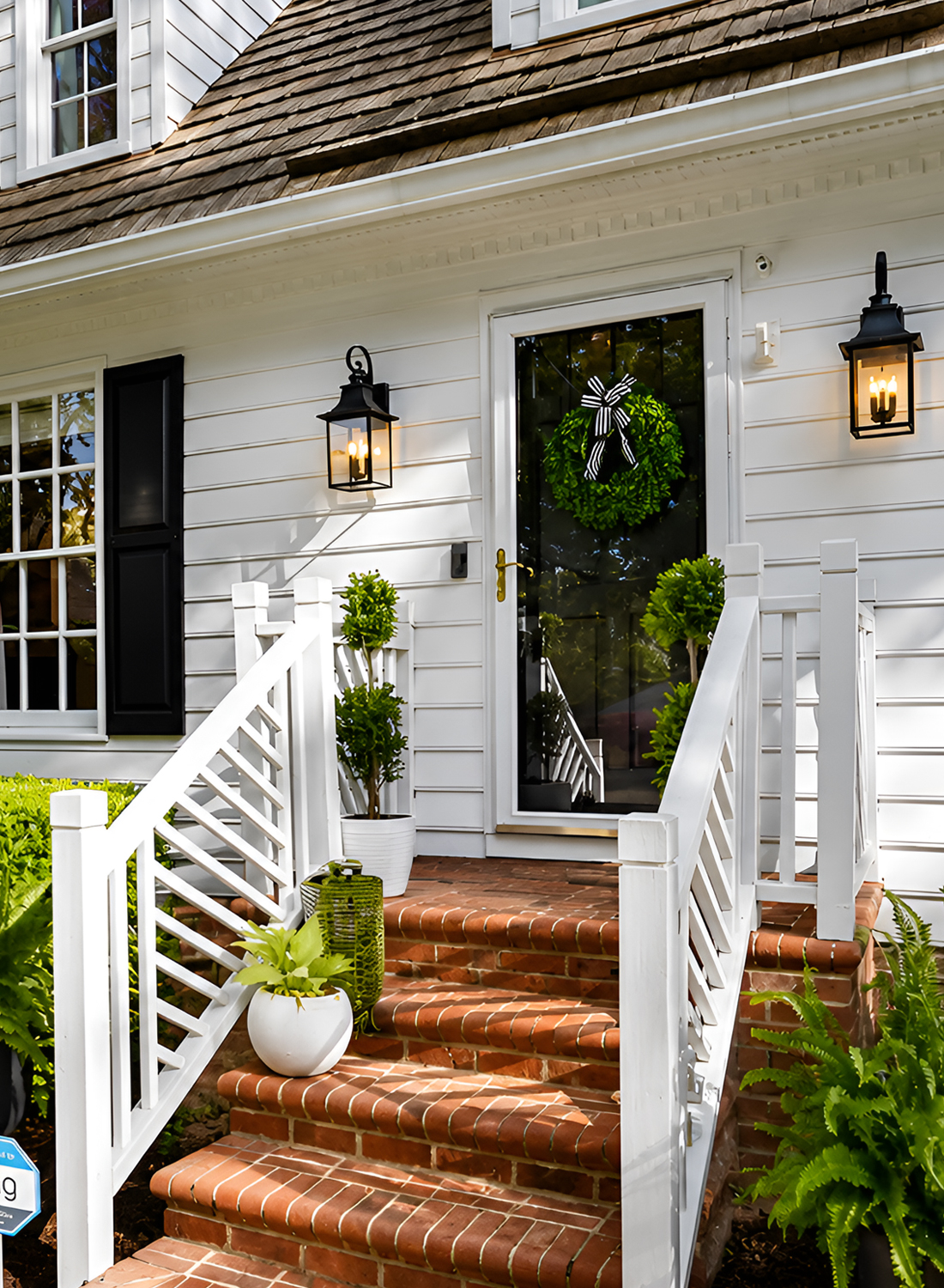
The small front stair uses white rails with slim diagonal slats. This adds a light pattern without making the entry feel closed.
The white paint helps the rails blend with the siding. As a result, the brick steps remain the main feature. The railing gives safety and shape, but it does not pull too much focus.
Square posts give the stair a firm outline. Their simple caps suit the direct style of the house. The diagonal inner detail adds just enough charm.
This railing design also appears near the side and rear areas. That repeat creates a clear link from the front to the back.
Because the railings have open gaps, light can pass through them. Plants and brick remain easy to see. This keeps the small landing from feeling crowded.
Design cues:
- White-painted wood rails
- Square posts and simple caps
- Open diagonal slats
- Light visual weight
- Matching rails around the home
10. Warm Black Lanterns
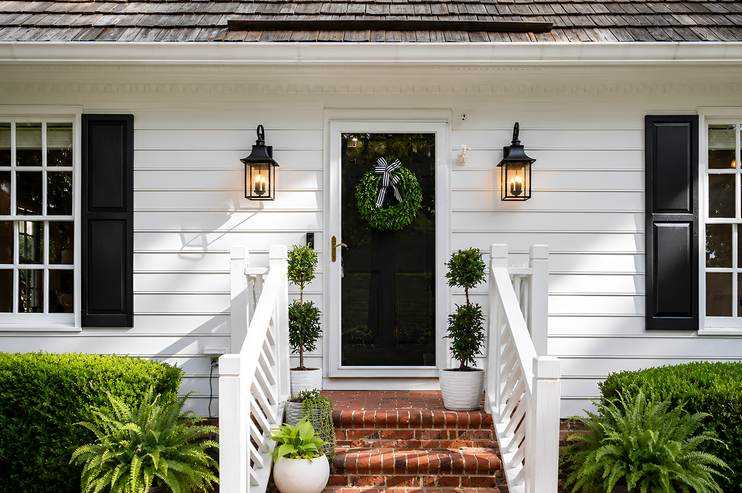
Two black wall lanterns flank the front door. Their size feels right for the small entry, while their warm glow makes the white wall feel cozy.
The lanterns have a clear glass body and a classic frame. This style fits the shutters and dark door. It also adds a hint of old-world charm without feeling too ornate.
Their placement matters. One light sits on each side of the door. This keeps the entry balanced and makes the steps safer at night.
The dark metal casts bold shadows in the sun. Those shadows add another layer of detail to the plain white siding.
A smaller black fixture appears at the side door. This repeat helps the front, side, and rear spaces feel like parts of one plan.
Design cues:
- Black metal frames
- Clear glass panels
- Warm-toned bulbs
- Matching lights beside the door
- Smaller fixtures at secondary entries
11. Neat Foundation Planting
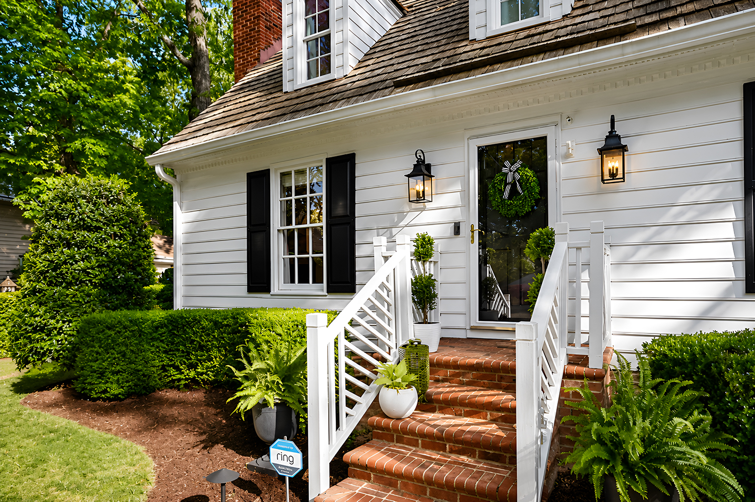
Low, clipped hedges run across the front of the house. They form a strong green base below the white siding.
The flat hedge tops echo the long wall. They also hide parts of the foundation and help the home feel settled into the yard.
Larger shrubs stand near the corners. Their taller shapes soften the edges of the house. Ferns near the steps add a looser texture and keep the garden from looking too stiff.
This mix works because it uses only a few forms. There are low blocks, tall rounded shrubs, and soft leafy plants. The garden looks full, yet it stays calm.
Dark mulch gives the beds a clean finish. It also makes the green leaves and red brick look brighter.
Design cues:
- Low clipped hedges
- Taller shrubs near the corners
- Ferns beside the steps
- Dark mulch in curved beds
- Clear lawn edges
12. Mature Trees and Filtered Shade
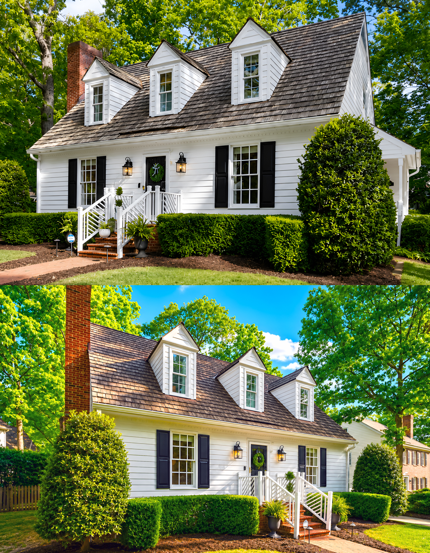
Large trees surround the house and create a green ceiling over the yard. Their scale makes the cottage look tucked into the landscape.
The trees also filter the sun. Light and shadow move across the white walls, roof, and lawn. This gives the simple exterior a soft, changing look through the day.
A mature setting can make a newer paint plan feel more natural. Here, the black and white scheme does not look stark because leaves, bark, brick, and mulch add many warm shades.
The house also respects the trees. The planting beds and paths curve around them rather than fighting the site.
This is part of the home’s appeal. The building and garden feel connected. Neither one seems placed on top of the other.
Design cues:
- Large shade trees
- Layered green canopy
- Soft light across the siding
- Natural brown and green tones
- Open lawn beneath the branches
13. A Quiet Side Entrance
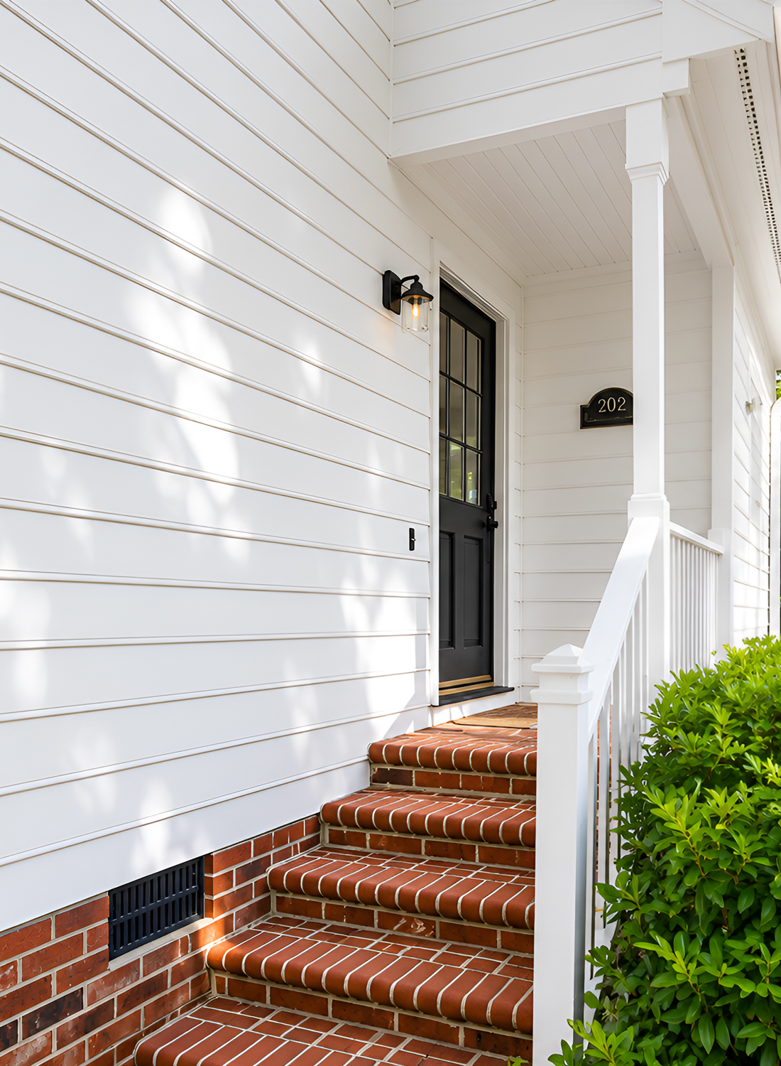
The side entrance is small and useful. Brick steps lead to a dark door beneath a shallow roof. A single light marks the spot.
This area does not try to copy the front entry. It has less trim and fewer plants. Even so, it uses the same core materials. White siding, brick, black metal, and white rails keep the look consistent.
The narrow side route also shows how the home sits close to its garden. Shrubs line the path and create a sense of privacy.
A side entrance like this works well for daily use. It can connect to a driveway, kitchen, mudroom, or utility space. Meanwhile, the front door remains the main guest entry.
Design cues:
- Small covered side stoop
- Brick steps
- Dark door
- Single black wall light
- Simple white handrail
14. A Small Rear Deck
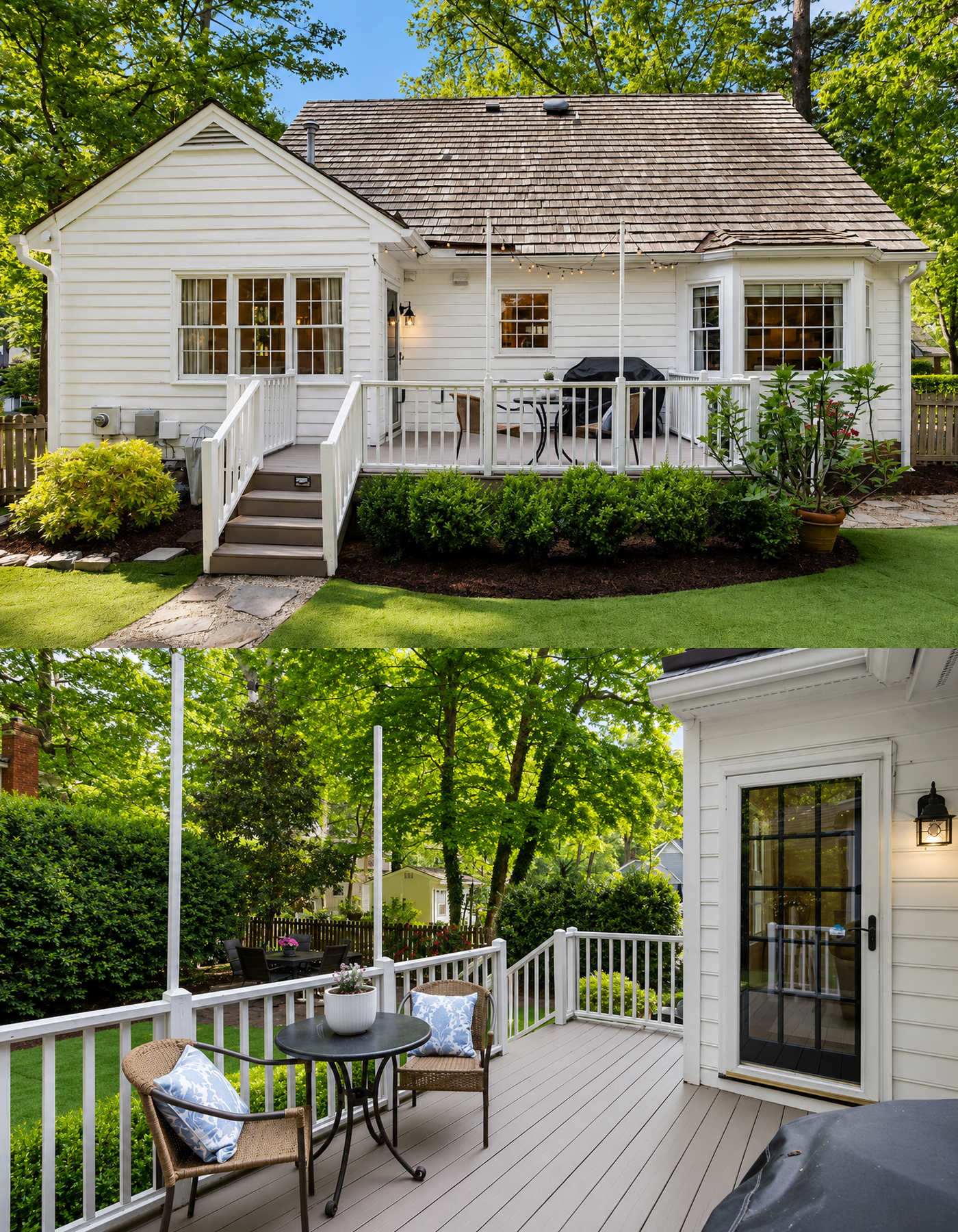
The rear deck creates an easy outdoor room. It is large enough for a table, two chairs, and a grill, but it does not overpower the yard.
Light gray deck boards form a soft base. White rails connect the deck to the house trim. Black and brown furniture then repeat the darker accents seen at the front.
The deck sits only a few steps above the yard. This low height makes it feel linked to the garden rather than cut off from it.
Tall posts hold string lights above the seating area. At night, these lights can make the deck feel warm and enclosed.
The setup remains simple. There is room to eat, talk, or cook outdoors. However, open floor space keeps the deck easy to move through.
Design cues:
- Low raised deck
- Pale gray floor boards
- White perimeter rails
- Small café table and chairs
- Grill placed near the house
- Overhead string lights
15. A Private Green Backyard
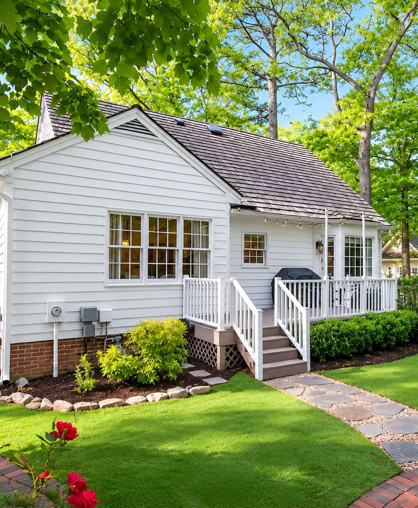
Tall hedges surround the rear yard. They act like living walls and screen views from nearby homes.
The open center uses a smooth green ground cover. It gives the yard a neat look with very little visual clutter. The bright surface also helps the shaded space feel lively.
A stone path links the deck to the lower patio. This creates an easy flow between the two outdoor areas.
The yard feels private, but it does not feel closed in. Tall trees lift the view upward. The open lawn keeps the center clear. Plants stay near the edges.
This layout works well in a small city or suburban lot. It makes every part of the yard useful while still leaving room to breathe.
Design cues:
- Tall privacy hedges
- Clear open center
- Green lawn or low-care turf
- Stone path between outdoor zones
- Dense plants along the fence line
16. A Shaded Brick Patio
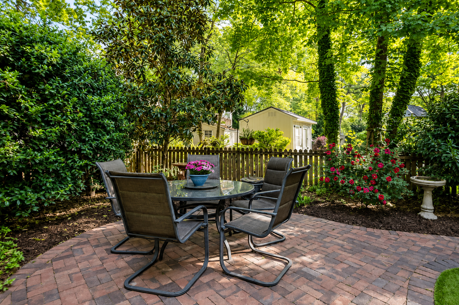
The brick patio adds a second place to sit outdoors. It rests beneath mature trees and feels more like a garden room than a deck.
A round table fits the curved patio shape. The open metal chairs keep the setup light. They also relate to the black details used on the house.
Brick gives the patio warmth and age. It repeats the front path and steps, so the rear yard feels tied to the home’s main design.
Flowering plants add color near the fence. A small birdbath brings a classic garden detail. Dense shrubs form a green wall around the space.
This patio does not need a large outdoor kitchen or built-in fireplace. Shade, privacy, brick, and a simple dining set create all the comfort it needs.
Design cues:
- Brick patio floor
- Round outdoor table
- Dark metal chairs
- Flowering shrubs
- Small birdbath or garden accent
- Deep shade from mature trees
Conclusion
This Cape Cod house proves that simple details can create lasting curb appeal. The steep roof, balanced windows, dark accents, and warm brick bring timeless style to the exterior. Meanwhile, the deck, garden patio, and green landscaping make the home feel just as inviting from the back.