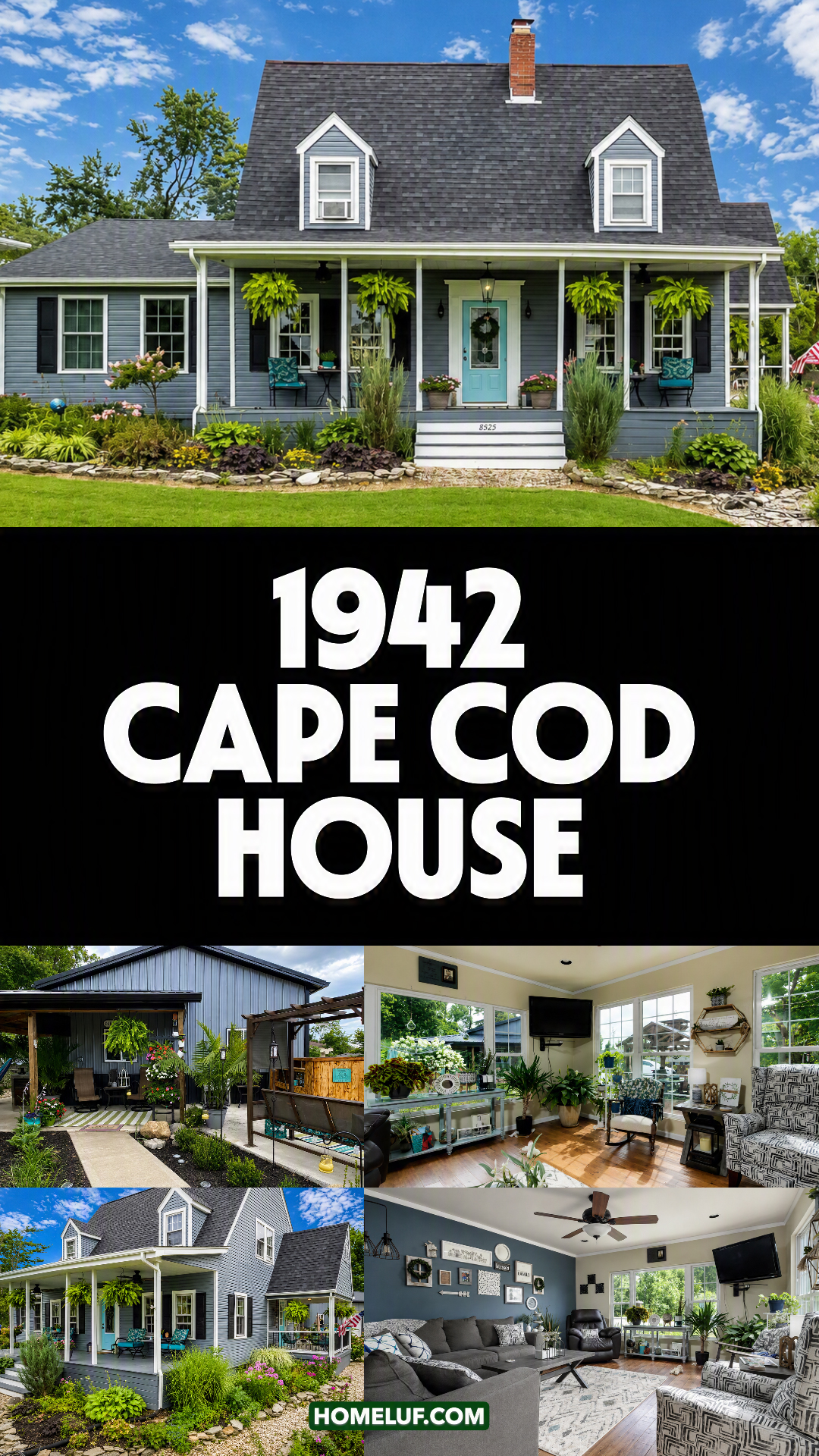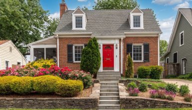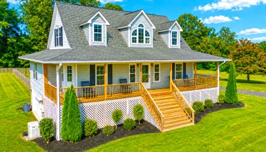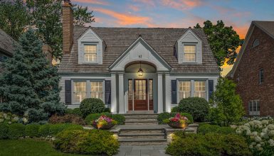
What gives a 1942 Cape Cod house its lasting charm? This cozy home blends classic architecture with fresh color, warm wood, and relaxed farmhouse touches. Gray-blue siding, crisp white trim, dormer windows, and a cheerful aqua door set the tone outside. Inside, blue cabinetry, hardwood floors, rustic barn doors, and light-filled rooms create a home that feels both old and new.
Here is a closer look at the design and the cues that make it work.
1. A Classic Cape Cod Shape Sets the Tone
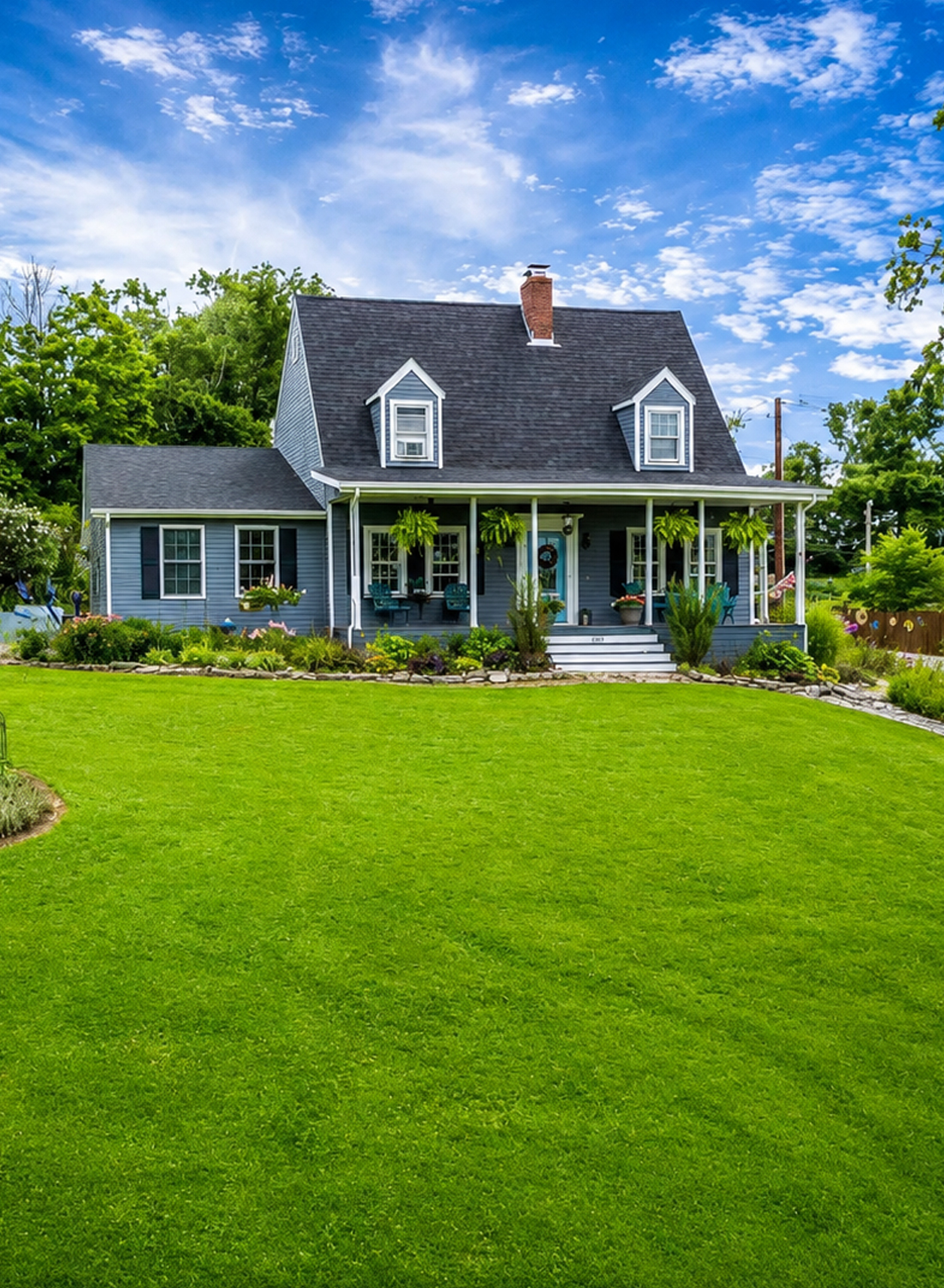
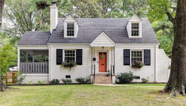
The first view gives the house its strongest Cape Cod signal.
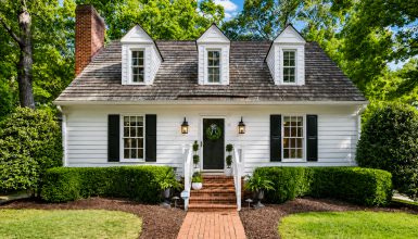
The main roof rises at a steep angle. That tall roof gives the home a simple, cottage-like form. It also makes the second story feel tucked into the roof rather than stacked high above the first floor.
Two front dormers break through the roof. Their small gabled tops add charm without making the front too busy.
The dormers also help balance the front elevation. Their white trim stands out against the dark roof and blue-gray siding.
A brick chimney adds another traditional detail. Cape Cod homes often used chimneys as key parts of the exterior design. Here, the warm red brick adds just enough color to keep the roof from feeling flat.
The house does not have perfect front symmetry because of the side additions and porch. Still, the main section keeps a calm, ordered look.
That is important.
Cape Cod style works best when the basic shape stays clear.
Design cues
- Steeply pitched main roof
- Simple rectangular core
- Front-facing gabled dormers
- Brick chimney
- Modest roof overhangs
- Straightforward exterior lines
- Compact upper story tucked into the roof
- Simple cottage-inspired proportions
2. Gray-Blue Siding Gives the Exterior a Fresh Look
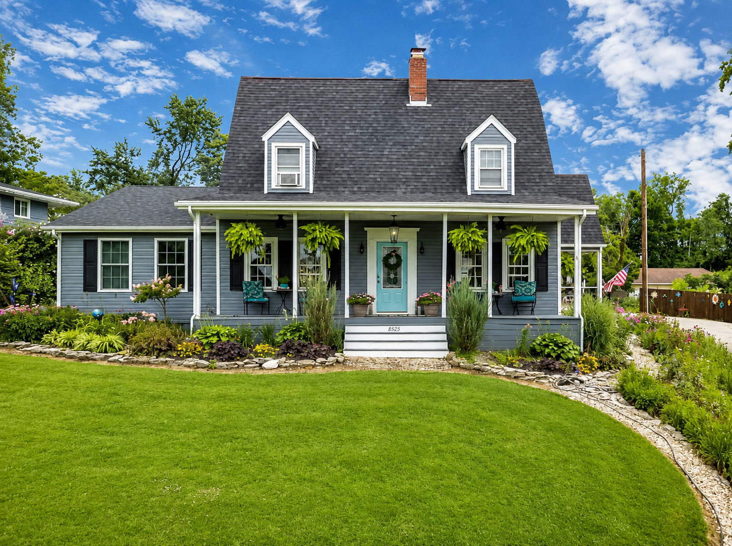
The siding color makes a big impact.
Instead of white, beige, or tan, the house uses a soft gray-blue tone. It feels classic but not dull.
The color also works well with the lush green yard. Grass, hostas, ferns, shrubs, and flowering plants stand out against the cool siding.
White trim keeps the palette crisp.
The fascia boards, porch posts, window frames, dormer trim, and corner boards all share the same light finish. That repetition ties the front together.
Black shutters add a third layer.
They frame the windows and bring a stronger contrast to the walls. The dark roof then repeats that deeper tone.
This simple color plan gives the exterior depth without using too many shades.
Design cues
- Muted gray-blue siding
- Bright white architectural trim
- Dark charcoal roof
- Black or deep brown shutters
- Warm brick chimney
- Green landscaping as a natural accent
- Small touches of turquoise for contrast
3. The Aqua Front Door Adds Personality
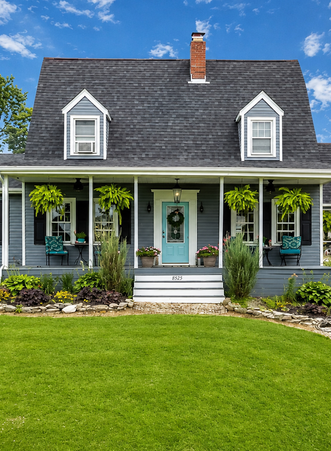
The front door may be one of the smallest parts of the facade, yet it grabs attention right away.
Its pale aqua color feels cheerful.
It also gives the home a more relaxed look. A dark door might have made the front feel more formal. White would have blended into the trim.
Instead, aqua creates a clear focal point.
The color appears again around the property. You can spot similar blue-green tones in porch furniture, rugs, decor, and the garage door.
That repeat is smart.
It keeps the bright color from feeling random.
This is also an easy idea to borrow. You do not need to repaint a whole house to freshen a traditional exterior. One colorful door can do a lot.
Design cues
- Aqua or soft turquoise front door
- White door trim
- Dark wall lanterns
- Seasonal wreath
- Matching blue-green porch accents
- Repeated color in outdoor decor
4. A Deep Front Porch Makes the House Feel Welcoming
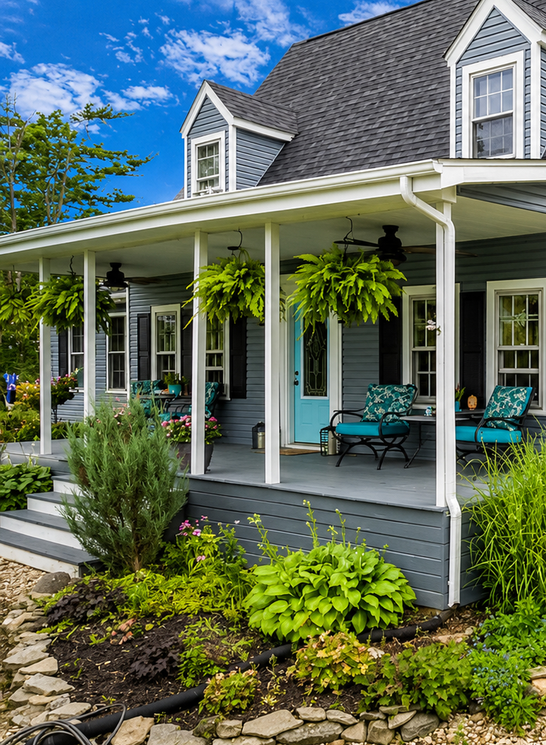
Traditional Cape Cod homes do not always have large porches. However, this addition changes the way the house feels.
The porch stretches across much of the front.
Slim white posts keep it light. The low roof gives the entry shade. It also creates a softer transition between the yard and the front door.
Hanging ferns bring life to the porch ceiling line.
Meanwhile, chairs placed on both sides of the door make the space feel useful. This is not just a decorative porch. It looks like a spot where someone could sit with coffee or talk with a neighbor.
The porch also gives the front more horizontal balance.
That helps ground the tall, steep roof.
Design cues
- Full or near-full-width covered porch
- Simple square or narrow posts
- Gray-painted porch floor
- White trim
- Hanging ferns
- Small seating areas
- Potted flowers near the steps
- Wide central stair
- Casual rather than formal furniture
5. Layered Landscaping Softens the Structure
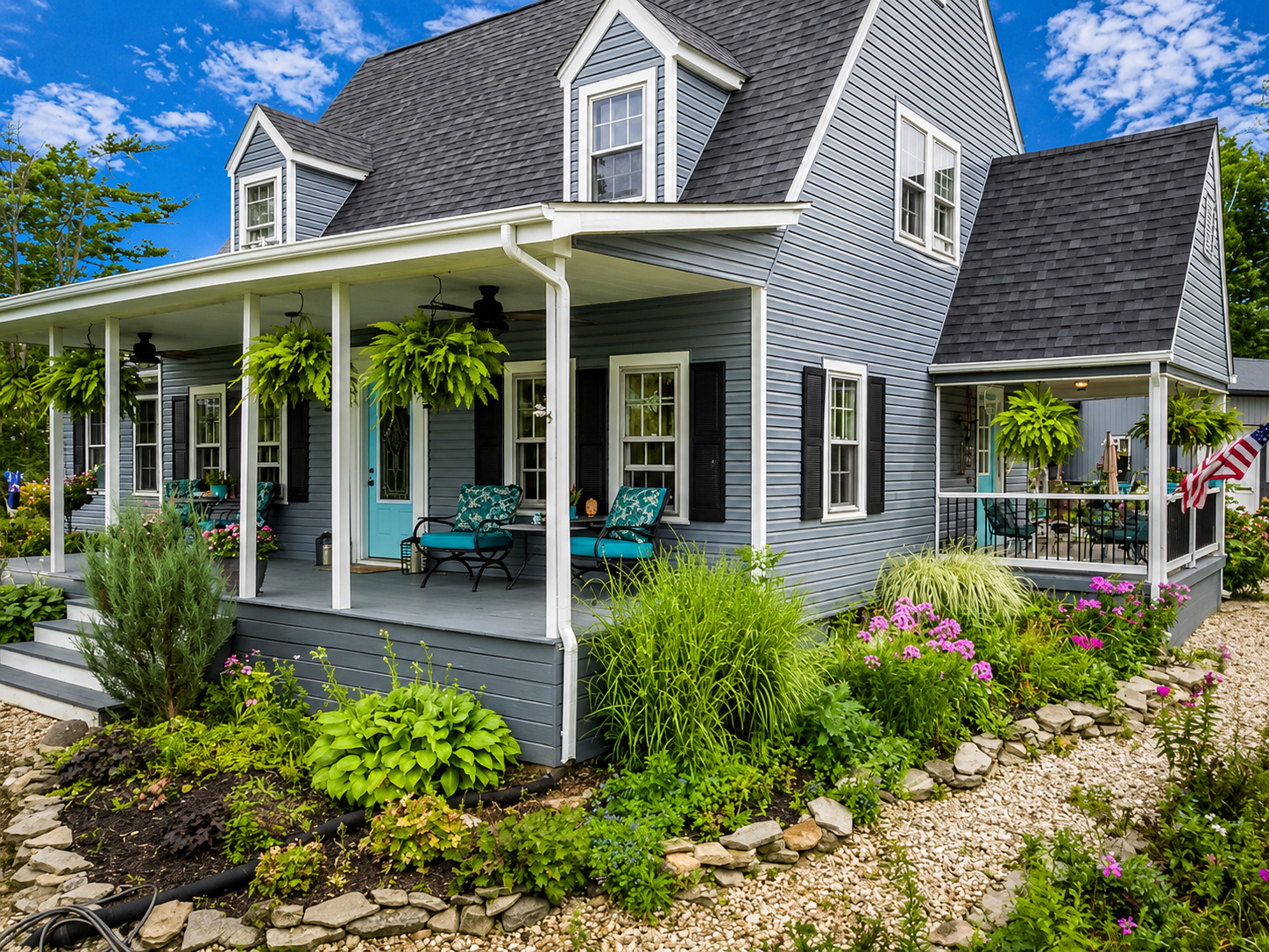
The garden adds another layer of charm.
Instead of straight planting beds, the front yard uses curved edges. Those lines soften the boxy shape of the home.
Different plant heights also create depth.
Low ground covers sit near the lawn. Hostas and flowers fill the middle zone. Taller grasses and shrubs rise closer to the porch.
Stone edging adds a rustic touch.
The mix feels loose rather than perfect. That suits this house. A very formal landscape would fight the casual cottage feel.
The lawn gives the eye a calm place to rest.
Then the denser beds frame the house.
Design cues
- Curved flower beds
- Natural stone edging
- Mixed plant heights
- Ferns and hostas
- Ornamental grasses
- Flowering perennials
- Large green lawn
- Loose cottage-style planting
- Layered greenery near the foundation
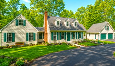
6. Side Additions Make the Old House Work Harder
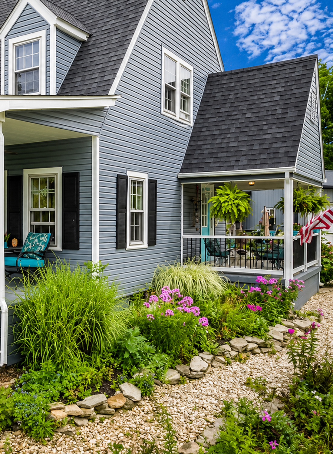
The side view reveals that this home has changed over time.
That is common in older houses.
The original form appears to have gained added living space. Yet the newer sections still use similar siding, trim, roof colors, and window shapes.
That helps them blend with the main house.
The trick is not to copy every old feature.
Instead, the additions repeat enough details to feel connected.
You can see this in the roof lines, gray-blue siding, white window frames, and black accents.
One side also includes a covered porch.
That gives the home another outdoor room and adds more shade.
Design cues
- Additions that echo the main siding color
- White trim used throughout
- Similar roof materials
- Simple rectangular windows
- Connected porch spaces
- Mixed roof heights
- New sections that stay visually quiet
7. The Backyard Feels Like a Collection of Outdoor Rooms
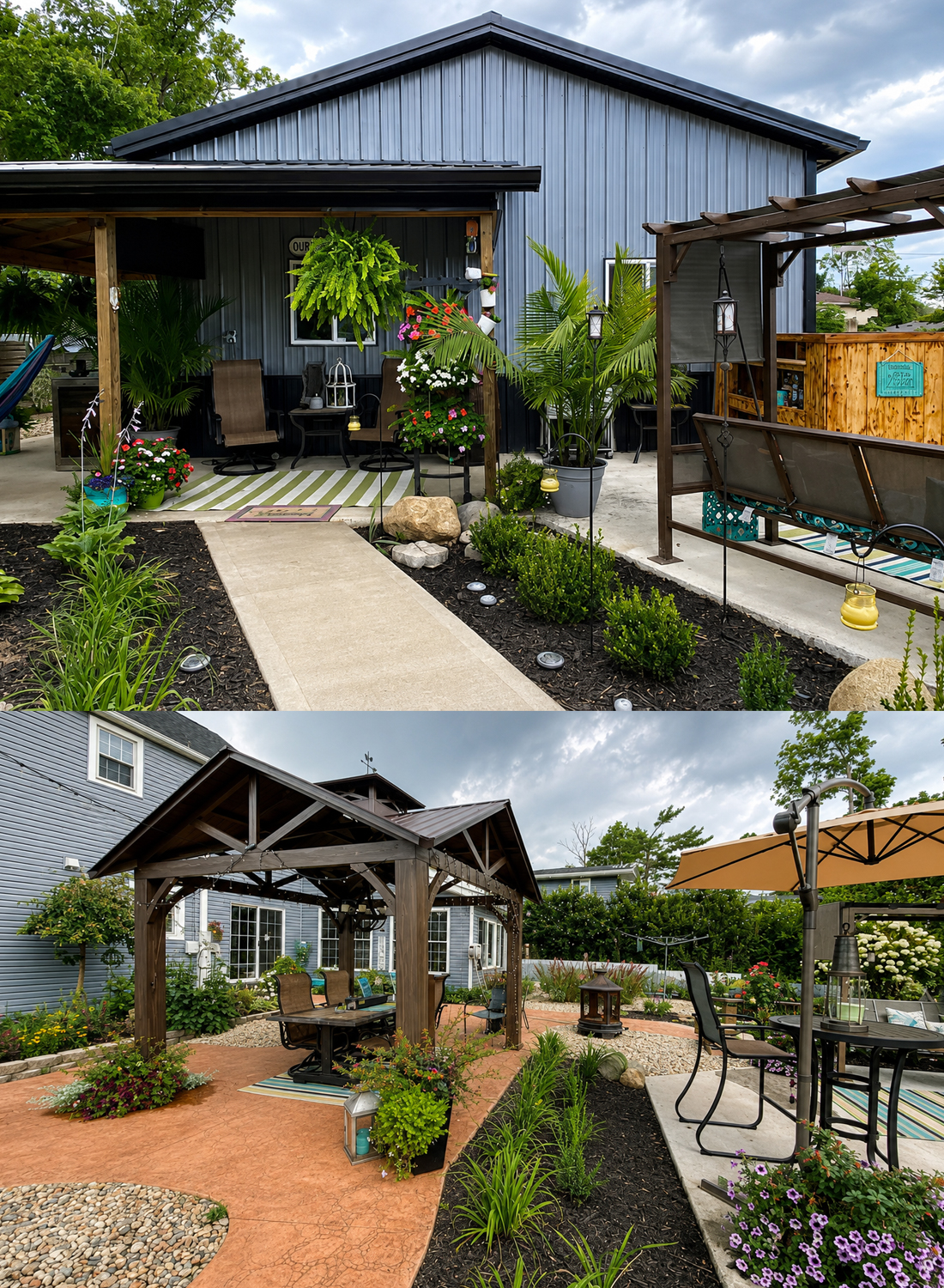
The rear yard goes far beyond a simple patio.
Several zones create places for different types of use.
There is a covered structure with a peaked roof. It works like an outdoor dining room or garden pavilion.
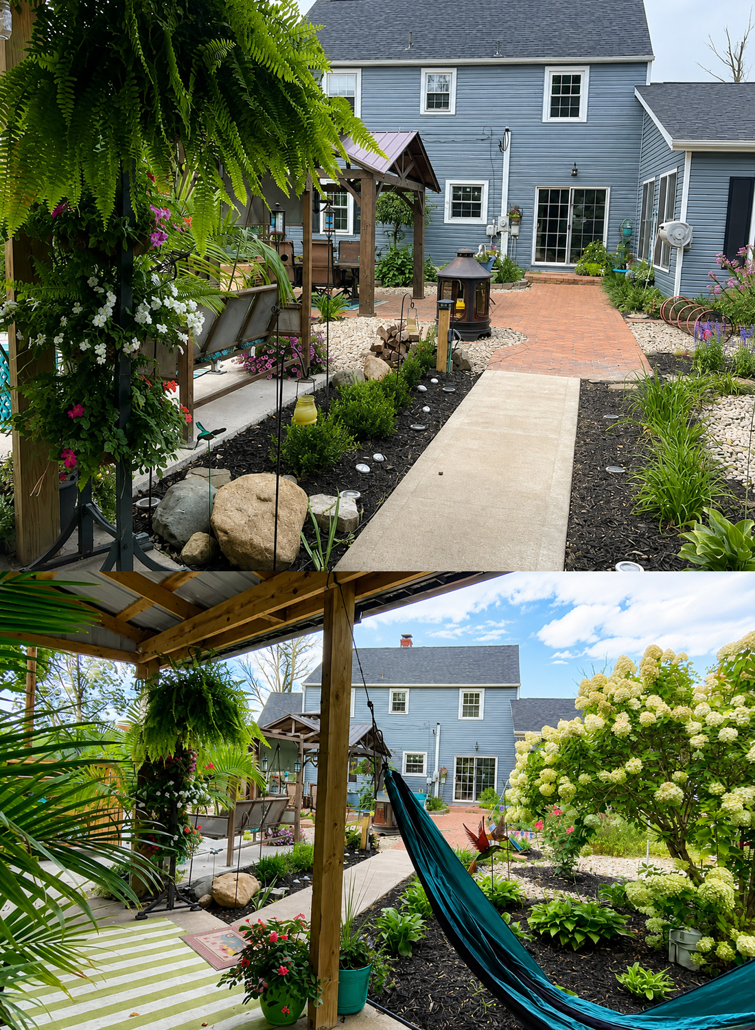
Nearby, another open patio gives space for chairs and a table.
A pergola adds shade to a swing.
Paths connect the spaces.
This layered plan makes a large yard feel more intimate. Instead of one open area, you get several smaller destinations.
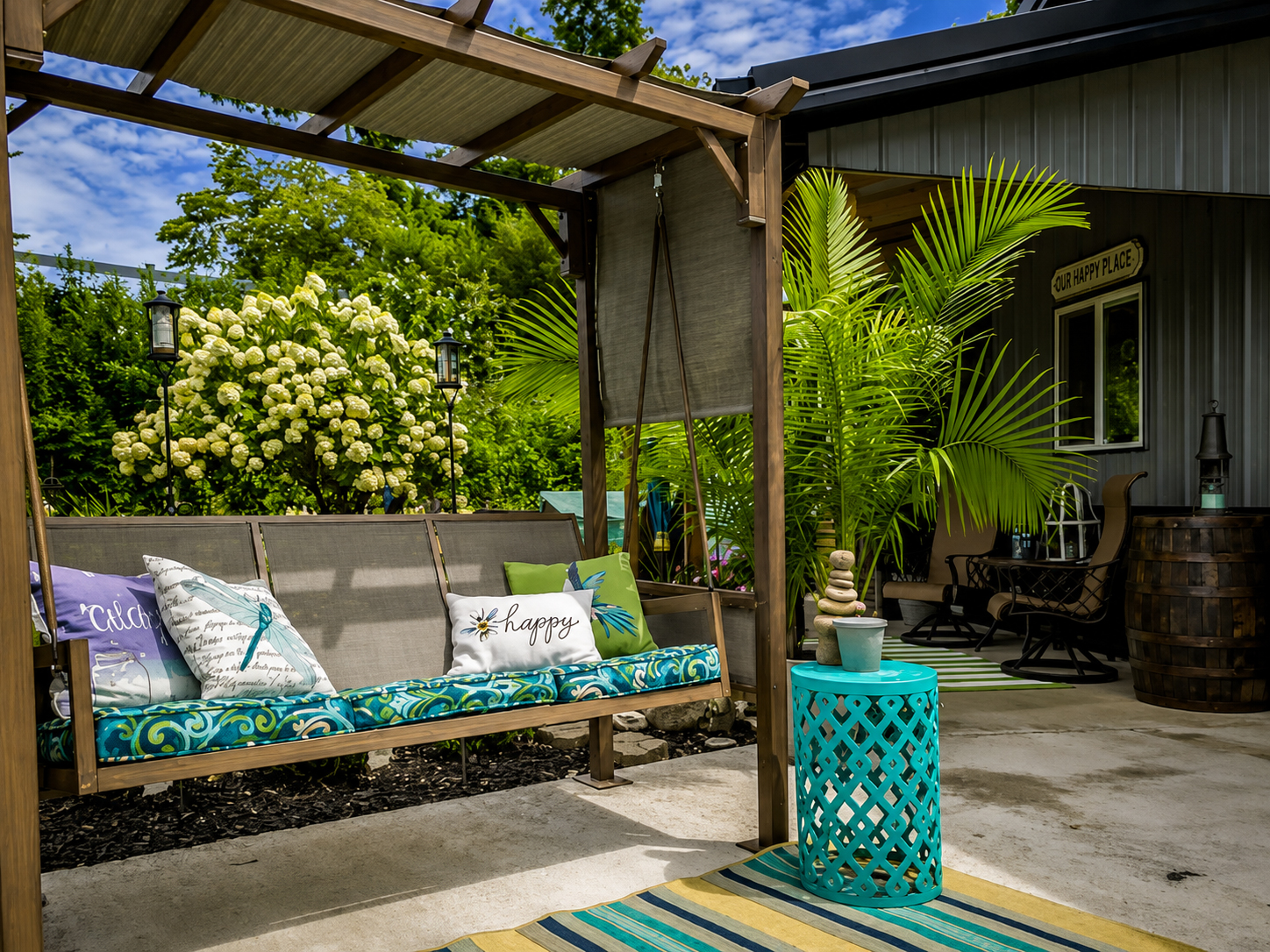
That is a useful design lesson.
Outdoor spaces often feel better when each zone has a clear job.
Design cues
- Freestanding garden pavilion
- Pergola-covered seating
- Patio dining zone
- Garden swing
- Mixed paved surfaces
- Gravel paths
- Flower beds between hardscape areas
- String-light potential
- Multiple seating choices
8. A Detached Garage Adds a Modern Farmhouse Note
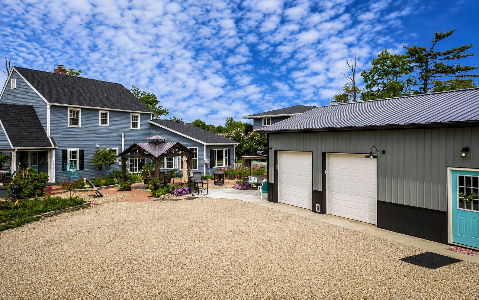
The large outbuilding takes a different path from the main house.
Its simple metal siding and broad roof feel more like a modern barn or workshop.
Still, the colors connect the structures.
Gray siding ties it to the house. Black lower panels create contrast. White garage doors keep the front bright.
Then comes another aqua door.
That small detail links the building back to the house in a fun way.
The black gooseneck lights also fit the farm-inspired look.
Design cues
- Metal exterior cladding
- Broad simple gable
- Black lower wall panels
- White garage doors
- Black gooseneck lights
- Aqua service door
- Gravel drive
- Barn-inspired form
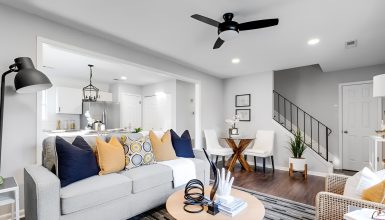
9. The Living Room Mixes Soft Gray With Warm Wood
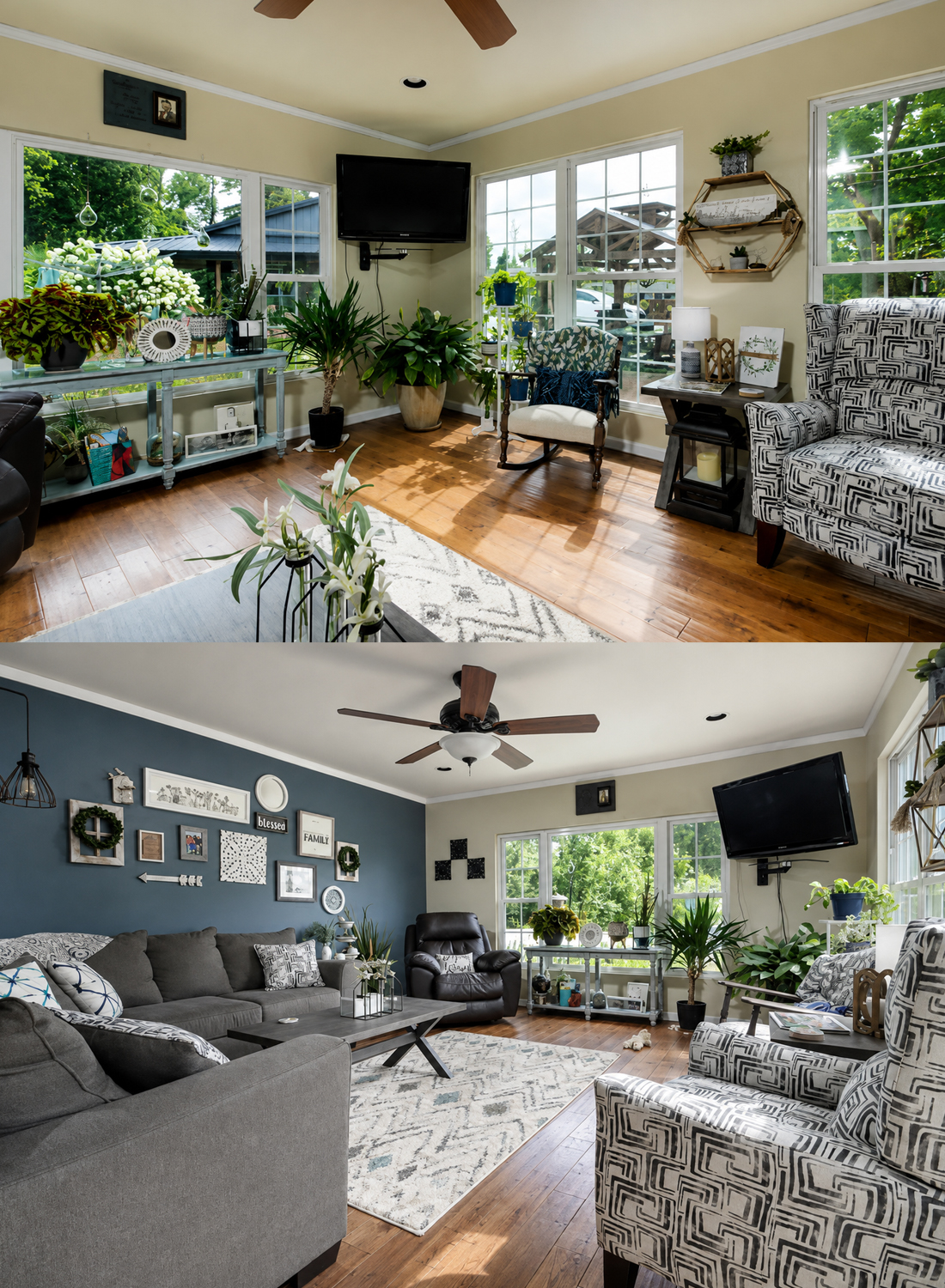
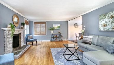
Inside, the living room feels relaxed and bright.
Gray seating fills much of the space. A large sectional gives the room a casual tone. Rather than placing many small pieces around the room, one large sofa creates a simple seating anchor.
Patterned chairs bring more energy.
Their bold geometric fabric keeps the gray palette from becoming flat.
Warm wood floors run beneath everything.
That natural brown tone matters. Without it, the room could feel cold.
Instead, the wood adds warmth and helps connect the modern furniture with the older house.
Design cues
- Large gray sectional
- Neutral area rug
- Patterned accent chairs
- Warm wood flooring
- Soft gray-blue feature wall
- White ceiling trim
- Black leather recliner
- Simple coffee table
- Mixed gray and wood tones
10. A Gallery Wall Gives the Room a Personal Touch
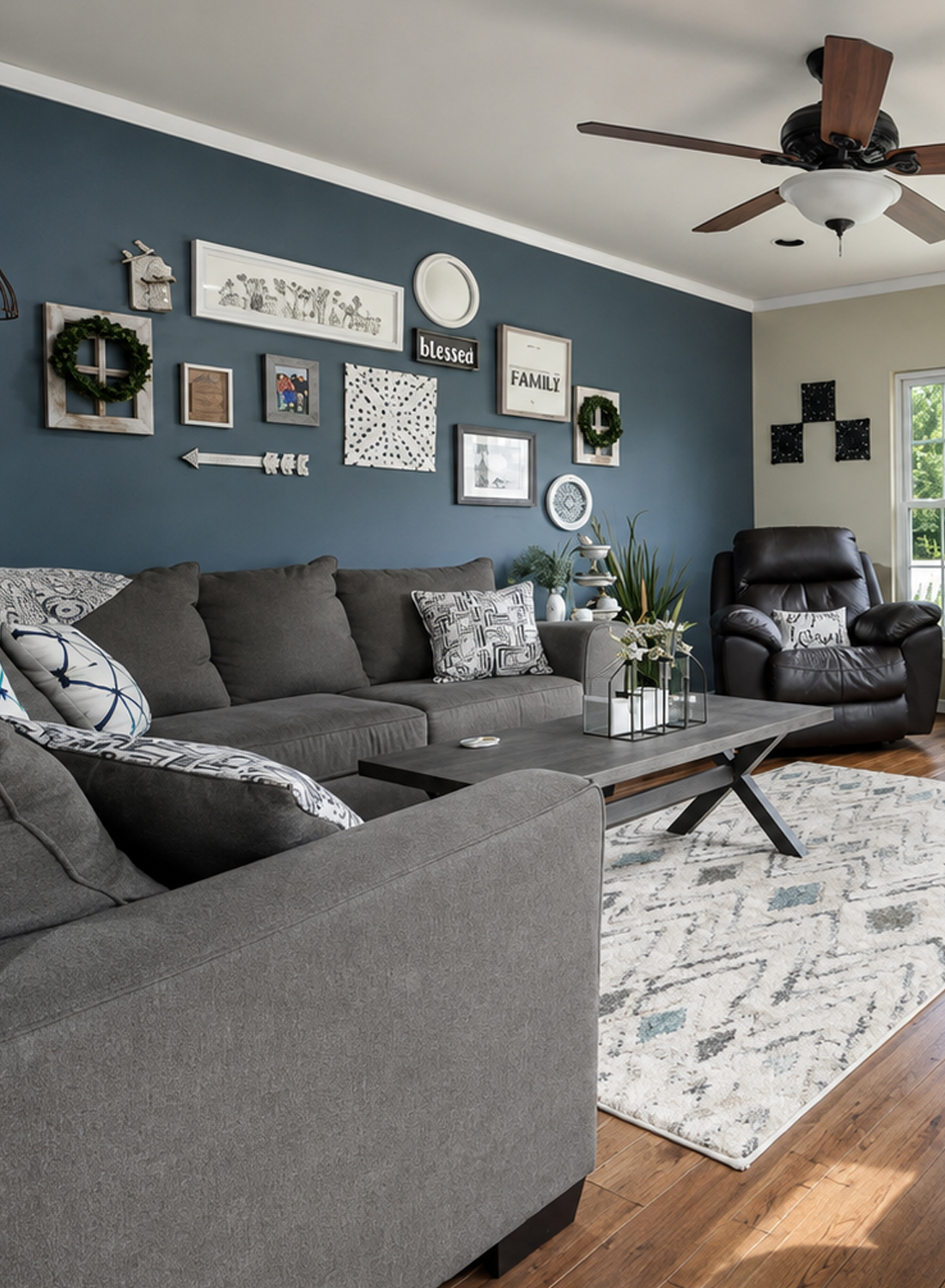
The dark accent wall holds a group of small frames and signs.
The layout does not follow a strict grid.
That keeps it casual.
Different frame sizes and shapes create movement across the wall. The dark background also makes light frames stand out.
This type of display suits an older home because it feels collected.
It does not look like every piece came from the same set.
Design cues
- Dark gray accent wall
- Mixed frame sizes
- Small signs and art
- Light frames against dark paint
- Asymmetrical arrangement
- Family-style decor
- Casual collected look
11. Large Windows Turn One Corner Into a Sunroom
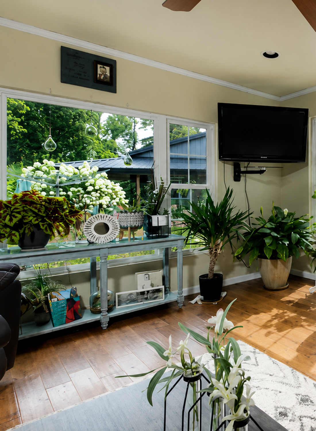
One of the best features in the living space is the wall of windows.
Natural light pours into the room from several sides.
That creates a sunroom feel even though the area connects directly to the main living room.
Plants thrive near the glass.
They also reinforce the connection between the house and garden.
A slim console table sits in front of the windows. Because it has an open base, it does not block much light.
This keeps the room airy.
Design cues
- Large banks of windows
- Windows on more than one wall
- Indoor plants
- Open-leg console table
- Light walls
- Warm wood floor
- Small reading chairs
- Strong indoor-outdoor link
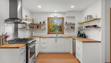
12. The Kitchen Brings Blue Into the Heart of the Home
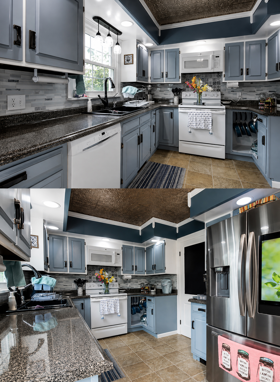
The kitchen takes the exterior color story indoors.
Soft blue-gray cabinets fill the room.
This shade feels calm, yet it has more character than white.
Dark counters create contrast. They also help ground the pastel cabinets.
Black hardware repeats that darker tone.
Meanwhile, white appliances keep the room bright.
The stainless steel refrigerator adds one newer finish, but it does not take over the room.
The kitchen uses a U-shaped layout.
That keeps the work zones close. In a compact older home, this plan can make good use of every wall.
Design cues
- Blue-gray painted cabinets
- Dark stone-look counters
- Black cabinet hardware
- Black faucet
- White range
- White dishwasher
- Stainless steel refrigerator
- U-shaped work zone
- Cabinets pushed into corners for storage
13. The Backsplash Adds Texture Without Taking Over
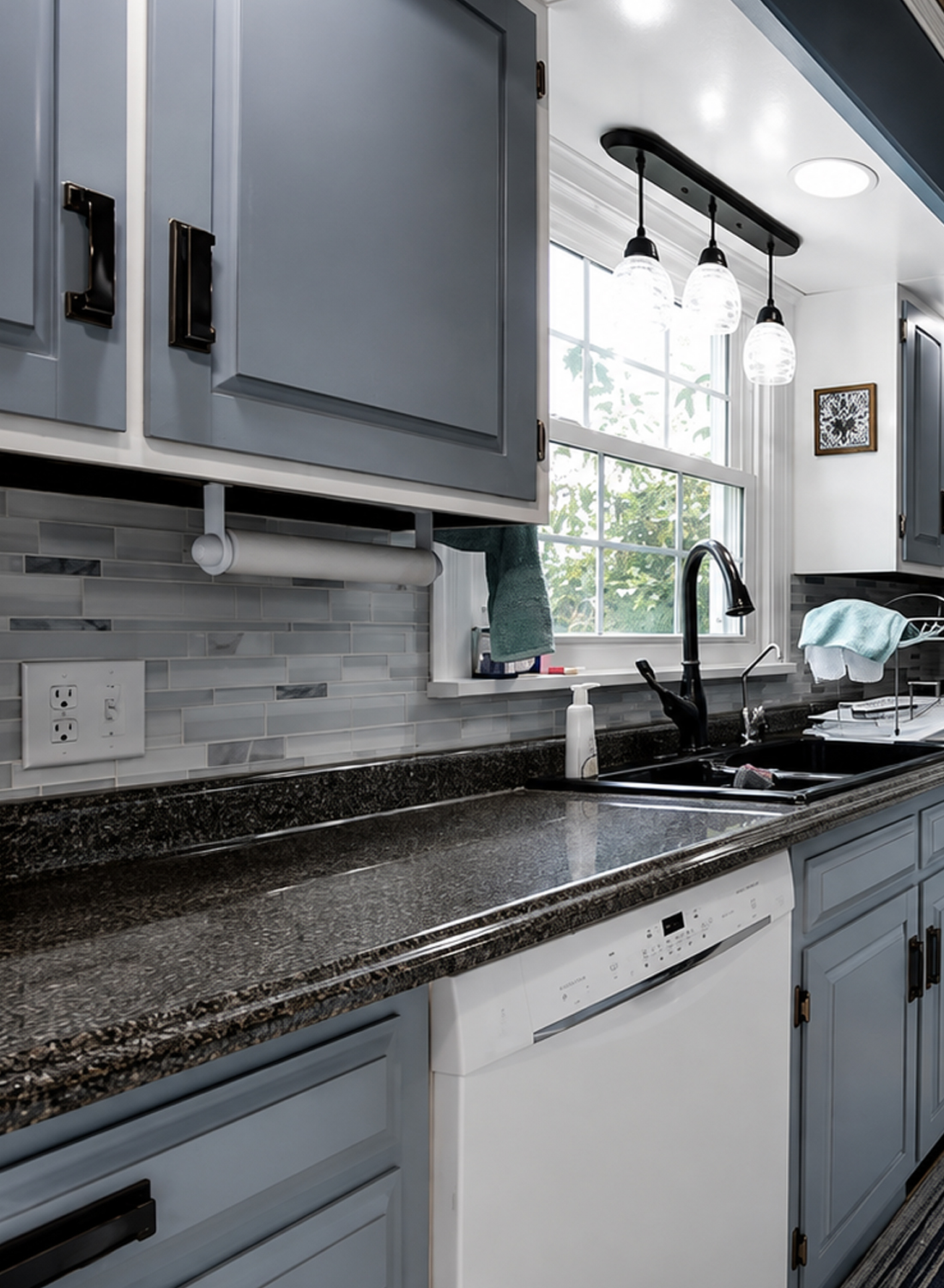
A horizontal backsplash runs along the counters.
Its mix of gray, blue, and neutral tones works with both the cabinets and dark counters.
Behind the range, a patterned section creates a small focal point.
This is a nice way to use a bold tile.
Instead of covering the whole kitchen with pattern, the design keeps it to one spot.
That gives the eye somewhere to land.
Design cues
- Linear gray backsplash
- Small range accent panel
- Mixed tile pattern
- Cool neutral tones
- Dark grout or shadow lines
- Simple balance between plain and patterned tile
14. The Ceiling Adds a Surprise
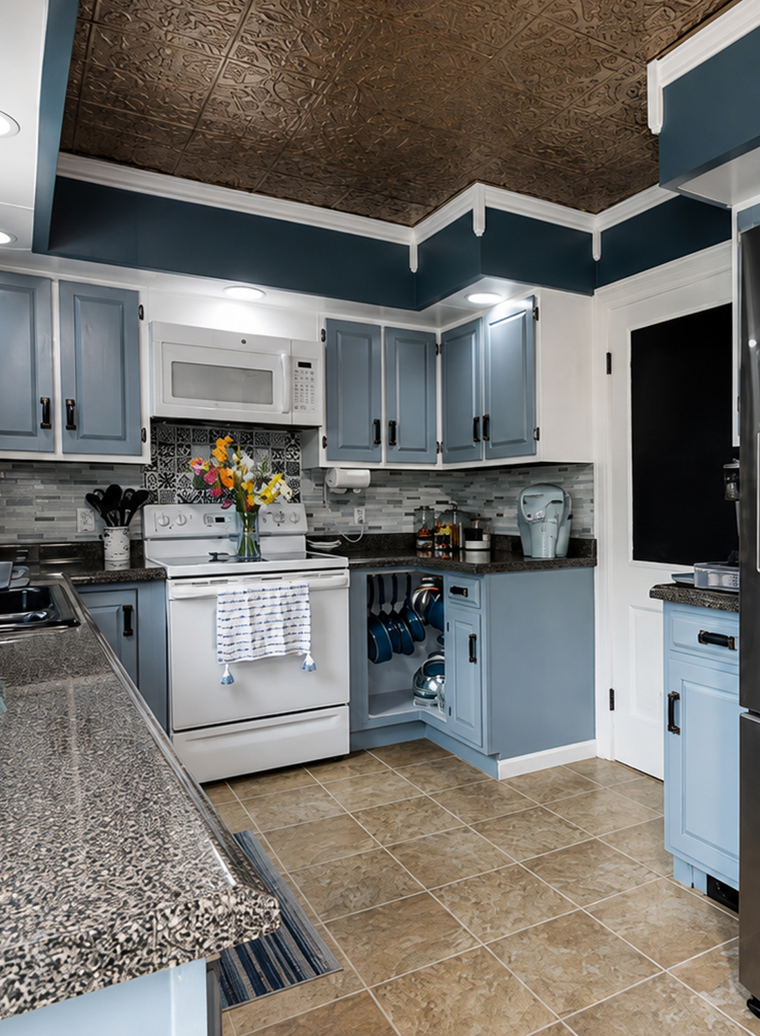
Look up, and the kitchen becomes more interesting.
A dark pressed-metal-look ceiling adds texture above the cabinets.
Then a blue-green band frames part of the ceiling edge.
White trim outlines the whole detail.
This choice gives the small kitchen a lot of character.
Dark ceilings can make rooms feel lower. Yet here, strong recessed lighting helps offset that effect.
The result feels cozy rather than closed in.
Design cues
- Dark decorative ceiling
- Pressed-metal or tin-look finish
- Blue-green ceiling border
- Bright white trim
- Recessed lighting
- Decorative ceiling used as a focal point
15. The Dining Room Leans Into Rustic Farmhouse Style
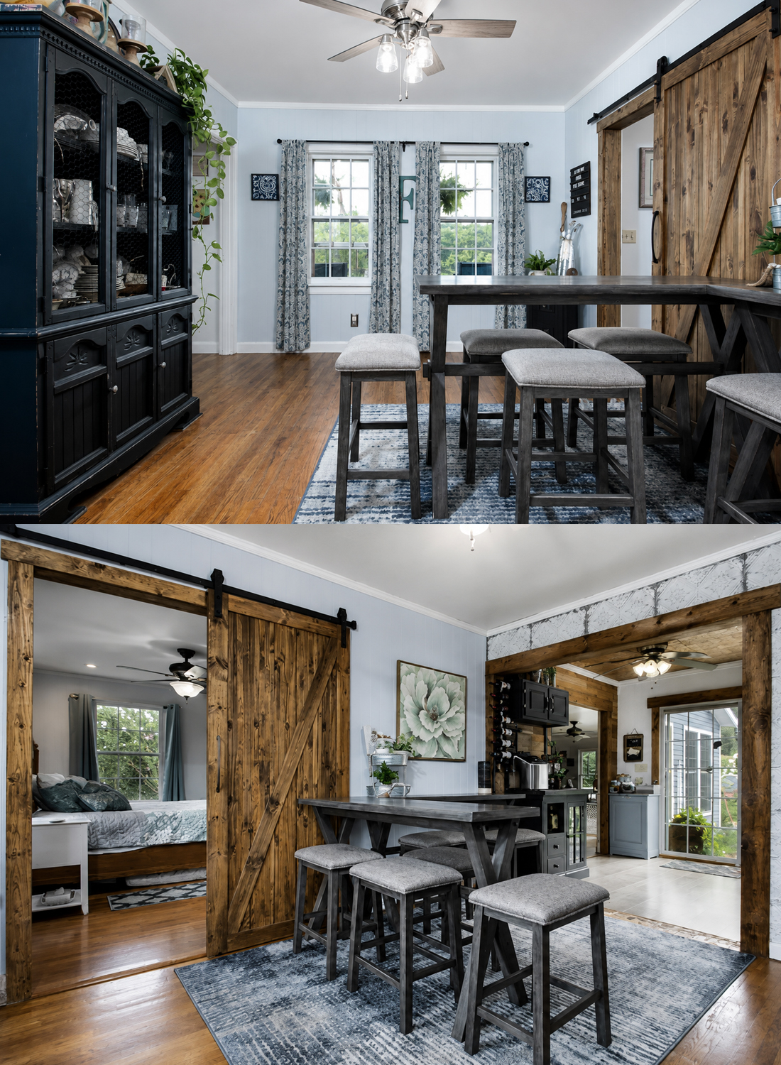
The dining room moves away from the cleaner look of the kitchen.
Here, rustic wood becomes the star.
A tall table with stools creates a relaxed eating area. The dark finish gives the furniture weight.
Then large sliding barn doors make an even stronger statement.
Their rough wood grain introduces texture. Black tracks and hardware add contrast.
This is more farmhouse than Cape Cod.
Still, it works because the house already mixes old and new ideas.
The wood also links back to the floors and bedroom furniture.
Design cues
- Rustic wood dining table
- Counter-height stools
- Gray upholstered seats
- Sliding barn doors
- Black metal tracks
- Warm stained wood
- Neutral rug
- Simple window panels
- Large dark storage cabinet
16. Wide Wood Trim Helps New Openings Feel Intentional
One dining room opening uses thick stained wood trim.
That detail gives the opening more presence.
It also makes the transition between rooms feel deliberate.
Older homes often have stronger room divisions than new open-plan houses. Keeping a wide framed opening can preserve that sense of separation without using a solid door.
Here, the wood adds warmth and gives the newer layout a handcrafted feel.
Design cues
- Thick stained casing
- Wide room openings
- Exposed wood grain
- Rustic trim details
- Open sight lines
- Clear room-to-room transitions
17. The Main Bedroom Stays Calm and Simple
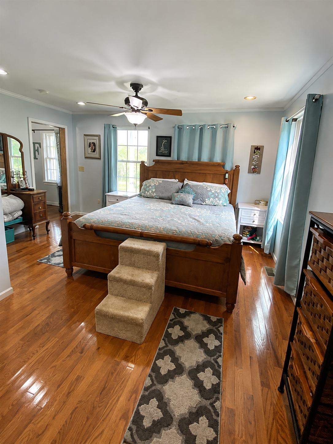
The bedroom uses a much quieter approach.
Pale blue-gray walls wrap the room.
Light blue curtains bring a soft color to the windows. A gray and aqua bedspread repeats the same cool tones.
Then the wood bed changes the mood.
Its warm finish creates a clear focal point and stops the room from feeling washed out.
Matching and mixed wood storage pieces add function.
The room does not chase a perfect furniture set. That gives it a comfortable, lived-in look.
Design cues
- Pale blue walls
- Aqua or blue curtains
- Warm wood bed
- Gray patterned bedding
- Hardwood flooring
- Small bedside tables
- Wood dresser
- Ceiling fan
- Soft runner rugs
- Simple wall decor
18. The Bedroom Shows How Cool and Warm Colors Can Work Together
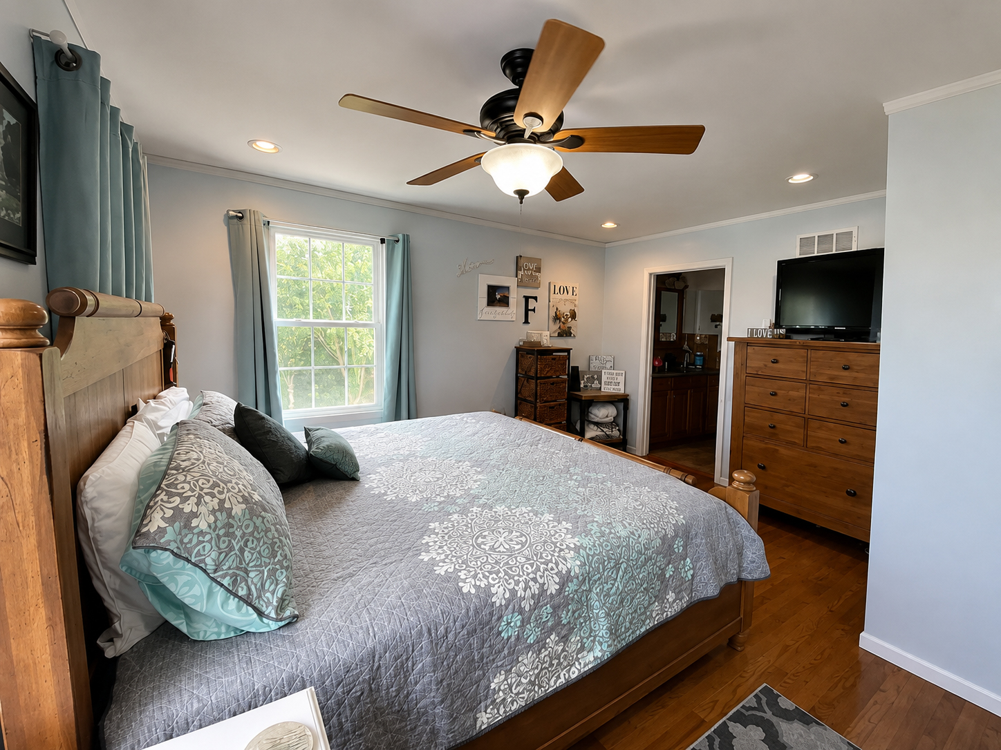
One of the strongest lessons from this house is its color balance.
Cool colors appear almost everywhere.
Blue. Gray. Aqua. White.
Yet the rooms rarely feel cold.
Why?
Warm brown wood keeps showing up.
You see it in the floors, doors, bed, cabinets, mirror frames, and furniture.
The house needs both groups.
Cool paint gives it freshness. Warm wood gives it comfort.
Design cues
- Pale blue as a base
- Gray for calm contrast
- Aqua as a bright accent
- White for trim
- Medium brown wood for warmth
- Black hardware for depth
- Small green accents through plants
19. The Bathroom Blends Traditional Wood With Updated Features
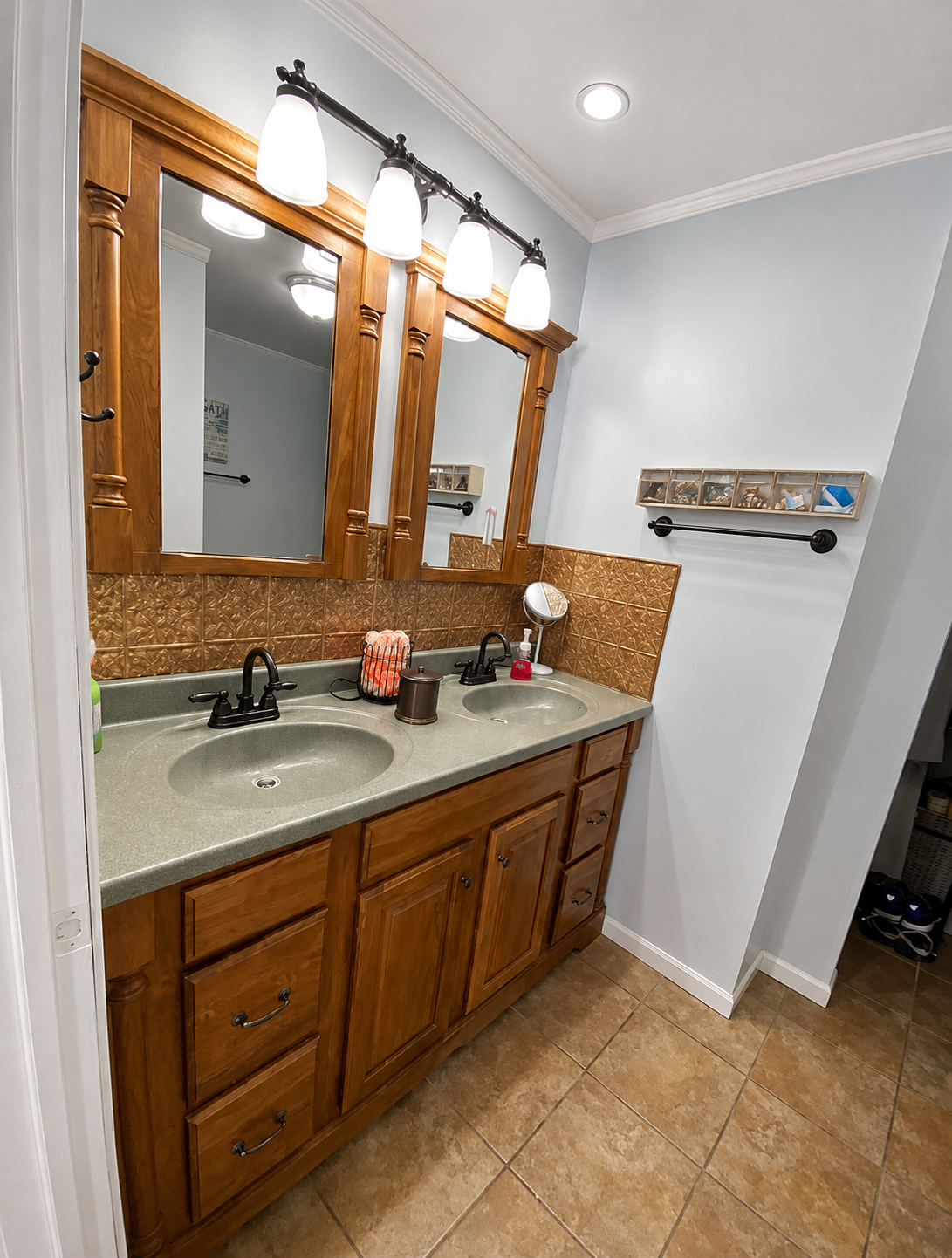
The bathroom continues that warm-and-cool mix.
A long wood vanity anchors the room.
Its cabinet fronts have a traditional style. The wood grain also brings warmth beside the pale blue walls.
Two sinks make the vanity more useful.
Black faucets add a more current touch.
Above the vanity, wood-framed mirrors continue the brown tone.
Then a bronze or copper-look backsplash creates another textured surface.
The bathroom feels updated, but it does not look stripped of personality.
Design cues
- Double-sink vanity
- Traditional wood cabinets
- Wood-framed mirrors
- Black faucets
- Warm metallic backsplash
- Light blue walls
- Bright vanity lights
- Beige tile floor
- White crown trim
20. A Large Walk-In Shower Adds Everyday Comfort
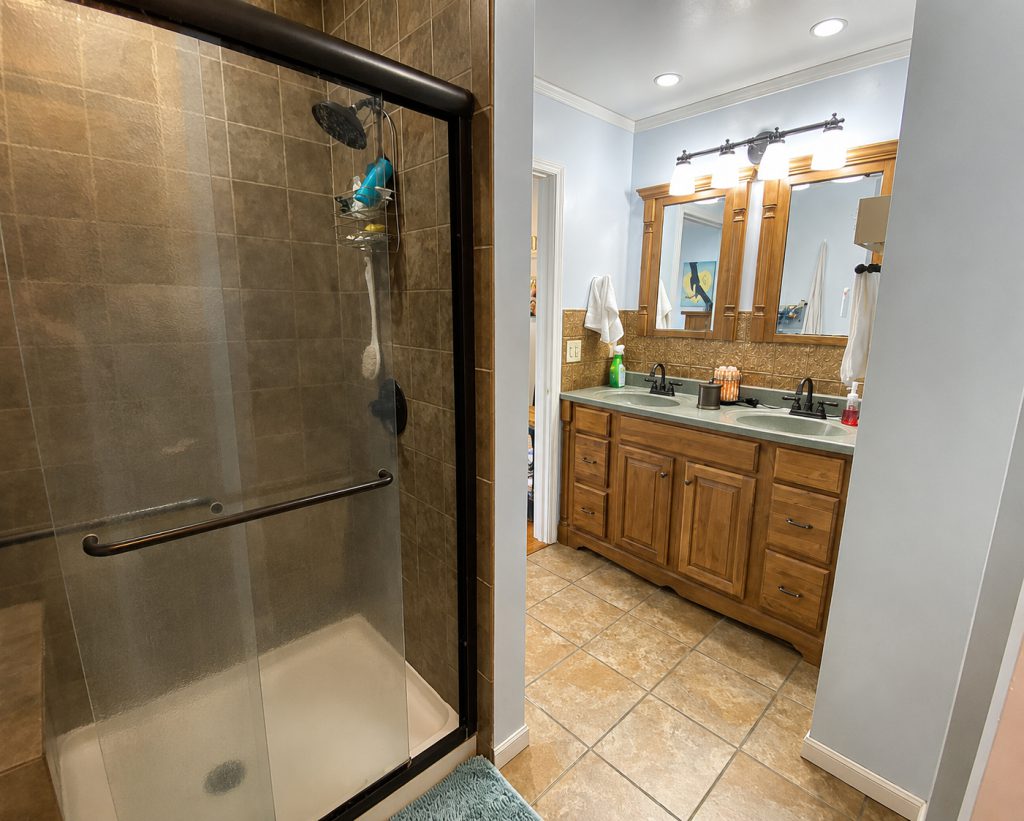
The walk-in shower gives the bathroom a more modern feature.
Large brown tiles wrap the walls.
A dark framed glass enclosure adds contrast.
The shower has a simple shape and avoids fussy detail.
That helps it fit the room.
The bathroom already includes several textures, so the shower stays calm.
Design cues
- Walk-in shower
- Glass enclosure
- Dark metal frame
- Brown wall tile
- Neutral shower base
- Simple hardware
- Easy-to-clean surfaces
Conclusion
This 1942 Cape Cod house shows how an older home can grow without losing its character. Classic rooflines and dormers keep the exterior rooted in tradition. Meanwhile, blue-gray colors, warm wood, updated rooms, and inviting outdoor spaces make the house feel ready for modern life. The mix feels personal, practical, and wonderfully comfortable.