
What if one bold roofline could turn a simple forest house into a total showstopper? This mid-century modern A-frame does exactly that. It mixes clean lines, warm wood, big windows, and cozy cabin charm in one beautiful package. From the striking triangle shape outside to the airy living room and sleek kitchen inside, every space feels calm, fresh, and easy to love. If you adore homes that feel stylish yet relaxed, this one is full of ideas worth saving.
Exterior
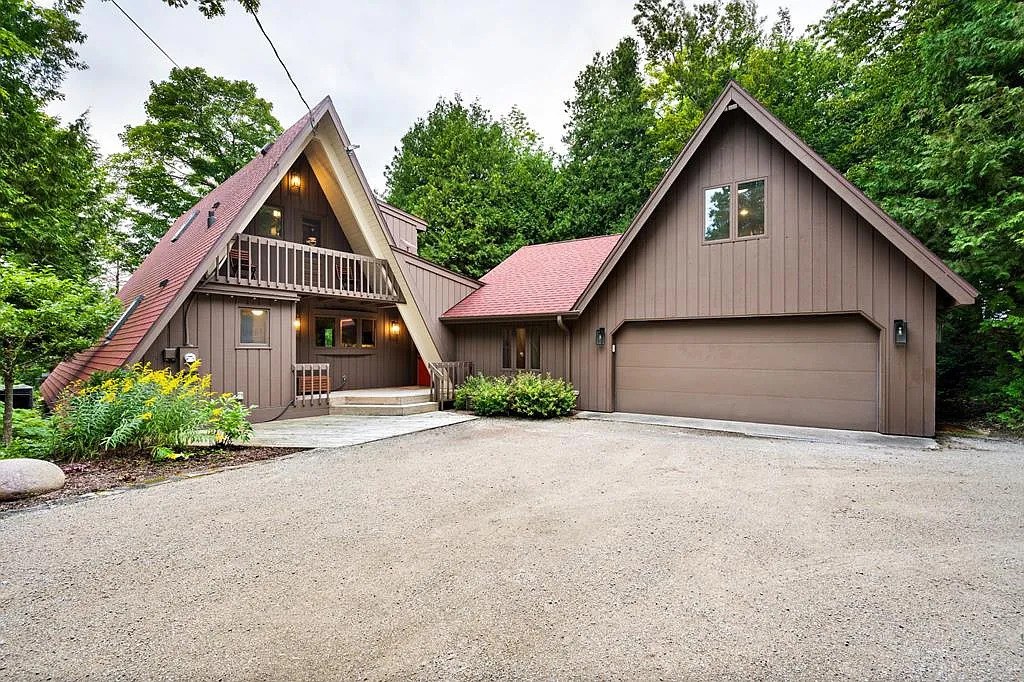
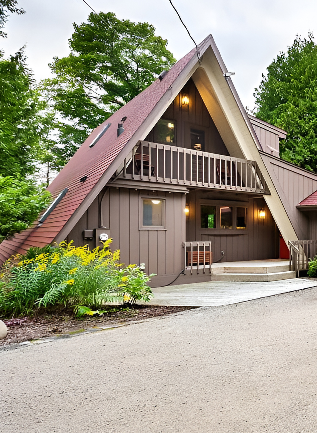
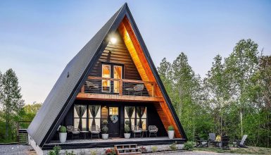
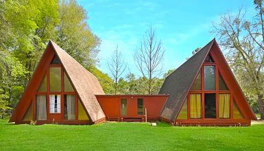
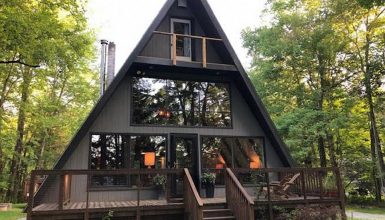
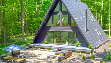
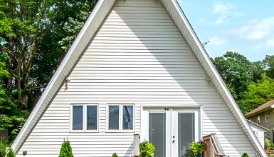
The exterior is the first place where this house gets it right. The A-frame form stands tall and sharp among the trees, which gives the home a striking profile without making it feel oversized. The roofline is steep and clean. That classic triangular front becomes the star of the elevation.
Instead of painting the home a bright or trendy shade, the design leans into earthy brown tones. The vertical siding gives the exterior a grounded, natural look. It also helps the house feel taller and more streamlined. Then the lighter trim around the front frame sharpens the silhouette and highlights the dramatic geometry of the structure.
This contrast matters. Without it, the shape could disappear into the trees. With it, the house feels crisp and defined.
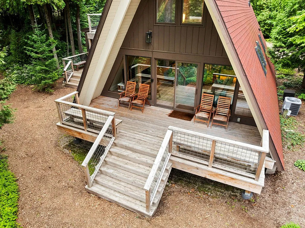
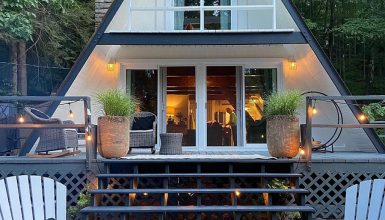
The front deck extends the architecture outward in a simple, useful way. It gives the façade a softer landing and creates a transition zone between the house and the landscape. The straight stairs leading up to the deck reinforce the centered symmetry of the front elevation. Meanwhile, the cable railing feels light and unobtrusive, so the eye can stay on the triangle form and the glass.
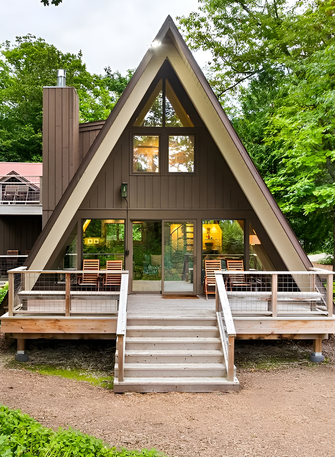
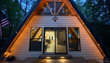
The oversized front glazing is another key design move. Large sliding glass doors and upper triangular windows let the front wall act almost like a frame for the forest. That is very much in line with mid-century thinking. The house does not try to shut out its surroundings. It opens to them.
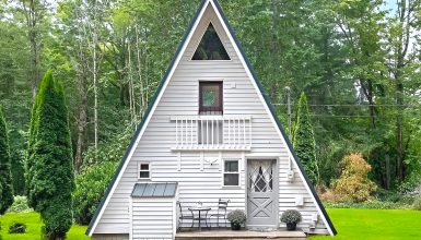
Around the house, the site design stays simple. Gravel and mulch ground the setting. Mature trees provide shade and privacy. Small shrubs and low plantings add softness without looking overly manicured. This keeps the property from feeling fussy. It still feels like a woodland retreat, not a formal estate.
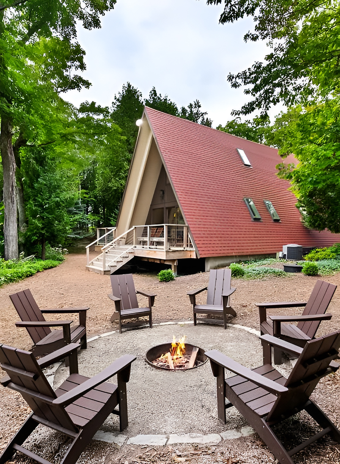
Then there is the fire pit area. This feature turns the outdoor space into a destination. A circle of Adirondack chairs around a central fire pit creates a classic gathering zone. It adds a social element that matches the relaxed tone of the house. You can picture cool evenings, warm drinks, and long conversations under the trees. Design-wise, it also balances the sharp triangle of the house with a softer circular form on the ground.
The garage addition is handled well too. It gives the home more function without stealing attention from the A-frame volume. Because the colors and rooflines are coordinated, the added structure feels like part of the same story.
Cues:
- Classic steep A-frame roofline
- Strong triangular front elevation
- Earth-toned vertical siding
- Lighter trim that outlines the structure
- Large front glass openings
- Deck that extends the living space outdoors
- Minimal cable railing for a lighter look
- Natural woodland setting
- Simple gravel drive and low-maintenance ground cover
- Fire pit seating area for casual outdoor living
- Attached garage that blends with the main house
- Clean, symmetrical approach to the front façade
Living Room
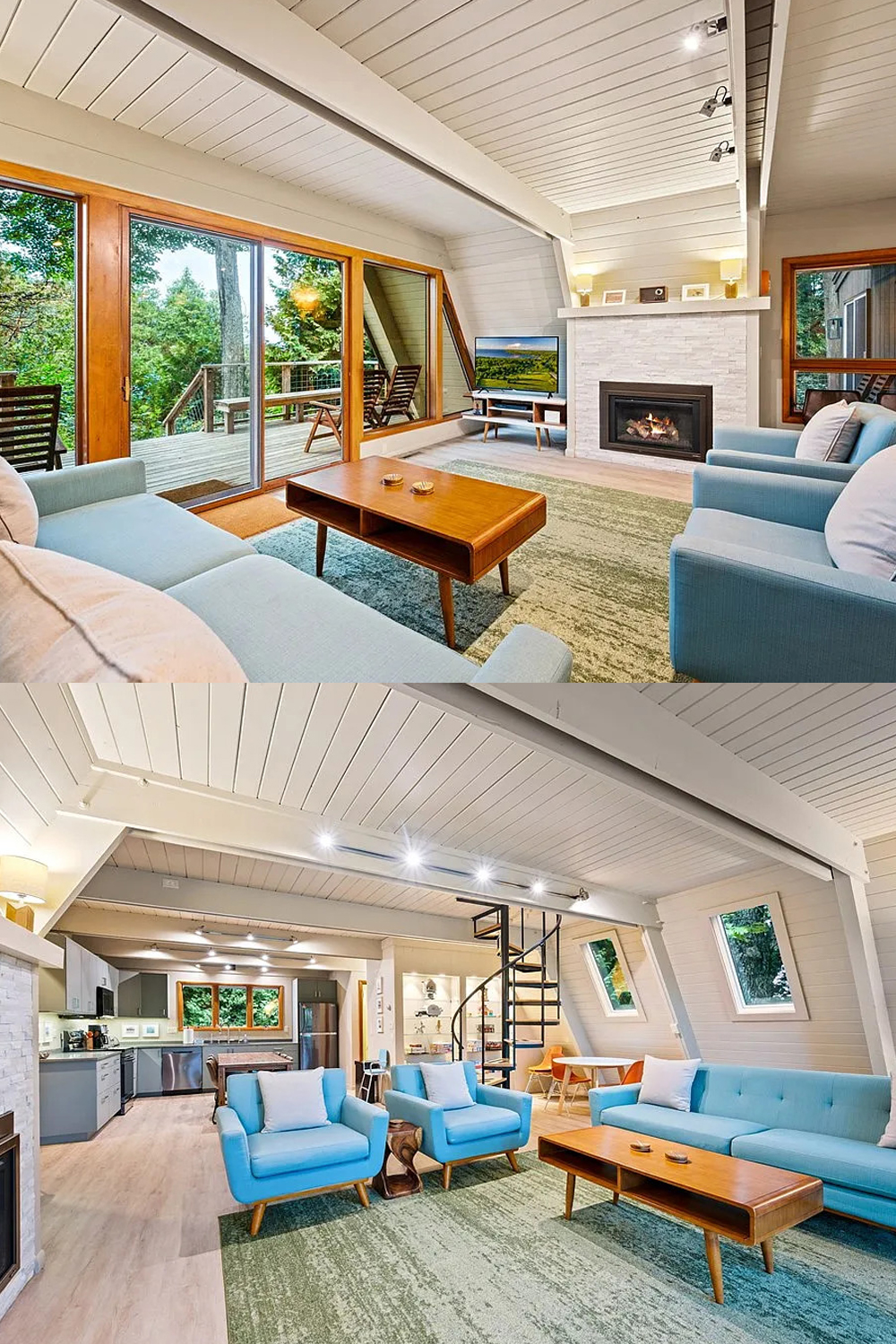
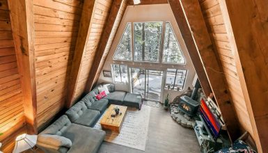
Inside, the living room shows how to modernize an A-frame without losing its soul.
The first thing you notice is the volume. The sloped ceiling rises overhead, and the exposed beams define the shape beautifully. Instead of leaving the wood dark, the ceiling and beams are painted in soft white and pale neutral tones. That one move changes everything. It brightens the room. It reflects light. It makes the architecture feel fresh rather than heavy.
This is a smart update for any older A-frame.
Many vintage cabins can feel dark because of all the stained wood overhead. Here, the lighter finish helps the room feel bigger and more modern while still letting the beams stand out. You still see the structure. You just see it in a cleaner way.
The fireplace wall anchors the room. Its pale stacked-stone finish adds texture, but the color stays soft and understated. That keeps the wall from overpowering the room. The linear firebox adds a modern touch, while the simple mantel shelf gives the space a quiet, polished finish.
The furniture selection also supports the architecture instead of fighting it. The blue seating is soft in color and simple in shape. It adds freshness without becoming too loud. The slim wood legs on the chairs and sofa nod to mid-century style. The walnut-toned coffee table brings in warmth and keeps the arrangement grounded.
The rug does important work too. Its muted green tone pulls a bit of the outdoors inside. It also defines the seating area within the open plan. In a large room with sloped walls and broad floor space, a rug helps create a sense of order.
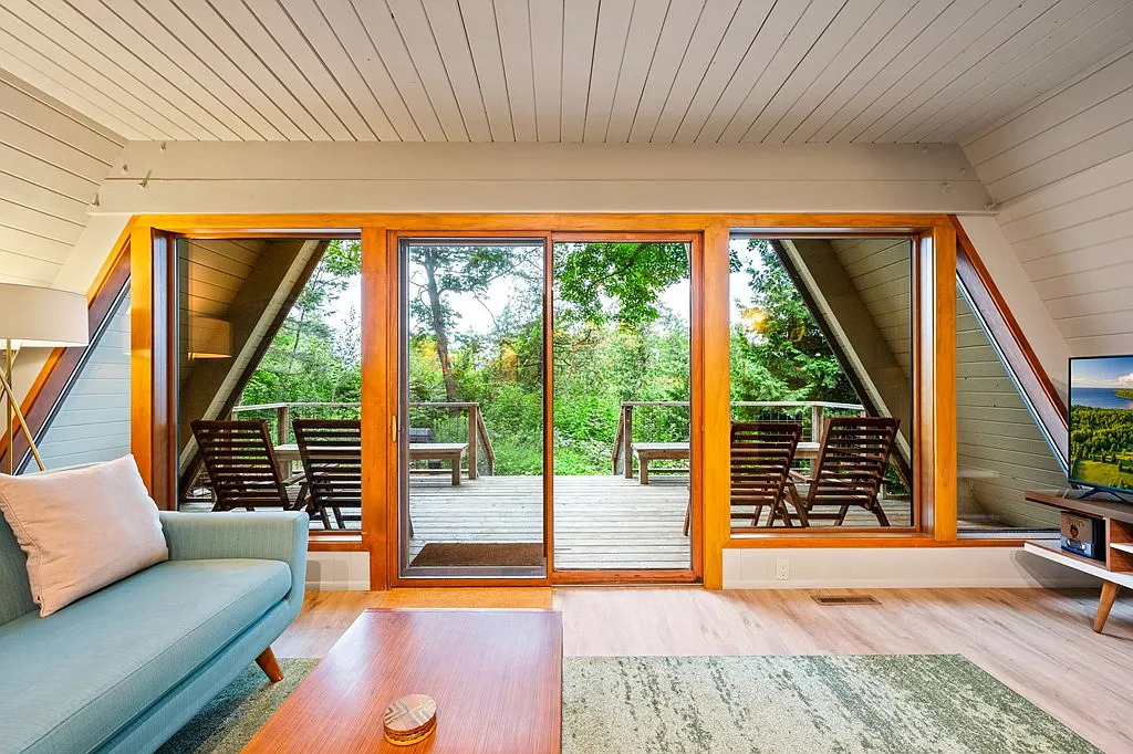
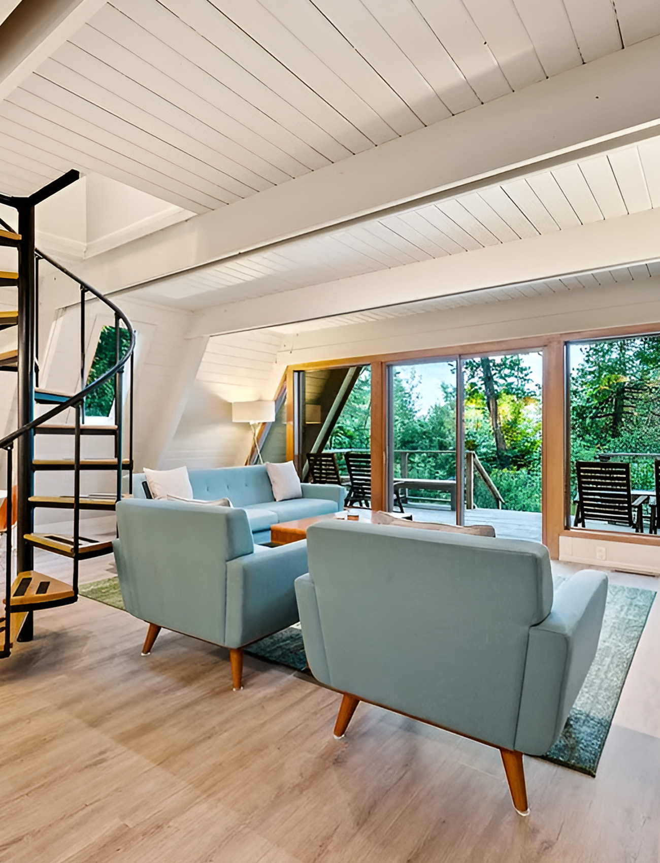
Then there are the windows and sliding doors. These are some of the strongest design features in the house. They stretch the room visually and flood it with daylight. More importantly, they make the trees feel like part of the decor. When the view is that good, you do not need heavy styling.
Cues:
- White-painted plank ceiling for brightness
- Exposed beams that celebrate the A-frame form
- Pale stone fireplace with modern insert
- Mid-century-inspired seating with slim legs
- Warm wood coffee table
- Soft blue upholstery for a fresh pop of color
- Green rug that echoes the landscape
- Large sliding doors for indoor-outdoor connection
- Minimal decor for a clean, open look
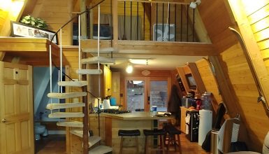
Spiral Staircase
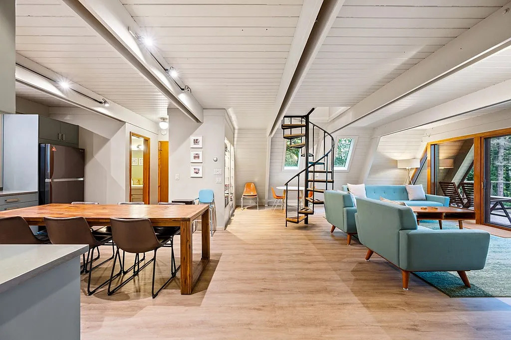
One of the standout features in the main living area is the spiral staircase. It acts almost like a piece of art in the room.
In many homes, a staircase is either hidden or bulky. Here, it becomes a focal point. The black metal frame gives it a crisp graphic look. The warm wood treads tie it back to the rest of the interior palette. Because the structure is open, it does not block light or sightlines. That matters in an A-frame, where openness is part of the charm.
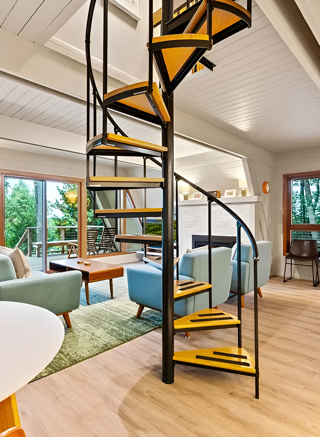
The staircase also adds a hint of retro style, which fits the mid-century direction of the home. It feels sculptural, but it also feels practical. It leads the eye upward and reminds you that the house has layers without making the room feel crowded.
This is a great example of how one architectural detail can shape the mood of a whole room.
Open Kitchen and Dining Area
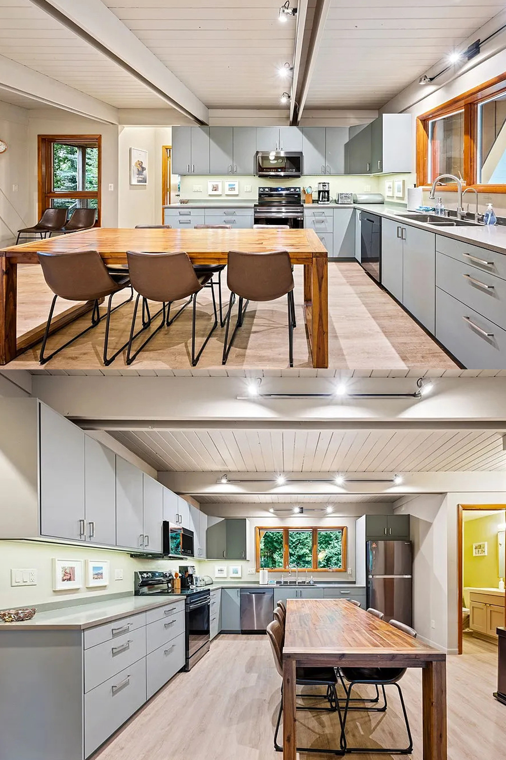
The kitchen and dining area continue the same design story. Nothing feels oversized. Nothing feels too ornate. Everything is pared back and easy to use.
The kitchen cabinets are flat and simple, which works well with mid-century modern principles. The soft gray finish keeps the room neutral and calm. It also pairs nicely with the warm wood trim around the windows and doors. That mix of cool and warm tones keeps the kitchen from feeling bland.
The counters are light and clean-lined. The hardware is simple and modern. The appliances are dark, which adds contrast without turning the space too industrial. Under-cabinet lighting brightens the work surfaces and gives the kitchen a clean glow at night.
Across from the kitchen, the large wood dining table adds warmth and weight. It is sturdy, straightforward, and unfussy. The black dining chairs bring in a bit of edge and help tie the dining zone to the black details elsewhere, especially the staircase and darker fixtures.
Because the layout is open, the kitchen does not feel cut off from the living room. That gives the whole main floor a casual, social feel. You can cook, eat, talk, and relax in one connected space. That kind of flow is a hallmark of both modern living and mid-century planning.
Cues:
- Flat-front gray cabinetry
- Light counters for contrast and brightness
- Minimal hardware
- Dark appliances for a modern edge
- Warm wood dining table
- Sleek dining chairs with dark frames
- Open-plan layout that encourages flow
- Clean sightlines from kitchen to living area
- Balanced mix of cool gray and warm wood
Bedrooms
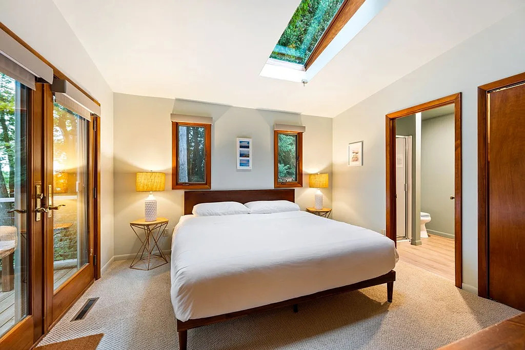
The bedrooms in this house are not overly decorated, and that is exactly why they work.
The main bedroom feels restful and uncluttered. A simple bed frame, crisp white bedding, soft carpet, and warm wood trim create an easy, welcoming atmosphere. The room gets charm from architecture rather than decoration. Narrow vertical windows frame views of the trees. A skylight overhead brings in extra daylight. French doors open to the outdoors, which adds another layer of connection to the landscape.
This room proves that you do not need a lot of furniture to make a bedroom feel complete. Good proportions, natural light, and a few warm materials can do most of the work.
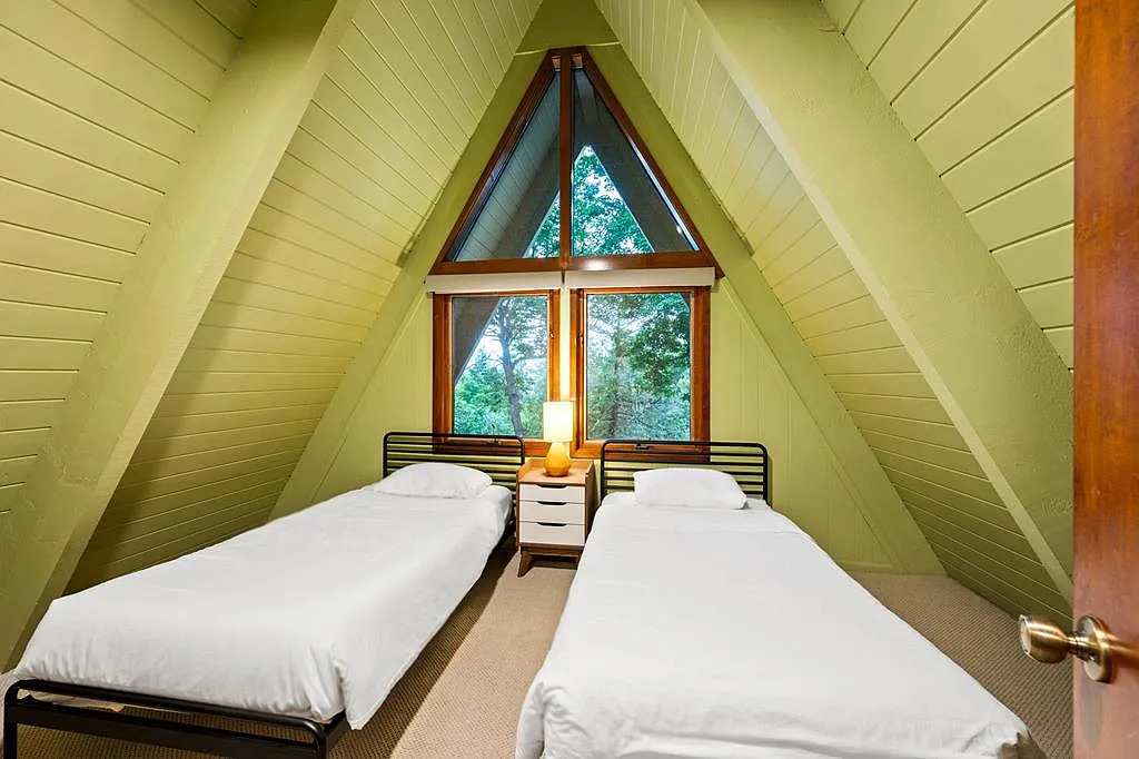
The loft-style twin bedroom has even more character. The sloped walls and triangular window turn the room into a cozy little nest. The green-painted plank walls give the space a soft, earthy personality that suits the wooded setting. The twin beds keep the room practical and guest-friendly. A small nightstand and lamp provide just enough function without crowding the footprint.
This is a great lesson for A-frame design. Lean into the geometry. Do not fight it. Let the angled walls become part of the charm.
Cues:
- Minimal furniture for a calm feel
- White bedding for freshness
- Skylight for added natural light
- Wood-trimmed windows and doors
- Direct outdoor access from the main bedroom
- Sloped walls used as a design feature
- Earthy green paint in the loft bedroom
- Twin-bed layout for a smart guest room setup
Bathroom
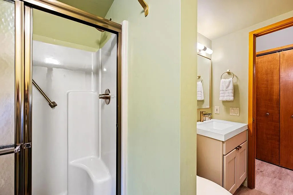
The bathroom is one of the simplest spaces in the home, but it still supports the overall design.
It has a compact layout, which makes sense for a house like this. The shower enclosure is practical and straightforward. The vanity is clean-lined and modern. The finishes stay light and easy. Nothing competes for attention. That keeps the room feeling tidy and functional.
In a design like this, the bathroom does not need to be dramatic. It just needs to feel clean, bright, and in step with the rest of the house. This one does exactly that.
Conclusion
This mid-century modern A-frame proves that great design does not need to feel complicated. It uses strong architecture, simple furniture, soft color, and a close link to nature to create a home that feels timeless. The exterior feels bold and inviting, while the interior feels light, open, and warm. Altogether, it is the kind of house that makes you want to slow down, sit by the fire, and stay awhile.